How Learning Feng Shui Taught Me To Think Mobile-First (20 minute read)
Design and Harmony
Apple is not worth 680 billion USD (as of Feb 2016) because they are efficient. It's not because they serve great team lunches. It's because they get it. They know how to design, and they know how to execute. They know how to put a product together that makes you feel something. It's music in your hand. It's sand between your toes at the beach. You feel it. Good design invokes emotion, and yet, carries something more with it: a message. The message is subtle, honest, and derived from the overall experience. This is a balanced and valued design approach that most any company and brand can leverage to get themselves into position in front of a customer in the right place and time.
When dropbox launched, there were already 14 competitors doing the same thing. Dropbox, however, knew how to make something work intuitively and naturally. They also had a great viral marketing strategy, and just the right incentives (250mb of space) to get the 'share' button to actually be used. But still, their balance of usability and seamless engagement was a musical treat. People were getting setup on dropbox like it was a public utility (water, sewage, gas, electricity, etc) and they seemed to demand it on any new PC or Mac they purchased.
Balance in design. Balance in function. Product positioning. This stuff matters. It makes or breaks. But it's not just simple design work. It's not a matter of knowing photoshop or illustrator better than the next designer. It's more 3-dimensional than that. It requires texture and thought, inner and outer exchanges of information and feelings. This is a soft-science. It's why you pay the branding guy all that money. He has some bits of information and knows how to connect dots that other designers don't even see.
Enter Mobility.
Mobile apps. They are not going away. The world is changing. Our design is behind the times. Mobile apps require specific thought and specific movement. They have a flow-expectation and they require special attention to detail. Every pixel counts. Thumb-arrangements, movements, etc. Slide up or slide right. Positioning of interactions. All of the details that keep you up at night. They are exacerbated in mobile apps.
If you need to hire a Mobile App developer, check out our extensive listing here. Now, back to Feng Shui....
Feng Shui is simply the arrangement of things so that your environment is comfortable, balanced and harmonious.
Many of you probably think of it as a Asian gimmick to sell interior design services, or as a New Age fad, but it is in fact a great way to improve the way we interact with the environment. Just like great UI (User Interfaces) created for web applications, good feng shui can create a more pleasant experience in a home or space making you feel more comfortable, happier and productive.
While normally Feng Shui applies to building citing and interior design, it can be applied to many aspects of our lives from our work space to web design.
Like most Front-End ninjas starting out...
I would design a site for desktop first. Most of you will recognize something like this in their CSS files:
/* For desktop: */
.col-1 {width: 8.33%;}
.col-2 {width: 16.66%;}
.col-3 {width: 25%;}
.col-4 {width: 33.33%;}
.col-5 {width: 41.66%;}
.col-6 {width: 50%;}
.col-7 {width: 58.33%;}
.col-8 {width: 66.66%;}
.col-9 {width: 75%;}
.col-10 {width: 83.33%;}
.col-11 {width: 91.66%;}
.col-12 {width: 100%;}

@media only screen and (max-width: 768px) {
    /* For mobile phones: */
    [class*="col-"] {
        width: 100%;
    }
}
Designing top down will work but the website will load slower on a mobile device as the media query will be initiated on screens smaller than 768px.
Now you may be saying to yourself:
"Well yeah ok page speed, that makes sense but how does the ancient science and art form of Feng Shui come in?"
Well. . . If you design top down with CSS such as above, you will find that all your columns stack nicely on mobile and everything is neat and tidy. Job done. No need to learn the art of mobile design.
Not quite.
What you will miss by doing this is the vast amount of styling that can be done on mobile to draw your customers in and make your website as unique as it is on desktop displays. You will get lazy and just be satisfied with simple stacked divs and an acceptable mobile design.
I recommend getting to know a framework such as Bootstrap. Bootstrap is becoming a standard in responsive design and can help minimize the time needed to create a fully responsive website.
Bootstrap is the most popular HTML, CSS, and JS framework for developing responsive, mobile first projects on the web.
Ok, now back to Feng Shui.
The first lesson I learnt was that Feng Shui was not just about moving some stuff around so you feel good, but a way to use color psychology, symbols and other effects to essentially master your life and learn how to be happy. The more I studied these aspects the more I realized how these techniques can be applied to web design to make the person viewing the website feel happier, more engaged and more likely to convert into a paying customer.
Is it ethical? Heck yeah..
So lets go through a few of these techniques and how you can apply them to your responsive designs.
Color
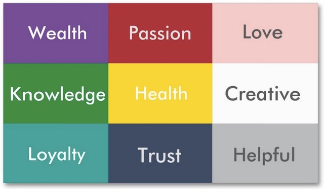
Feng Shui Color Chart
Color is not only seen with the eyes but interpreted by the brain as a vibration at a specific frequency. These frequencies can directly effect your intentions and well being. So understanding these colors and what effects they have can directly increase conversions and lead to a better user experience.
For a dating website that has a predominantly red theme, red representing love, passion and stimulation, I may consider replacing red with pink for desktop devices. Pink, while less arousing then red, would allow for a more intimate experience focusing more on love and romance. This would psychologically effect the user experience on desktops, where users are more likely to spend more time on the site as apposed to mobile users looking for a faster connection to a potential partner.
Symbols
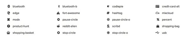
Font Awesome Fonts
We all know how effective symbols are in web design and while designing for mobile first symbols can be extremely effective at portraying content in an easy way that can greatly clean up your mobile design. From the infamous hamburger icon that can replace your nav bar with a simple drop down for mobile, to icons for contact us pages or models that can display additional information only when the viewer needs it. These devices can greatly increase user engagement and lead to a better user experience on mobile. Designing these elements up front for mobile may also lead to you being able to use some of these techniques for larger viewports and keep the site clean and tidy on all devices. You may miss some of these techniques if you simply scaling down from a site designed for desktop. Every symbol must have a meaning so choose wisely otherwise you may throw your visitors off.
Font Awesome fonts has become a web standard in scalable vector icons that are responsive and you can apply other css effects to them just as you would any other element.
You can also use symbols to reinforce an idea or psychological trait you are trying to get out of your visitor. Going back to the dating website example, pairing objects such as two gold birds or two pieces of matching jewelry in a photo on the landing page can reflect companionship and a "lasts the test of time" mentality in your visitor. So don't think symbols are only icons. They can be embedded into pictures, headers or even hidden within your logo.
Yin and Yan
Yan is masculine, bold, minimal like a clean bootstrap theme with very little done in regards to custom css or java elements while Yin is feminine, relaxing and dense similar to old school sites that have way too many ads. Creating a balance between these two can be essential to creating a user experience that translates well to all your visitors as apposed to only some visitors that may have the same imbalanced chi as your site.
Keeping a mobile site balanced can be extremely difficult, especially for mobile when you will most likely have the viewer swipe scrolling down the page. The general rule of thumb would be to have a different color background section for every body of content. This is more of an art than a science. Symmetry and parallax effects can be a great tool for this, especially on desktop, to keep the user engaged. But be careful when scaling up as you will have to carefully arrange these sections (using order: or color changes) otherwise you may find your color sections being all over the place, overlapping other content and clashing with the overall design of the site.
An easy way to do this is to keep a responsive.css file linked into your HTML and keeping changes specifically regarding style changes between mobile and large screens in this file.
Movement
The art of Feng Shui in regards to movement is all about directing your visitor towards a goal such as signing up to your mailing list or buying your product. So keep in mind the elements on a page that do not either reinforce your authority on the subject or invoke the emotional connection that you are trying to connect to. Are they essential? If not perhaps they are better off on another page or in a model.
During your mobile design you may even want some elements to rather not be displayed (by using display:none; in your main css and applying display:block; or display; flex during a media query when upsizing so a larger screen in your responsive.css file)
For instance you may have a table displaying baseball results and on mobile display only the end score, teams that played and dates and once the screen is larger display the home runs per inning and other stats.
On the dating site perhaps having a simplified search for mobile while on desktop allowing users to define their searches with much more information.
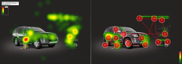
The Isreali start-up Feng-GUI will even go as far as analyzing your site and doing a eye tracking comparison, giving you a heat map of the most attractive parts of your page, and various reports telling you where the visitor looks and is most likely to engage in your site.
Remember on mobile things need to be simple and effective as the user is not used to having to type or select many options. The site should be designed with a goal in mind and way for the user to get to that goal without having to scroll through a bunch of fluff.
Lets take a look at Dropbox.
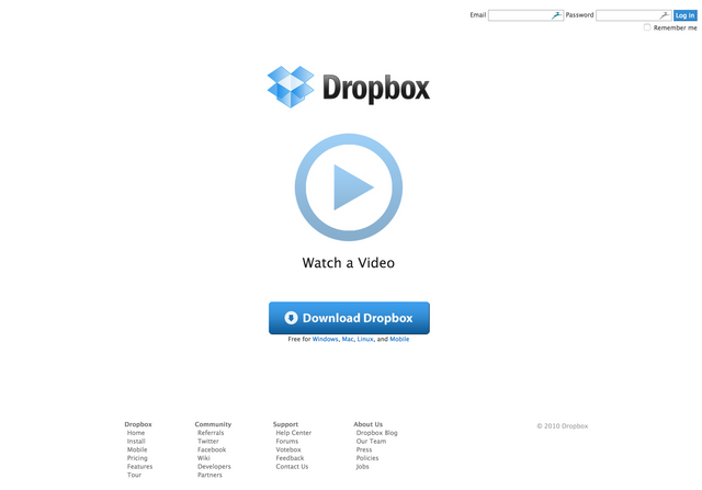
Dropbox website - August 2010
Dropbox, the successful file storage and file sharing platform, first started out as a minimum viable product. Their website just had a logo, sign up form and an animated video explaining the product. These 3 items where all they needed to become one of the larger boys on the block. Why? Because it was too the point and engaging. The color and minimal style, while a little too Yan was comforting and gave the visitor a sense of trust.
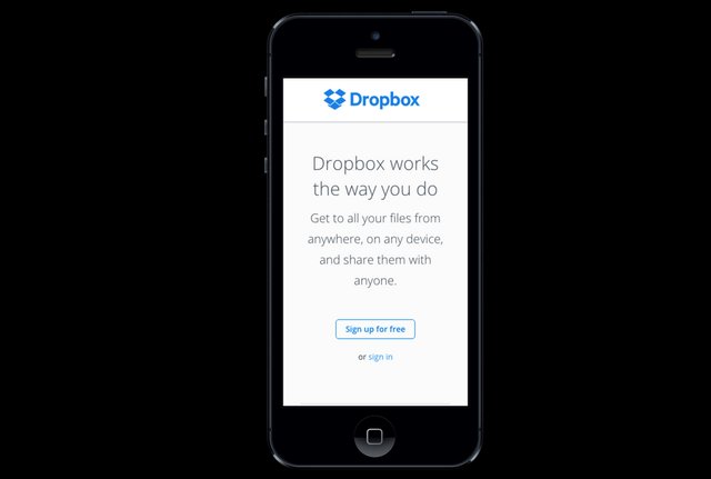
If you take a look at their website now it is remarkably zen. On mobile the main graphic and top buttons are not displayed at all and their is simply a short description and a sign up link. As you scroll down the logo removes the "Dropbox" wording and is simply the Dropbox symbol. This keeps the clutter to a minimum and allows the visitor to stay focused on the various sections. Each section is in the same format (Heading, Image, Discription, Symbol) all using a sparing amount of pastel colors creating a sense that the software is easy to use (Pastel colors in Feng Shui are associated with child like playfulness). At the bottom of the page is a bolder sign up button. The flow of the site has led the visitor to this button while reinforcing the psychological responses Dropbox wants from its visitors while explaining the benefits of their software.
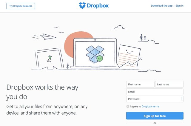
Dropbox website on desktop - 2015
When scaling to desktop you can see that there is now a full sign up form asking for your name, email address etc while a graphic image is displayed to take up most of the space. The image is minimal and keeps the landing page uncluttered and balanced. The rest of the site is similar to mobile, allowing the eyes to clearly distinguish the content blocks while leading the user to sign up.
Often websites want too much and don't realize visitors are most likely only willing to be drawn to one place on the site. So next time you think you need to list all your pages in the top nav bar (like the "about us" or "terms and conditions") consider moving those links to the bottom of the page for only those users that are really interested and seeking that content. Chances are those pages only get read by visitors that have already engaged in your primary goal.
The Workflow of Yesterday
Below shows where we have been. Its the process that most creative agencies would take a business through, in order to meet their clients' expectations. Logical, thorough, and holistic, yes. But it's predictable and doesn't necessarily hit the mobile target.
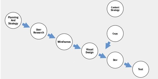
The flow of information for outside parties must be captured. So this is necessary, but at times, perhaps not.
There are many challenges with accepting or adopting this as the flow at all times.
The curse of knowledge (Malcomb Gladwell's "The Tipping Point") invokes insider information about the product or service that is truly impossible for the outside world to understand.
This process is commonly used a template-minded approach for companies to work together with agencies. In this, you typically have the visual design done 'by committee' is the worst possible way (in my opinion) to design a product or service. All of these steps and planning and strategic thinking minds can muddy the waters and turn a brilliant and 'simple' concept into something of a corporate missions statement, which says nothing. The old adage of marketing states, "If you have said 3 things, you have said nothing".
Visual design after the known facts from the insiders can be poisoned.
So what is the alternative flow? Let's start by the notion that customers experience your product and service in a flow of experiences, rather than a logical informative process. It's not going to happen the way you want it to always happen. They nibble around the edges. They don't go into the right funnel or door first. They make mistakes and have preconceived ideas about you.
Consider the core flow of information to the customer's mind, illustrated below.
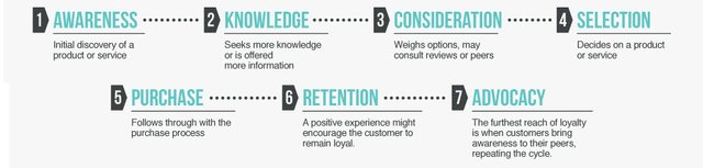
The notion of information flow being the primary and central theme is short-sided. What about the harmony of the Feng Shui mantra, in it's impact on the psychological? It's more important to impact the customer than it is to profit from the customer. After all, the greatest weapon in the history of the world is not a nuclear bomb, it's an idea. A single, powerful, world-changing idea can overthrow world leaders, change countries, start or stop wars, and improve or destroy the lives of a billion people.
Ok so back to balance... harmony... all of that stuff.
Try this instead. It's my own recipe for the core of the app experience, based on some known tactics, and some of my personal experiences.
Personas: Use Personas to Experience the user personally. Personas are used often to imagine your user experience. They are completely fictional characters created from the "expected" behaviors of your target users. They give you a centerpiece of conversation to make designs and decisions.
Priority list: This is something you can't live without. It's really important to understand from the customer's perspective, (not your client), what is their most important use case? What do they want for themselves? How does that priority shape the experience?
Scenarios: Scenarios provide a flow of steps and lead to exploring deeper into how a persona will be experienced. This flow allows you to design a UX that suits your defined personas and the goals they want to accomplish. In this step, you have to input the Feng Shui you've learned and make it noticeably evident to your constituents. They may need hand-holding. They will try to insert their priorities and dismiss the customers' priorities. You are an advocate for the customer, the user. The one who ultimately decides who lives and who dies in the marketplace. Do not let go of that ultimate responsibility.
Feelings: Invoking peace, harmony, balance, and sustain that throughout the user experience. Consistently remind the user who you are, in 'how' you make them feel. “I've learned that people will forget what you said, people will forget what you did, but people will never forget how you made them feel.” ? Maya Angelou.
Experiential Maps: Imagine and document all if the possible outcomes or decision trees for a single interaction. Experience maps will chart each step that a persona is most likely to take using your app. These will help communicate all the emotions surrounding your UX. They reveal balance and feel.
Blue waters: This blue-water-test is derived from the 2005 book, "Blue Ocean Strategy: How to Create Uncontested Market Space and Make Competition Irrelevant". This piece of amazing business literature was focused on the notion of moving your customer/user experience into blue waters, escaping the bloody red (blood from competition fighting over eachother) waters. They stab and kill, and blood fills the water around them. Swimming away from that, finding a clear, blue ocean area to swim in, this is the goal of a differentiated business model. I know this digresses from the Feng Shui thought process, but it ties in nicely here, since your customers will never experience you if you blend into the noise. You must design with the differentiation in mind. What is the core and dominating voice that the customer hears? It should be central to the design and flow of the app. DO NOT BLEND IN.
Last Words
Thinking mobile-first and having the concepts of Feng Shui in mind will help you focus on what is important for your website and keep your website clear from any content that distracts from your goal. Need to hire a mobile-first developer? Check out our informative interview guides, not forgetting to ask prospective candidates for your project these important questions, both dependent upon the skill-set you are seeking.
Keeping your own balance can also help. Reviewing sites that you are working on after a good nights sleep and decent breakfast is always a good thing. As a fellow code monkey that loves coffee and coding late into the night, I find my balance can really be off sometimes and reviewing projects this way can help you see these imbalances.