Visual Literacy Part 1: The Language of Visual Design
With this post I begin a series of posts dedicated to the language of visual design. I believe it could prove helpful to visual designers of all kinds.
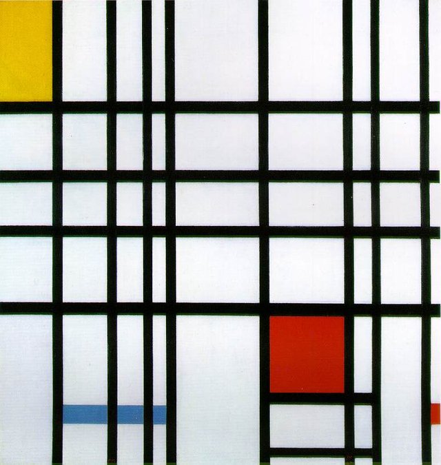
Composition with Red, Yellow and Blue by Piet Mondrian. Source: Wikimedia
The series will combine my 20+ years experience as a graphic designer, later web designer and now frontend developer, my design school studies, my own learning and my experience as a teacher of Design Director online course.
In this first post, we will start our design journey by talking about what design is not. My point here is that good visual design couldn’t be reduced to any single aspect of it, be it illustrative art, decoration, composition, or anything else.
Design ≠ Layout
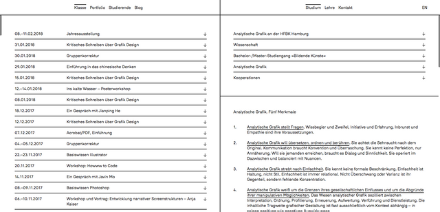
A mere organisation of information isn’t yet visual design in a modern sense as it lacks emotional impact. Nevertheless, the art of giving the information a correct structure is the basis of good design (while not the substitute of it). The information structured correctly and using other elements of the language of visual design, like space and typography, becomes a masterpiece even without using imagery. Klassegrafik website is a brilliant example of it:
Design ≠ Illustration
This one is harder to accept but still easy enough. A quality illustration adds a lot to a good design but again isn't the substitute of it… Even if it's a pretty girl :)
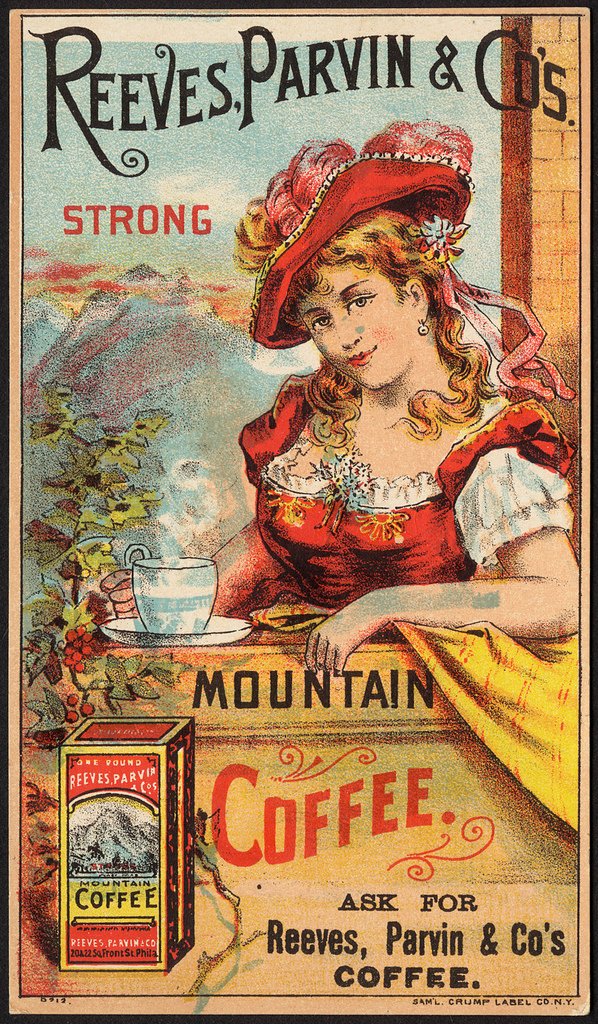
Source: Flickr
Design ≠ Decoration
This is the trap many unexperienced designers fall victim of most often. Randomly adding decorative elements to a design doesn’t make it any better, quite the contrary.
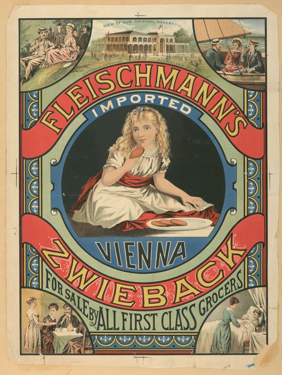
Image courtesy of The Graphics Fairy
Summary
Quality visual design in modern sense of the word is a play of many single design elements. I selected seven elements of the language of visual design for this post series: space, form, color, type, imagery, composition, and logic.
In the next post you will learn about how they were introduced to the graphic design scene and what impact they have on a good design. Stay tuned!
Related Posts

I look forward to reading the series, @vitkolesnik. This first post was very informative!
Thank you @jayna, glad you liked it!
Congratulations! This post has been upvoted from the communal account, @minnowsupport, by vitkolesnik from the Minnow Support Project. It's a witness project run by aggroed, ausbitbank, teamsteem, theprophet0, someguy123, neoxian, followbtcnews, and netuoso. The goal is to help Steemit grow by supporting Minnows. Please find us at the Peace, Abundance, and Liberty Network (PALnet) Discord Channel. It's a completely public and open space to all members of the Steemit community who voluntarily choose to be there.
If you would like to delegate to the Minnow Support Project you can do so by clicking on the following links: 50SP, 100SP, 250SP, 500SP, 1000SP, 5000SP.
Be sure to leave at least 50SP undelegated on your account.
I'm all eyes for the next posts!