Credit Score Mobile UI Design
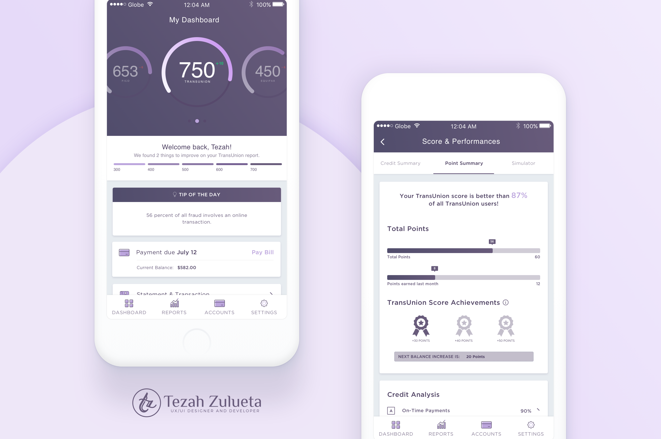
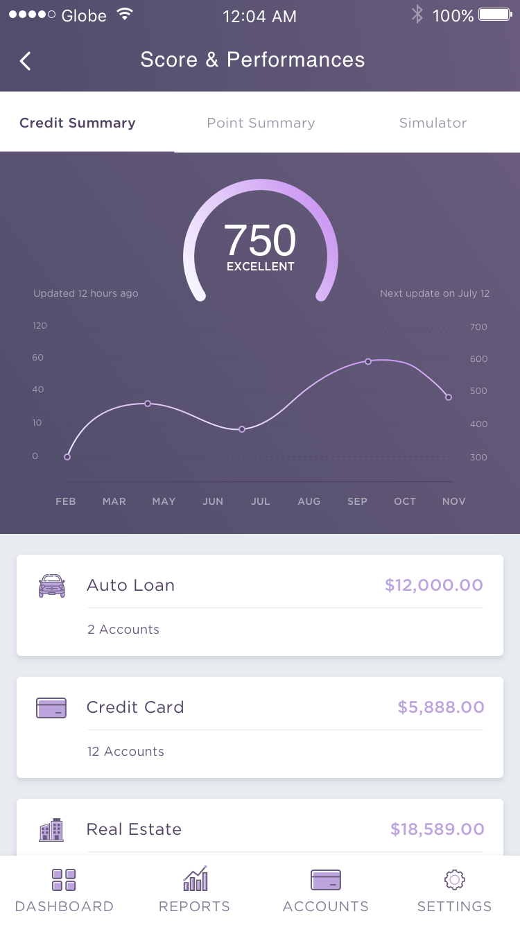
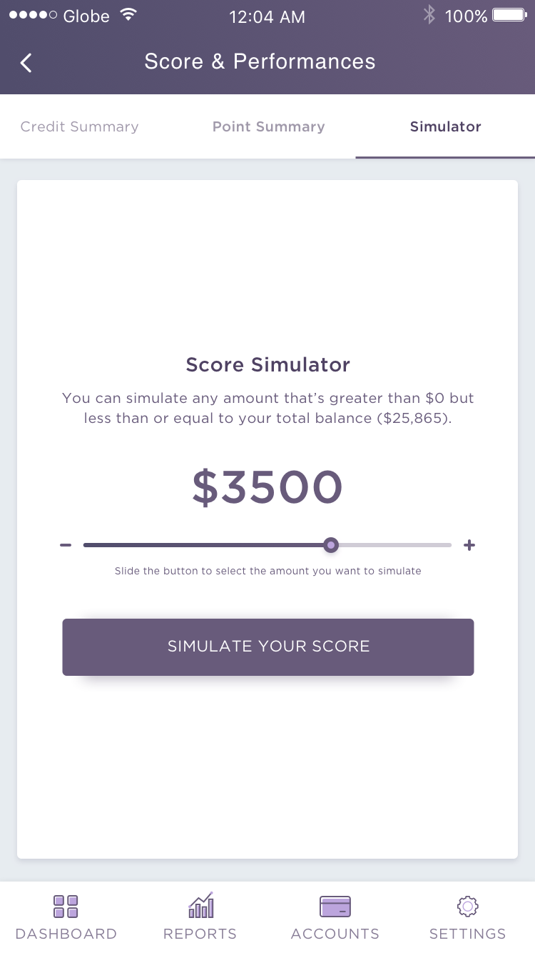
This is mockup design I created for credit score app based in the US. Looking forward getting feedbacks from you about this design I made.

Dashboard

Credit Summary

Point Summary

Score Simulator

Simulated Score

Let me know what you think about this design. I would love to hear your feedbacks. :)
If you like this post please don't forget to upvote this post. Thank you! :)
Looks pretty good. I'd suggest moving the tip of the day or anything else of that nature to the main screen when you log in, and only have the relevant information for the dashboard, reports, etc. on those pages. Love the purple!
Thank you for the suggestion, I appreciate it and will consider it to my next design. :)
Good Job so elegant!
Nice job, I like it..:)