01.02 - The Importance of Typography
Chapter 01 - Introduction
Lesson 02 - The Importance of Typography
Good use of typography allows your work to be more legible, easy to read, and most importantly it creates a good first impression. By incorporating appropriate typographic techniques to your message, you will set a positive tone for your audience, before a single word is ever spoken or read.
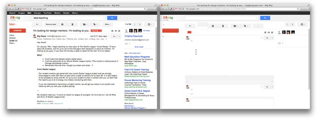
Today, type is everywhere. The internet would be a very empty place without it! (https://signalvnoise.com/posts/3404-reminder-design-is-still-about-words) Signal vs. Noise posted a fascinating article a couple years ago which shows common websites with and without words. And as you can probably see here, it’s pretty apparent that design is still really about the “words”.
Even people who haven’t been educated in typography are becoming more and more visually sophisticated. They can sense the difference between well executed typography and type that has just been chosen thoughtlessly, even though they may not be able to articulate their reasoning.
There have been a number of studies (I have linked a few in the resource section of this lecture) that have deducted typography’s importance in marketing, and yet many marketers are still unaware of the importance of typography. Successful companies spend a lot of time and money formulating their typographic branding and corporate identities, because they understand the power and the personality of typography.
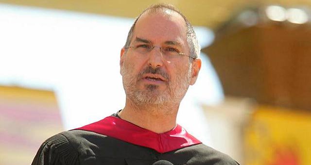
In fact, one of the only college courses Steve Jobs took was on calligraphy and typography, which he believed played a critical role in not only the success of Apple, but the personal computer. As he once said in his Stanford University commencement speech, “I learned about serif and san serif typefaces, about varying the amount of space between different letter combinations, about what makes great typography great. It was beautiful, historical, artistically subtle in a way that science can't capture, and I found it fascinating." "...If I had never dropped in on that single course in college, the Mac would have never had multiple typefaces or proportionally spaced fonts."
So, as you can see, Steve Jobs was someone who really understood the power of type, and you know, I think he ended up doing alright for himself.
Typography is a perfect harmony of verbal and visual language, and this is what makes it such an effective form of communication. Words are powerful. They have initiated revolutions, they have brought justice, peace, and understanding to our society. They inspire us, they challenge us, and they form the way we think. So if this is the power of words (or verbal language for that matter), just imagine the power of typography!
Stay tuned, next post we'll cover a brief history of typography so we can understand where we came from, and where we are going.
In the meantime, WHAT do you want to learn about typography?


It is some useful information that I can use in my writing.... thank You!!
I hate it when a website or article uses a font I don't like -- I usually just move on from reading it. Something about a poorly selected type face makes you feel, just...bad, or something! I kind of touched on something similar in a post I did on colour selections: it's almost like the "body language" of your text.
With information everywhere, there is truly an economy built around attention. Seconds spent on a site can make a huge difference when websites have thousands of users visiting. The site's typography has a huge part in this! I really like the analogy of body language, because it definitely communicates a message to the user as well.
I know! The body language is that unspoken feeling you get after reading something. A huge part of that is typeface. I was recently reading an interesting article about comic sans and how it can be the key to help people with dyslexia (I belive). But it's not widely used because it's an ugly font!
I'll talk more about this later on, but it all comes down to fitting the context. Comic sans does have it's place, but it's just used incorrectly so often that it's developed an infamous reputation. There are of course just ugly fonts too.
i can like to type
:P
Welcome @spencec6. I hope you enjoy here as much as I do! Nice post, I will follow your account, please follow me at @rohitrajput.
Great! Thanks @rohitrajput!!