My COVER SUGGESTION for DAILY QURATOR NEW COVER DESIGN
This is my new entry for another graphic design contest. @qurator is having a contest for their new daily qurator cover photo.
I found this contest yesterday and I want to participate and send my entry to them. So yesterday on my spare time I created my entry for their Daily Qurator new Cover. There are lot of good designs suggestion by other steemians but I want to try it either.
This is the Cover photo I made and my entry to @qurator's contest for their New Daily Qurator Cover.

@qurator want their cover to be cleaner and more professional look.
So I came up with this design which for me, is cleaner and more professionl look. Hope they also think it that way and like my entry.
Below are the screenshots on how I created the cover photo - Step by step
First, I created the base of the cover photo in 1600 - 960 Pixel Ratio
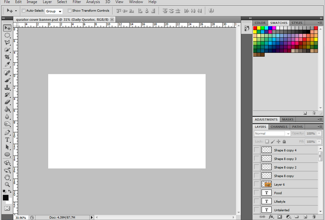
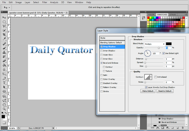
Then I begun to type the word "Daily Qurator" at the top and put some style.
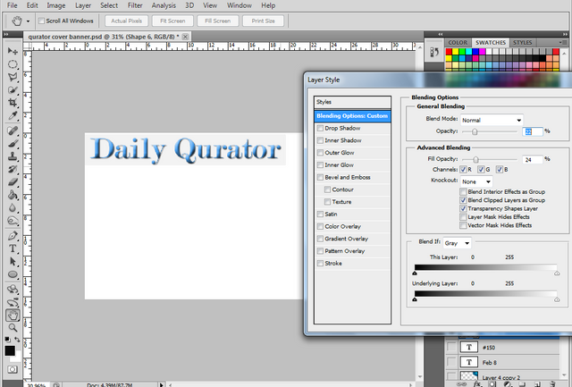
I put rectangular shape behind the word Daily Qurator and reduce the opacity to make the rectangle in lighter color.
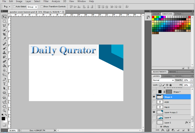
I made blue and lighter blue design at the upper right side. I will put here the date and the # of the daily qurator.
I got the design from the logo of the qurator and put it at the bottom right side to add some accent.
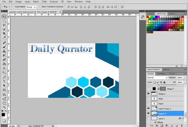
Then I created rectangular black shape. This will be the outer background of the photo of their daily qurator cover photo.
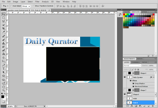
I begun to type the Date here.
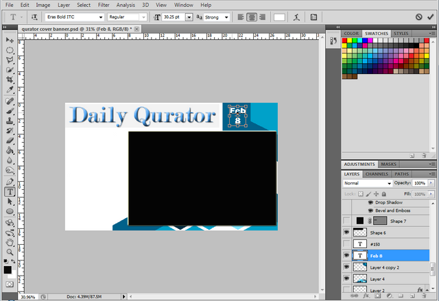
Then the # of the daily qurator.
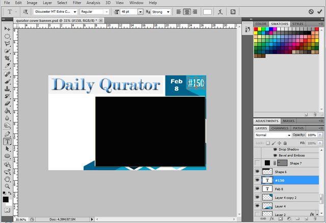
I created smaller rectangular shape and put it at the left side. I will put here the word "Today's articles".
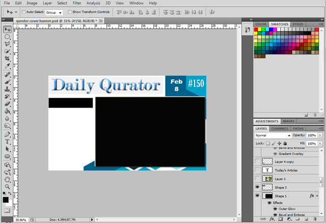
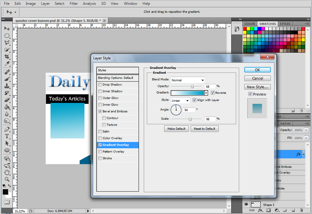
I finished to put the " Today's article here. Then I created color light blue vertical rectangular shape and put it at the bottom of the Today's article.
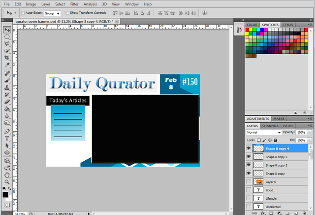
I put the 5 black line here. This will be the divider of different tags.
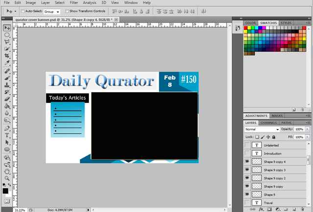
And made 5 bullets here.
I put the 5 tags in the light blue rectangular shape here and arranged the Logo of the Qurator at the left side bottom.
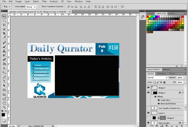
In this screenshot, I already typed the word " Your Quality Content Curator" at the top of the smaller rectangular black shape here.
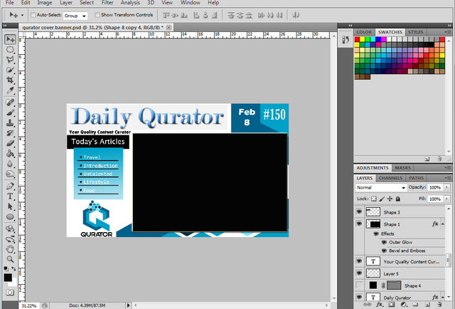
The final Output!
I already put sample picture here.
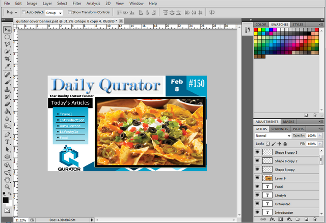
I am not a professional graphic designer but I want to enhance my few skills in designing. Hope you like my creation.
Your wanna be graphic designer,
@saskia :)
Note: All screenschots are mine.
@surpassinggoogle is a kind hearted person, please VOTE & SUPPORT him by typing @steemgigs as your witness at the first search box. Just click here ->https://steemit.com/~witnesses. Your vote is highly appreciated.
If you want him to be your proxy in voting for witness, you can visit https://steemit.com/~witnesses and type "surpassinggoogle" in the second box.

You got a 2.57% upvote from @allaz courtesy of @iyanpol12!
This post has received a 0.24 % upvote from @drotto thanks to: @banjo.
Talented!! 242% upvoted Thanks