The first time i fell in love with a brand: A Star Wars Story
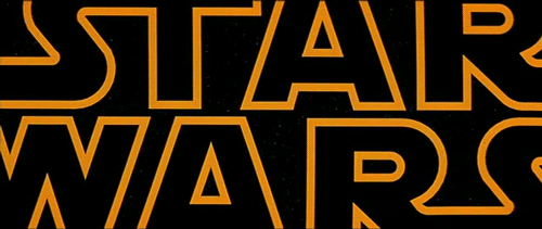
I stared into blackness, in complete and utter silence, until…. BOOM: The logo exploded across the screen in a magnificent flash of sound and colour. And as the legendary yellow typography faded into eternal darkness of deep space, I felt as if I had been both run over and bitch slapped. Not even the bombastic sound of orchestral trumpets, and the subsequent slated prologue could pull me out of my yellow haze. I had been bought and sold.
I was seven years old, and only moments before I had been watching the snow falling outside our eighth floor apartment in Copenhagen, while my father clumsily fiddled with the VHS players. I was young, innocent and completely unaware that I was moments away from the epic slap-in-the-face that would kickstart twenty-five years of fandom.
Every design-nerd remembers the first time they truly fell in love with a brand. The first time they uncovered an aesthetic universe, which seemed to have been designed just for them. The first time they discovered that all the happy tinkles could be evoked and prolonged by a simple flash of a logo. For me that pivotal moment is forever linked to my first exposure to Star Wars.
To give you a bit of background, the now iconic logo was first conceived by a newly hired art director at Lucasfilm named Suzi Rice. George Lucas asked her to do a “very fascist” logo and she decided to go with the most fascist typeface she could think of: a modified version of Helvetica Black:
![]()
After a bit of back and forth, the final edit of the logo was altered by Joe Johnson after Lucasfilm realised that the logo needed a bit more typographical tweaking to work well in the opening credits.
As the movies became a huge overnight success, the logo became a symbol of creativity – of childhood imagination – touching millions of people through the decades, including that little seven-year-old prehistoric version of myself. It became a mark for free creative thinking.
That was until I decided to revisit those old VHS tapes. But this time I looked upon it with my jaded adult eyes. And then it struck me: The logo that had been the epitome of perfection suddenly emerged as incredibly flawed and, dare I say it, shoddy. The kerning was off, and not just a tad. No, I would dare to classify this as somewhat disastrous workmanship. How could something such badly crafted still feel this perfect?
Well, a logo is a social construct and only as strong as the feelings and ideas it represents. In the case of Star Wars it never really was about the logo. It’s about the lightsabers. The Falcon. The Force. The good. The evil. The love. The role of the logo is to represents all of this and communicates this in its simplest form – a clear and distinct mark.
And that’s why great brands are, well, great. They are more than just beautiful marks – they actually stand for something that enriches our lives. So even though one might say that the Star Wars logo is technically really sloppy design work, it’s still for me perfect in every way. Instead of thinking that nostalgia and wonderful childhood memories can make even a graphic designer accept bad kerning, I’d rather look at it this way: when the product is truly great, the wrapping really doesn’t matter.