Creating logo for Nanzo Scoop
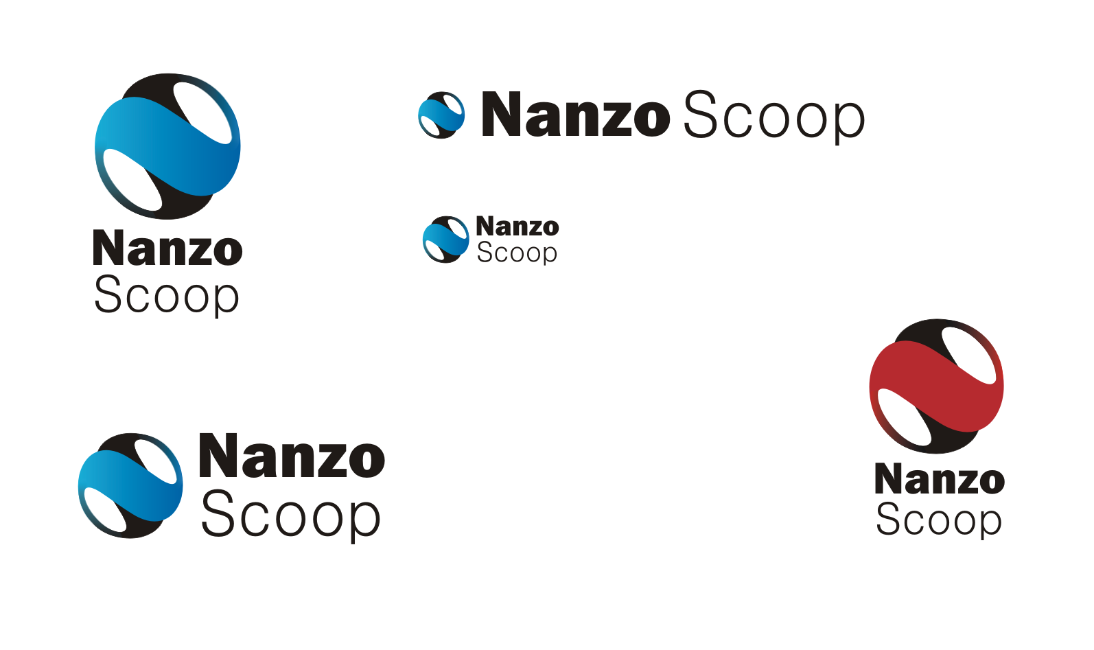
Hi mates, I would like to share with you my work for @nanzo-scoop. He is looking for a logo for his blog/vlog, so I decided to create something and show you a process and the final pieces.
I am working in a program Corel draw. It is not the best one for this kind of work. I use it usually for creating templates for my glass design, but today I tried logo :)
I started with sketching. I knew that the content is about sports, finance and life. He wanted the logo to be stylish and minimalistic, so I focused on the initials first. I made some research and found some inspiration. I realised there are many "NS" logos and it is hard to come with something new.
So I wrote the whole name into Corel and tried to find some interesting connections. I created the first variant. It is easy, minimalistic and it can say something about the content. The colored line is like a part of a talk bubble. I was not sure about colors, but now I think the blue variant is better
The second idea was about connecting initials into a circle. The letters "N" and "S" have so much in common so they can be expressed with one shape.
After this two designs I made some more, but I didn´t like them much.
So what do you thinkg guys? Which one is the best? :)
Thanks for watching!


Hey! you have almost the same thoughts as me with it :). I thought a lot about the N and S but actually the Z coming from the S.
I liked a lot what you did I hope you get the prize :) don't forget to communicate it to @nanzo-scoop at steemit chat
Cheers!
its not easy to come up with something different :D simple letters.. I saw your post, its really a good job :) thanks and good luck :)
Thank you for watching it. Same to ya! :'D
I really like the last one as well as the Ball Idea Though I'd play with the width of certain things to make it more aparent that it's an N and S as maybe I'd not get it if I didn;t read the description.
And Blue Colour is nicer. Steem is also Blue :D.
thanks so much for your comment, I agree :)