Commission Completed! R$ Logo Design Logo Showcase for a Steemit Music Artist
Failure will never overtake me if my determination to succeed is strong enough. - Og Mandino
Just a bit of a motivational quote there for you guys, I know it applies to me. Being a freelancer/ steemit blogger means you have to always be strong in the face of failure.
First and foremost, please check out @Rodollarsign, he is a fellow steemian who produces and creates music and his work is very good.
So, here's my design flow for @Rdollarsign who commissioned me for his new record label.
The client
@rdollarsign is pretty much a kindred spirit. We have a lot in common. One thing I noticed about him is that there is a sense of wanting to make things happen. Working with @rdollarsign was very easy, even when it came to revising the logo, just very freeing experience. Most of all, there is a respect of what I do that comes from him, and in turn allowed me some pretty deep freedom.
The brief
So this composition is for a logo mark for a record label. Pretty much the face of this business.
- Must incorporate an R and $
- Must be modern
- Must incorporate a feeling of Seattle
- Must have a hip-hop feel
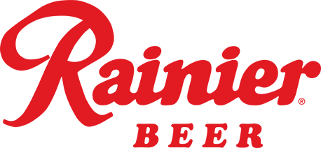
- Must be like Rainier Beer Logo
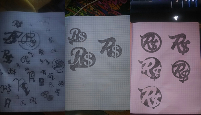
The drawing board
So when I approached this design, I already knew that the R had to be incorporated with the $ sign.
So I played around with some hand lettering. I also knew that there needed to be cursive lettering in there, to keep true to the Raineer beer style. But I couldn't copy it due to trademarking and copyright. So.
I tried to incorporate a circular shape behind the logo to bring some balance. Didn't work out as good as I hoped.
Finally, finding the right sort of balance between incorporating the R and $
Once I had found the right spacing and shape of the logo it was only a matter of tweaking and playing with paths.
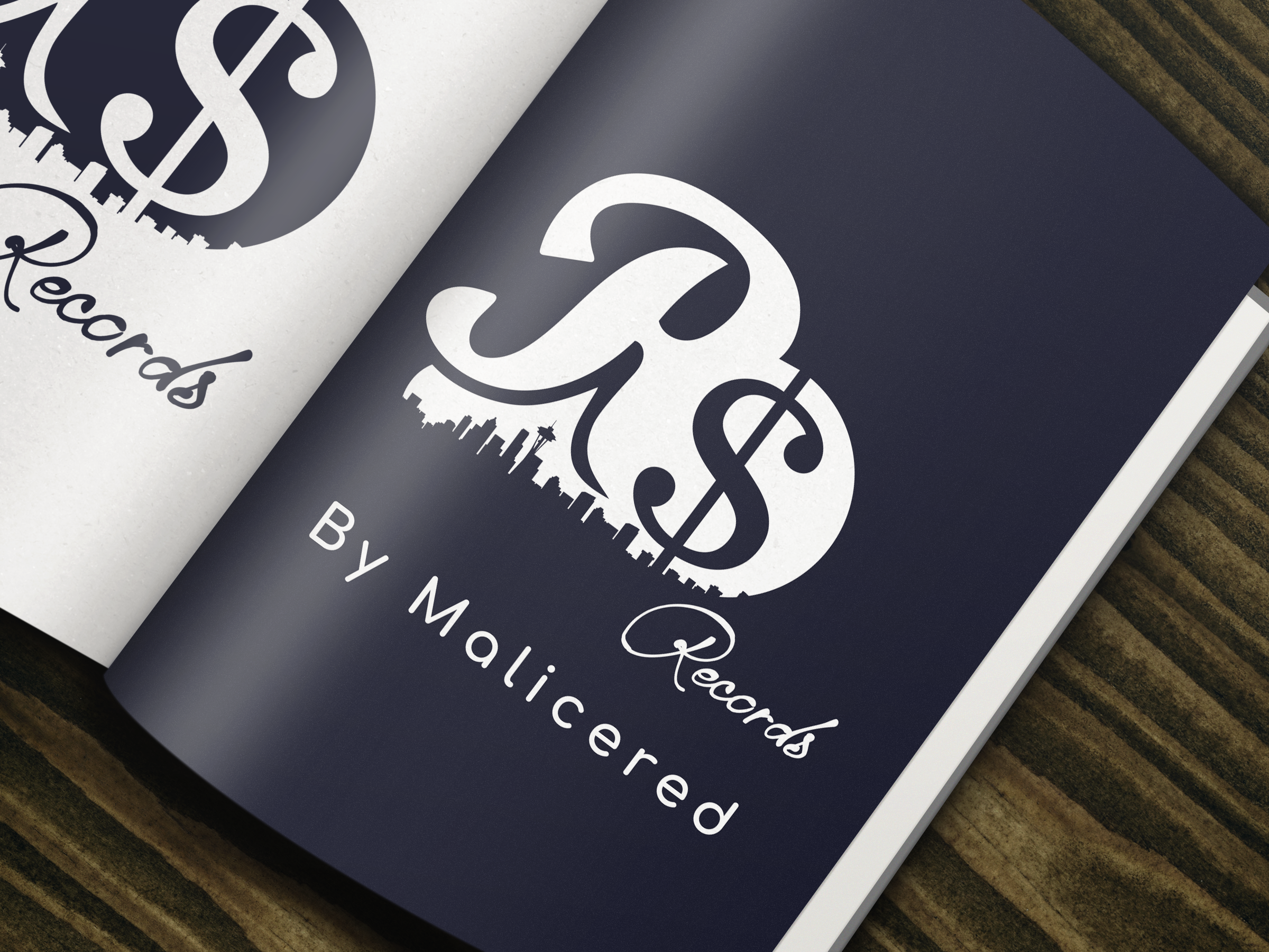
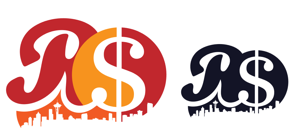
The Final
Incorporating the seattle skyline was a pretty clever way of meeting one of our goals, and pretty much sealed the deal on the logo.
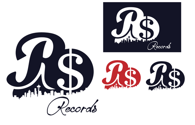
The shape is very organic, and free flowing, almost comparable to graffiti. The composition almost has a flow of class and modernism combined, by using cursive and flowing shapes and combining them with more basic shapes, we create this kind of effect.
Honorable Mention
This variation did not make the cut, but it's one of my favorite variations of the logo. The reason being that the R looks more like an A. But my favorite part of the logo is that the spacing under the characters combine together flawlessly.
Final Thoughts and pricing
I want to say that this logo took a total of 90 hours between drafting, sketching, Researching and actually creating the logo.
Considering that it's for a startup, the total working hours, and the actual revenue potential behind this piece, I'd be charging about 750.00 with all facts considered. I didn't actually charge that, nearly half though, since I am not at my prime, and there is the consideration that he is also a startup that doesn't have a board of investors and so forth.
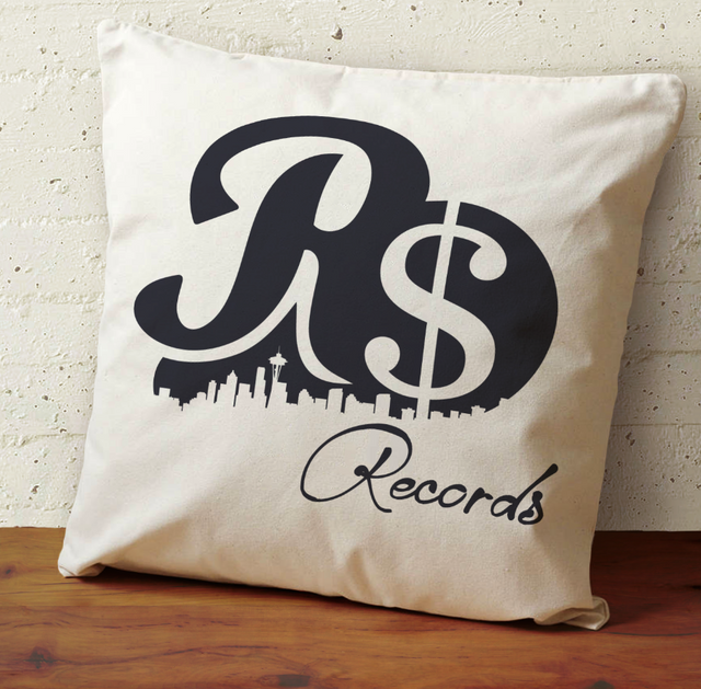
The logo is very unique to my style and actually the first logos that I've been commissioned with hand lettering. Definitely the first time I've designed for a record label. I believe that this logo meets the goals and will be very functional to what the client needs. It is a more complex logo however, and there's a lot of things going on in it, very busy... Perhaps more busy then I'd like...
However, we make use of those elements and take on having all these elements in a responsible way. We're not slapping bunches of effects together, the logo works with or without color, and will be functional as a brand on digital and print mediums.
Also ...
If you'd like to hire me, get in contact with me, or just hang out, I do have a Discord channel and everyone is welcome to join it, it is currently the best way to get in contact with me, Click here to join me
And if you guys love this content, please stay tuned, as I have another upcoming Logo showcase featuring @ausbitbank and another for the winner of my logo giveaway.
Anybody that needs a logo, please commission @malicered. He is humble, hardworking, and gets shit done. Please don't expect cheap work, we had an eye to eye understanding about pricing and this logo would be worth the $1000 investment if I had that to spare. Extremely professional experience and this logo will be here for decades to come.
It's been a pleasure working with you @rdollarsign, I'll be watching your project from the background wishing you luck. And a bit more on pricing to anyone else who is curious, I base pricing generally on amount of hours I will work on a project, and based on nature of the logo, and versus the client budget. Pricing can be complicated, but I can assure you It's more fair then most people might think it is! Thanks for the support man!
Always dude!
Nice Logo :-)
Thank you very much!
Great job man.
I'm very impressed! Nice work!
Thank you very much and thanks for showing support!
Not a designer but it's always interesting reading about others' art processes. Great job. :)
You've done a great job my friend, i think graphics design is your thing and who am i not to admire a beautifully crafted logo like that? Awesome!
Upvoted & RESTEEMED!
nice
Hi Malicered,
Im starting new FB group for designers and architects on Steemit to post their articles and support each other.
https://www.facebook.com/groups/SteemitDesigners/
Nice process!