Top 3 UI Design Trends of 2018

It’s about time to discover what the upcoming year holds for the mobile design community. Some of the old approaches would disappear in the mist of time, while the other ones would continue to dominate the scene. But there are no doubts that we’ll greet the division of new trends in UI design in 2018. So, let’s keep up with latest developments in the UI design field.
Top 3 Upcoming Mobile User Interface Trends
The world of UI novelties never stops spinning and evolving, bringing up more and more challenges for the designers. In this post, we will share three of the latest trends in UI design that our team plans to follow while making iOS and Android apps in the first place when 2018 comes.
#1 Vibrant Color Palettes & Displays Without Borders
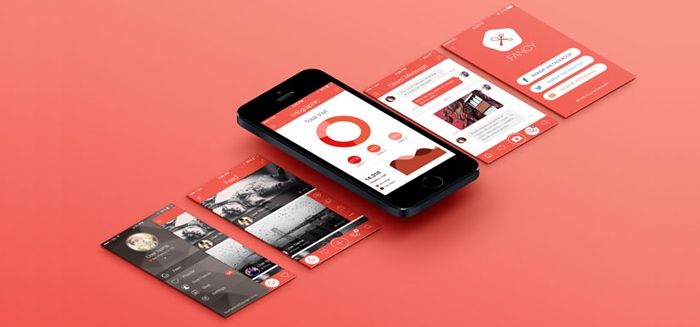
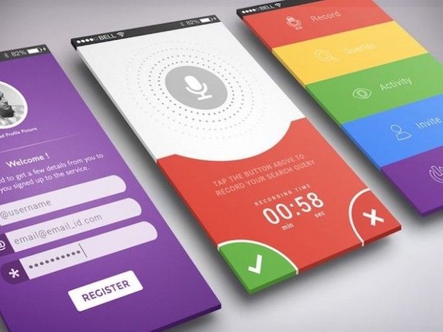
We are used to the popularity of flat UI design trend with its minimalistic approach to elements and muted colors. Though, according to all professionals’ predictions, the new UI design trend would emerge to take over the stage and stay. Gone would be dim and pale colors – vivat bright and striking palettes for user interfaces of all kinds. However, it’s impossible to forget the flat UI design completely – it would be relevant for some time giving designers the freedom of combining two trends and being more creative with colors.

Aside from overall vibrancy, to capture maximum user attention, designers would have to shift towards borderless display a.k.a continuous story-like presentation. Among other new UI design trends, this one was already implemented by Apple in their iPhone X. For the best brand’s experience, they used high-quality images in a continuous story in order to redefine the rigid grid concept of mobile design. Such approach effectively removes the boundaries of originality and let us think out of the box.
#2. From Static Content To Video Design
The design community has already embraced this one concept from latest trends in UI design. As every business owner knows, an eye-catching icon or logo speaks a thousand words about the brand itself. When it comes to the user interface development it is still a powerful tool that attracts users’ attention.
However, the world of graphic design evolves and transforms to another level each year and now we’re on the verge of welcoming the strongest representation of visual appeal after 3D-models. Static images will be overpowered by its next competitor – full-screen video content. The benefits of videos are numerous, but the most important thing that engages customers in all the e-commerce spheres – video clips are always dynamic, unexpected, and visually more appealing storyteller than static. In addition, you can voice all your propositions and add cool sound effects which greatly improves the user experience.
#3 Cards in Web and Mobile Apps. And then Even More Cards
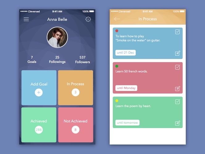
Among other trends in UI design, this one has begun taking over the scene with a power of the storm. Most of us are familiar with the cards (Pinterest and Facebook were trailblazers), but still, it’s an unknown territory for many UI/UX designers. According to Google, the cards play as a sheet of material that displays an entry point to more detailed data cluster. Those may contain photos, text, or links regarding a single subject. Also, different cards could place the content of different elements whose size or topics vary.

Visually, these intuitive cards are extremely appealing and organized for the purpose of presenting the big sets of information in one small space. Users are able to access this information in a second and decide quickly whether they want to proceed with checking it further or not. Thanks to such level of usability, the cards become more and more popular for all platforms – from smaller-screen devices to desktops.
So, this is obvious that such functional cards would dominate in the UI design trends field for 2018. Even giants like Google have moved to displaying the individual search results in cards. The predictions say, in the upcoming year there will be more and more cards around, especially for smartphones software and mobile apps.
Bonus. Sound Design
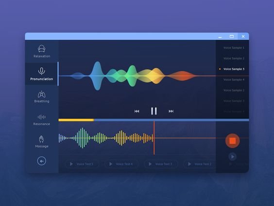
Last but not the least, the new UI design trends regarding sound layers. This design refers to the nice cute sounds that users hear when they visit a website, click to send a comment, or select some emojis. Here, the sound UI design makes the user experience far more pleasant and enjoyable. The year of 2018 promises an expansion of this trend to take the user experience to a fresh level.

Afterword
As in any software development, trends in UI design have a tendency to come and go, but professionals prefer to follow those which would stick around and become fundamental for user interface designers. Mobile app developers should always make their judgments carefully when it comes to deciding which new UI design trends we want to present our customers.