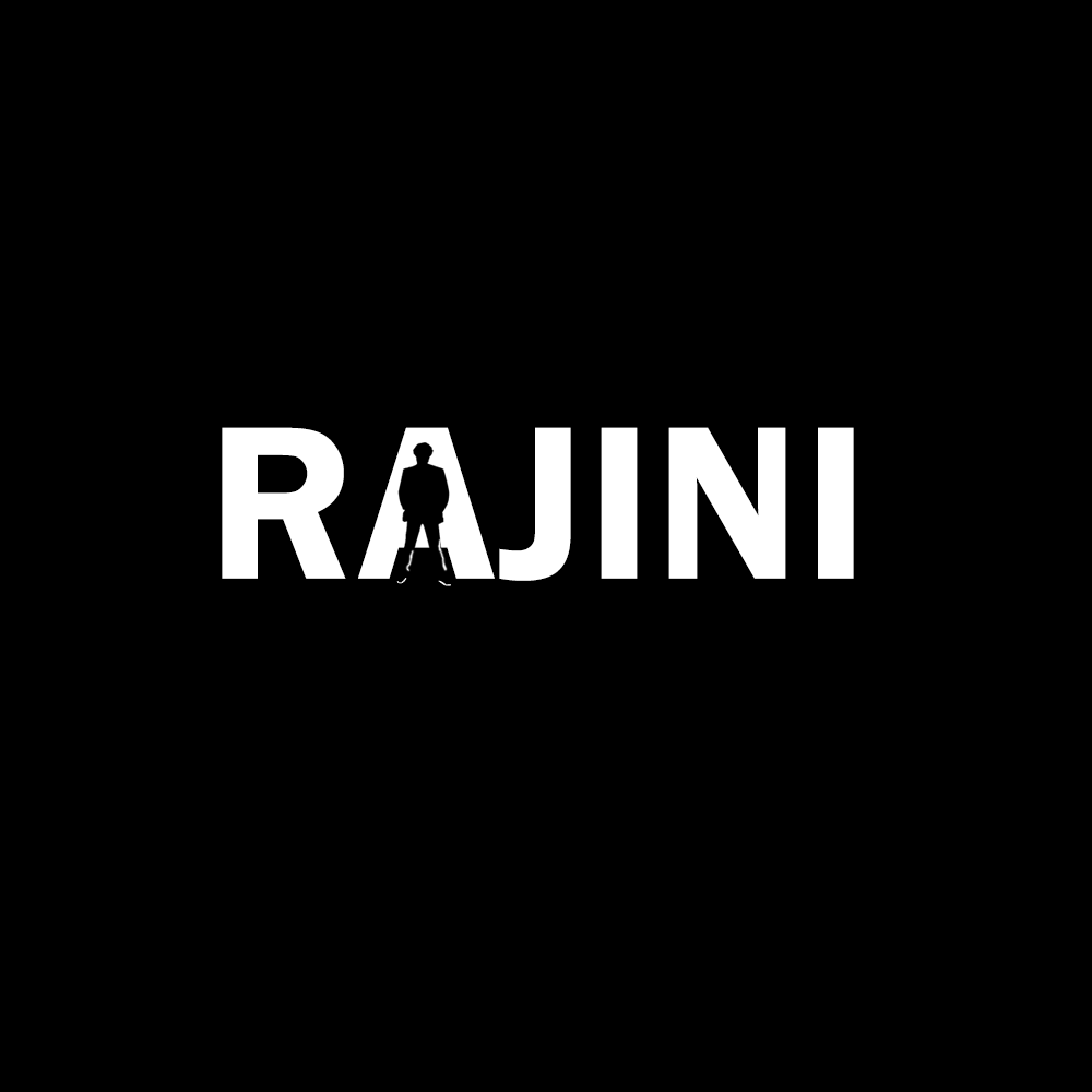
Negative Space Logo Design Challenge
Things which I learned by designing this logos :
- The black and white are the best contrasting colors to start designing a logo.
- The complexity level in designing a two color logo is high.
- There are maximum capabilities in finding random spaces between the fonts.
- The logo is designed based on the font. Different fonts gives you different ideas.
- Idea and Conceptualization increases for a creative mind.
- Different aspect of visualizing grows within you.
- It gives people to visual appealing when they find out the elements in the logo.
- More people literally gives you credit on doing this logos.


