Steemstreams - Developing the logo

In tandem with the Steemporium Logo (or more accurate, slightly before it) I also designed the Steemstreams logo for @jonny-clearwater. This one was actually much more cut–and–dried than the Steemporium logo. I made a sketch, showed it to the client. the client loved it and of I went to the digital design.
BUT ! @jonny-clearwater has a way of pushing the envelope when it comes to design. Upon seeing the sketch, he immediately envisioned it animated (which in turn increased the wish for the steemporium logo to be animated as well.
The Brief
As part of the Steemporium shop for goods, there's also going to be an area for music. In there, you can buy music in downloadable MP3 from Steemit musicians with SBD. When this grows this will become something standalone (and also grow into a streaming service), which is why it needs separate branding. As I've explained in the Steemporium post, the idea was to have something connecting to two brands / logos with some type of 'corporate' branding, which ended up being the first S of the brand-name (Let's just hope that any future endeavours will also start with an S)
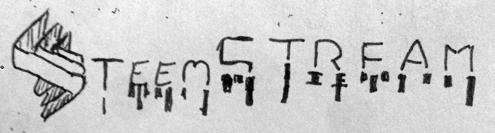
The Initial sketch
I was actually on vacation when I started work on both logo's (which I concepted in one and the same sitting) so the quality of the sketch isn't the best. It was sketched on the back of a drawing my son made, that was laid down on a magazine (for some harder backing), that was lying on my lap while I myself was sitting in a rocking chair enjoying the view outside my holiday home. So yeah, not the best settings for a quility concept, but it was sufficient enough to get the message across.
In regards to full disclosure, I made a bit booboo in this case. I forgot to add the less s to the name in my concept sketch. Luckily, my client was sharp as a hawk yet forgiving as a teddybear. Lesson learned. think twice about what you''re about to show to a client.
The Design
As I said, this design was pretty much cut and dry as I hit the right idea straight on with the sketch. I used After Effects to generate an equalizer curve for the bottom of the test (the equalizer) and then place my design on that in order to have an
actual EQ flow going on. This was also used for the next stage.
Animating The Logo
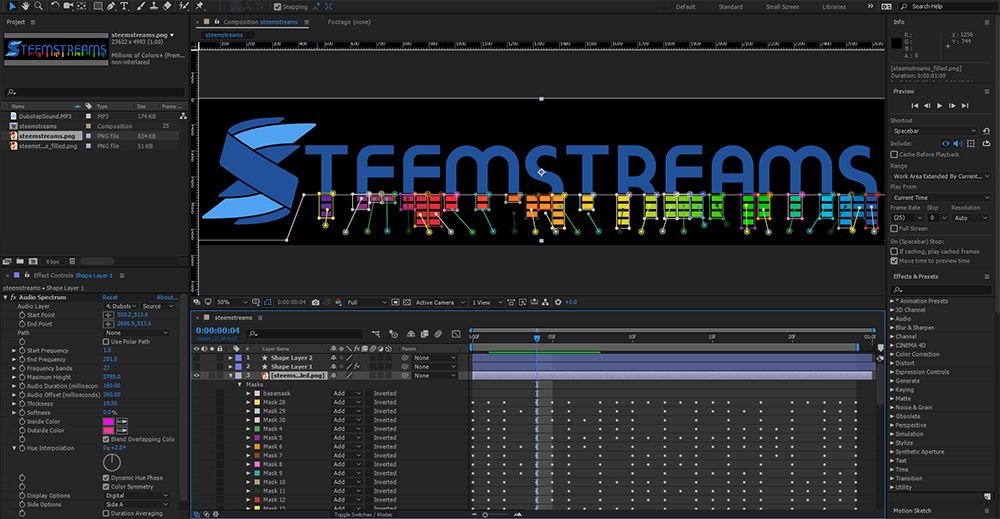
After we settled on the final digital design, the time came to animate the equalizer part of the logo. For this, I again used After Effects, animating masks over the logo (I made an alt logo were all EQ rows are filled to the max) in order tp get the EQ rows rising and lowering. In the below image, you can see all the masks on the EQpart of the logo. The area below shows all the animation keyframes. It was one hell of a job, animating each bar seperately.
Final Logo Animation
The end result is totally worth all the effort I put in though.

Be sure to check out the Steemporium shop, where you can buy goods with SBD and @steemporium the account with news related to the Steemporium shop.
Thanks again for reading. I had just as much fun making this logo as I had with the Steemporium one.
Full STEEM ahead my fellow Steemians

Man whoever hired you is a fucking genius!
More like an Idiot Savant I'd say 😁
:O
Looks Great man!
Whoop. Thank you bro ! more coming soon.
This design is sick bro!
Thanks man. Glad to impress 😃
This is really gorgous looking. I have some projects on my own coming up. What do you take for a cool logo like this?
And what is Steemstreams?
Thanks man. Make me an offer I can't refuse ;) find me on discord (eqko #6311) or in steemspeak channel on Discord https://discord.gg/mKQWk7
Steemstreams is a soon to be launched part of the Steemporium site.
Great work @ eqko
Great bro!