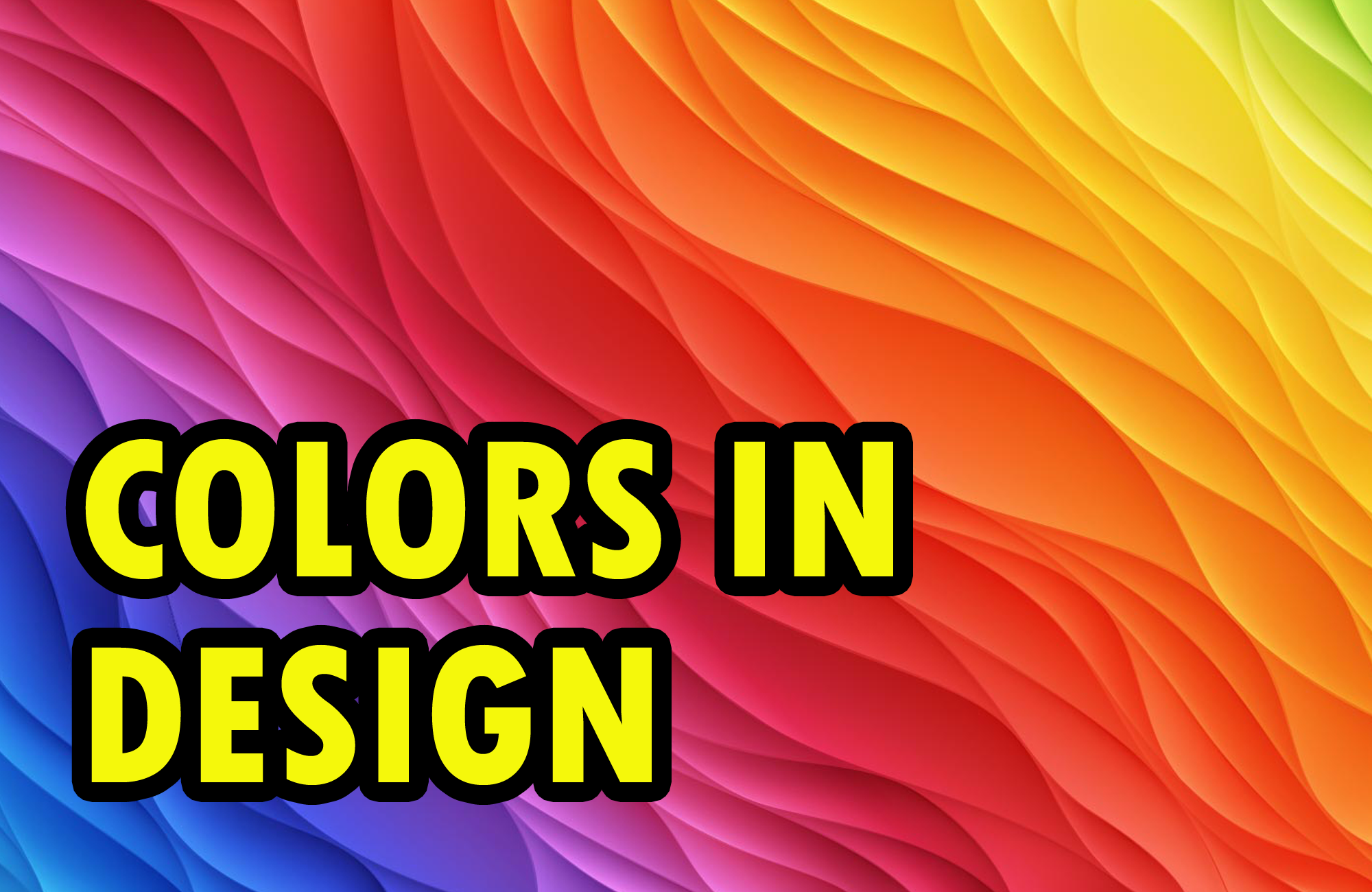
Role of Color in a Design
I have worked as a Graphics and Web Designer since past 6 years. I have put my experience in writing this post for Designers and how they can improve their designs just using colors. I'll talk about the DOs and DONTs while using color in Designing.
Colors play a very important role in our life, look around and you will see our world defined with colors. If you want to make a good design then you must know how to use the colors in your design. If you are a beginner you will have trouble with picking the right color for your design. So, here are few tips about how to use a colors while making a design.
Color according to the theme
Colors have defined the meaning for everything. For example Red is sign for Danger/Sexy, Blue is color for Peace, Green is color for Preserve. etc. So, when you are making a design know the goal of the design and for what / whom are you making the design for. If you are making a design for Charity, you can go for color blue or green. Using colors like Yellow or Red will be inappropriate.Know the theme of the design and use colors according to the theme. Sometimes you can be creative with the colors but don't be inappropriate at all. Let's say you want to be creative and you use Purple instead of Blue. But don't be so much creative that you use color Pink for a Deathmetal band's website / flyer. By, the way I've seen some examples myself.
To much sugar is bad
Nobody wants to see too many colors in a same design. Make sure you use a maximum of 2-3 colors in your designs as primary colors. Don't count Black and White colors as long as you are using those colors just on the fonts. You can however try more than 3 colors in the same design but I will suggest the beginners not to do that.Just remind yourself a fact that you are making a design not Rainbow. So, try to exclude the use of more than 3 colors in the same design and stick to few colors as a beginner.
Play with the complexion
If you chose a color then instead of using another color as second color try to use it's complexion. Sometimes it is better to use a darker or lighter complexion of the same color rather than hitting the design with another color. But, remember not to go to far with the complexion, don't use the darkest complexion or lightest complexion.Know the combo
While you are using colors don't try to use colors that doesn't have a good combination. Every colors has a partner and it looks good with it's partner rather than other ones. So, know the combo of the colors you are using and use it. For example Yellow goes good with Black, Red goes good with White/Blue. etc.Be experimental always
The key to become master in designing is being experimental and never satisfying. If you have a design, don't be satisfied with one design. Don't be like OK this looks good its final. Save the first design and try another design. This time put a different color and just experiment with the design. Keep on experimenting until you become a master.