Bayanihan Proposed Design Changes - Alternative Colors
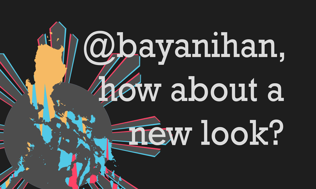
I've posted earlier about changing the designs we use for @bayanihan. Check out the blog post here: Bayanihan Proposed Design Changes.
I'm posting here the same logo with alternative colors. What do you think guys?
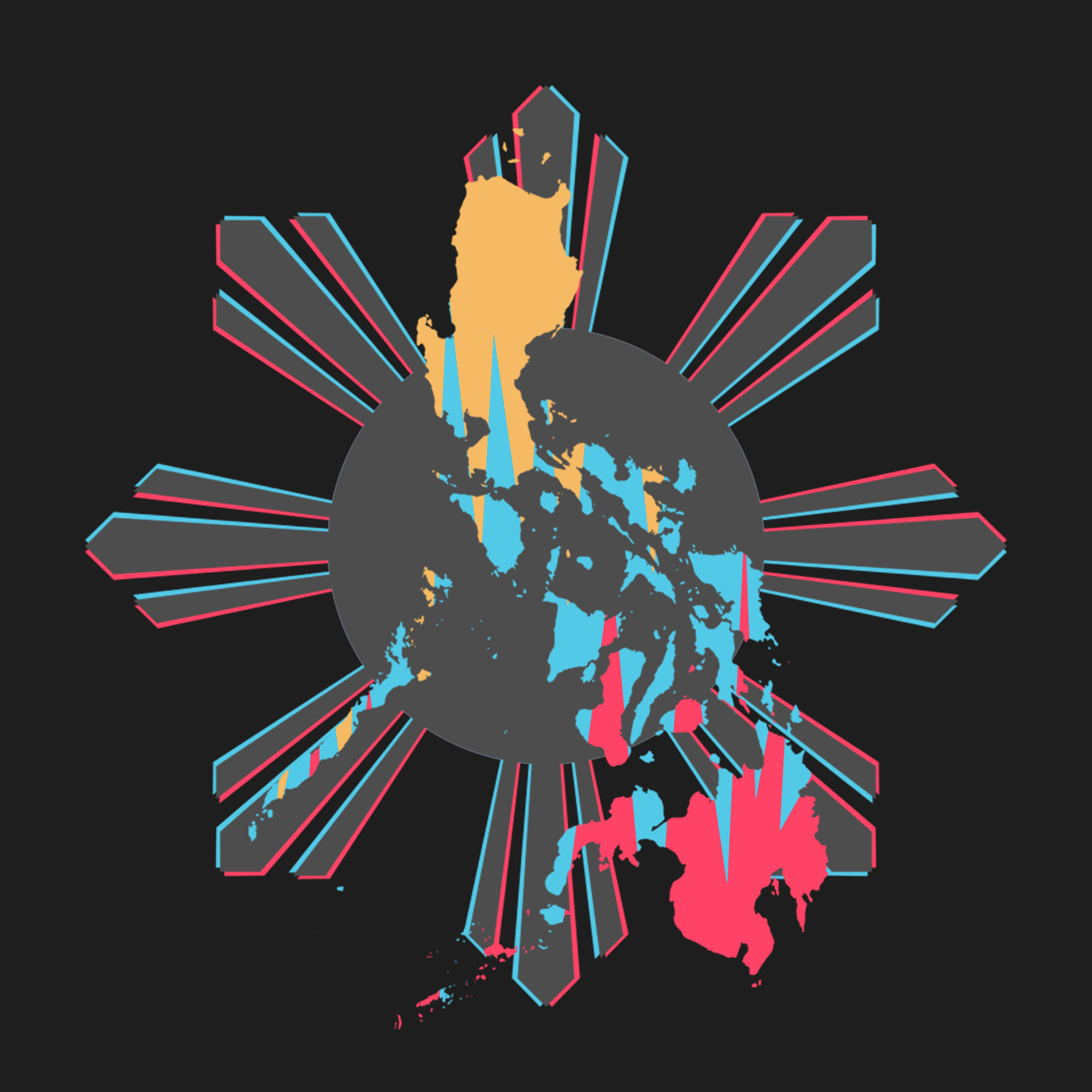


We're gonna stick to this new logo since most of my colleagues in @bayanihan said yes to the design. We're just sorting out the colors we're going to use and we will also be deciding on how our cover images would look like. As you can see, if you go to our profiles, all our cover images are the same, showing we're the dedicated curators for @bayanihan.
Anyways, that's it for this post. Thanks for supporting us always and for supporting each and everyone too. Cheers!
)
)
)


nice one @deveerei. Mas Maganda din to, for me.
Good Job!
Nice one !
The design is very interesting and funny, thanks for sharing ,,
Thank you @deveerei
It was indeed a nice design @deveerei.
nicer design than the old one, yet I am counting that previous attractive color for yellow which is more distinct before. Could it be more attractive if white or any bright color be used instead of grey for sunrays? I'm not good in arts, I just imagine how does it look if there can be a change in color.
The logo looks good on a black background, like the 2nd photo. Nice one Dev.