[Design Process] Pillar Wallet - Onboarding and the whole process behind it

Onboarding to me is extremely important step in the Customer and User Experience. It is one of the first bigger interactions the user will have with our brand so we better do it right.
When I say onboarding, I mean the whole process of initial opening of the app all the way to the point user starts to properly use the basic functionalities of the app. So to me, this also involves registration process and anything in between we need to obtain before the user can comfortably use our product for the first time. In the app -sphere the information we might need before we can offer our main functionality can include permissions, user details, etc.
I love onboarding and experimenting with ways of making it a smooth experience so I'll surely write a separate post about important things to consider, what we actually truly want to achieve with it, different patterns of achieving these goals, etc. But for now, let's keep one thing in mind
We don't want to have too many ASKS of our user before he's invested in our product
Now, remember, we're designing a Crypto currency wallet.
This is an uncharted territory for many.
Same thing can be said about our Target users we're designing for. Based on our User stories, many of them are in their beginning stages of coming to crypto. We need to think about that. These users are acustumed to certain type of patterns (good or bad) that they expect when installing a new app and we can use this to our advantage.
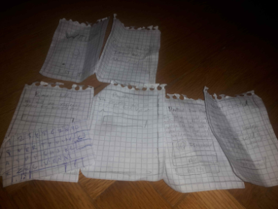
So let's create some quick paper wireframes we can take to the users and test it with them.
I created these wireframes with some quick ideas sketched up and a description at the back and took it for some in-person testing to get an initial feel.
As I really rushed through this and I didn't put too much thought into the wording (to me it was just a place holder) I actually had to explain some terms which I wanted to avoid because I wanted to abstract those ideas away from the beginner users.
This experience ultimately only increased my conviction that the complicated things like "seed" should be abstracted away from the regular users (but of course, still giving the power-users an option to find all these details).
Then I created a web version of the onboarding process where I was a bit more conscious with wording and send it out to more Users and asked for feedback.
Check it out and play with the whole flow on Figma
I personally thought the process is too long and my instinct was to completely get rid off the email and password prompt at the beginning and let the users go to the Dashboard screen as fast as possible so they can receive their first funds as that's their ultimate goal. This is especially true for a mobile wallet.
Though with the users I tested they did not even mention the email and password prompt as an inconvenience or did not have any negative feelings about it as they expect something like this and also it gave them a sense of security and trust, which they might lack otherwise if they'd not go through this process of securing and protecting their wallet.
So I decided to keep it.
Walk-through
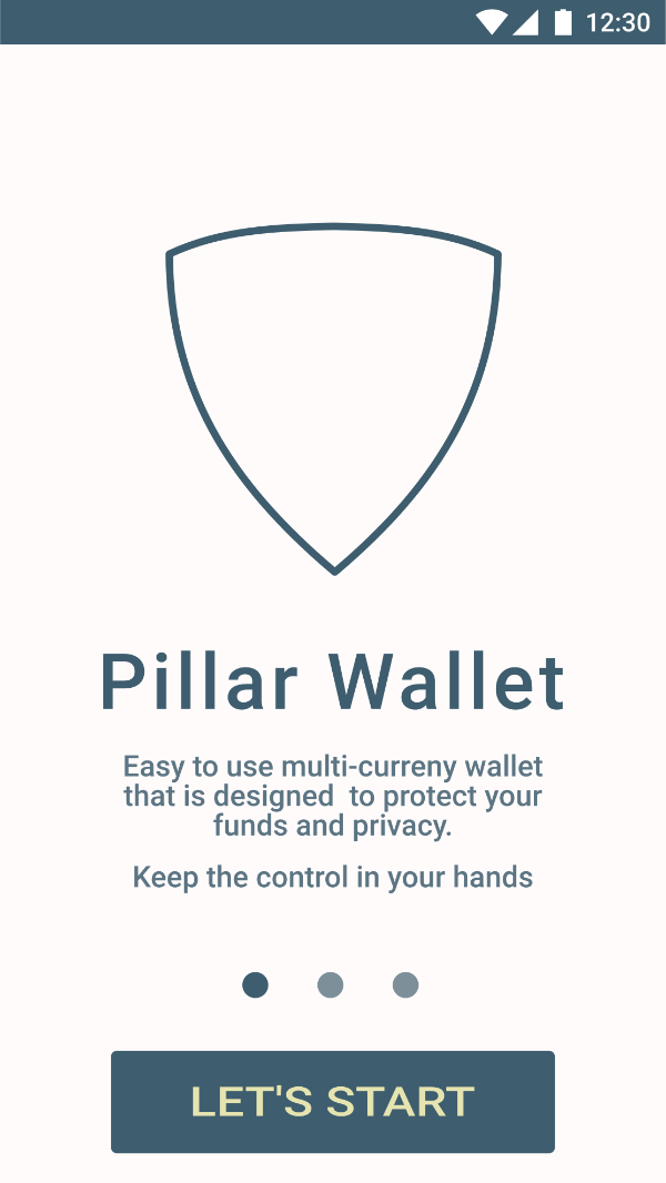
So let me walk you through a bit more hi-fi screens and explain the thinking behind it. This is still not the final version, though I colorized it and worked more on the wording.
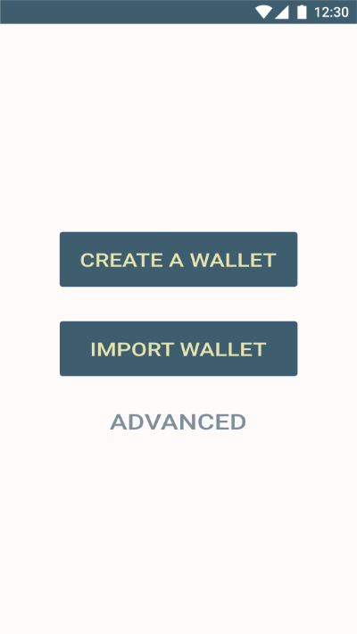
First and Second Screen
First screen let's the user start the flow of using the app and also giving him an option (by swiping) to check out what extra value he can get by using this app. This way we won't bore the user with the features as chances are he already knows the extra benefits of using this particular wallet. That's why he downloaded it.
Clicking Let's Start gives him an option to Create a New One, which most people will do, Import a wallet which some people might do and it's good to have it there that the new user gets an idea in their head that something like that is possible.
Then there are advanced options where all the features like setup of multi-sig wallet is hiding and other advanced features that I do not want a new user to worry about.
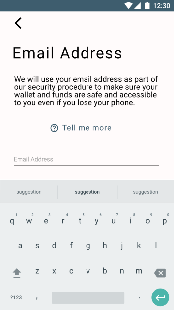
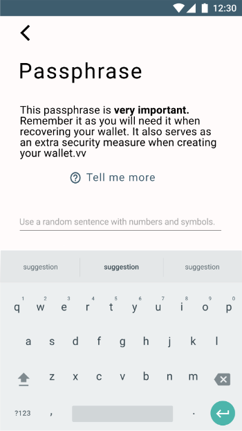
Email and Passphrase
Part of the brief is that we have to collect an email address.
Combining that with the finding from the testing it makes sense to ask for this information during the sign up process.
On top of this, we can also make the wallet more secure by using the passphrase as part of the seed so if someone was to get the Seed without knowing the passphrase it won't help them much.
These screens also contain a simple explanation of what to do and what the information is used for (eg. use a Passphrase instead of a Password) with an option to also get more thorough explanation when clicking on "Tell me more".
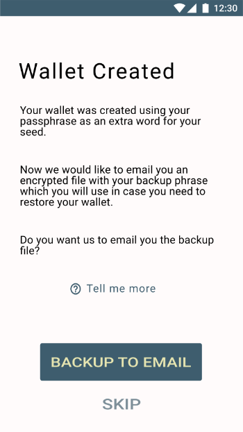
Wallet Created Screen
Now the wallet was created so we let the user know.
On top of that, we want him to back up the wallet but we do not want to burden a new user with writing down a Seed and giving him an option to store it unsafely. Therefore there is an option that would send the user his encrypted seed in an Encrypted file to his email address. This way, the user does not have to understand and bother about the Seed at the beginning.
There's an option to skip this, too, as people who know what they' re doing might not want to send this to the likes of Google, etc.
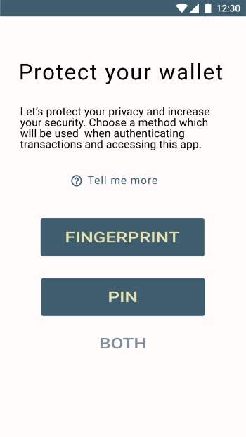
Protect Your Wallet
The final screen prompts the user to setup a way of authorizing funds and accessing the wallet. For now it's just Fingerprint and Pin.
The idea for future is to authorize transactions with more methods based on the risk factor. Eg. if you're sending 1000 ETH you need to use voice, face, fingerprint and pin to send the transaction, but if you're just paying for coffee you don't have to.
And now we're done. After confirming few permissions and finishing the setup we see the home screen.
I still feel like this is too long of a process and would prefer to have it later on (eg. after the user accesses the Receive functionality of the wallet) as I want the user to go as fast to achieve his goal of being able to receive some crypto.
However, I won't be fighting the data I have so far. Granted, with the time that could be dedicated to this project, those are not too accurate so this would need to be tested more but for the sake of this design process we'll use what we have.
Let me know what you think and what could be improved.
Join me on the journey at learning and improving in Design. Together we can learn faster.
Design Thinking
An account dedicated to human-centered design with a dream of making crypto and block chain usable for an average Joe.
You can look forward to
- Learning Resources and Material
- Design Breakdown and Critique
- Inspiration
- My Learning Journey
- My Work
- Other people's great work (resteemed)
and some surprises plus any suggestions from the audience.
