SteemSports Logo Exploration - All My Drafts And Possible Candidates For Refinement - Part 1
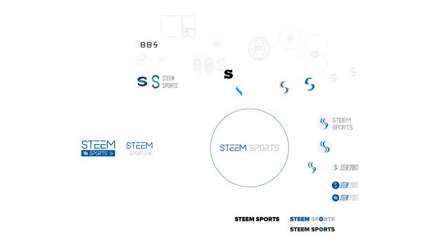
If you want to know more or less how looks my artboard when creating a new logo should be this...
Hello ladies and gents!
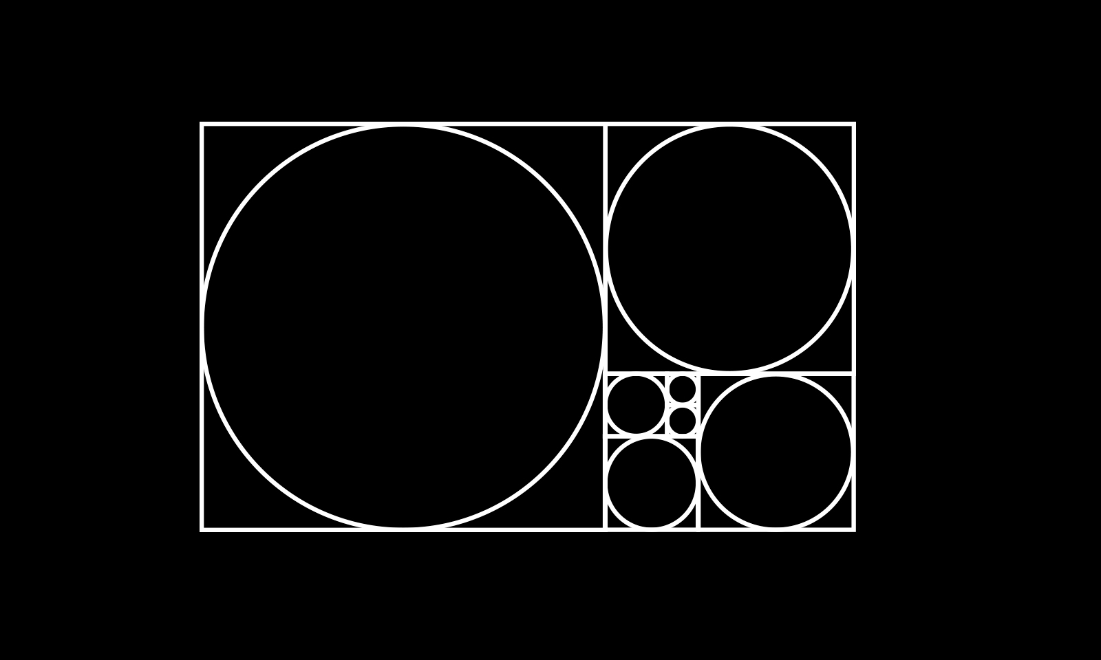
if you can recognize the golden ration you are one of my people! lol. If not, the golden ratio are those circles overlaped on top of each other, the interaction of them can create shapes based on this beautiful mathematical proportion.
I'm currently working on developing a new logo for steemsports as well and I'm going to show you my candidates for being develeped and polished. This last step of develpment and polishing could be the longest and hardest part to do where you have to include all the inputs about visual representation until it is accurate.
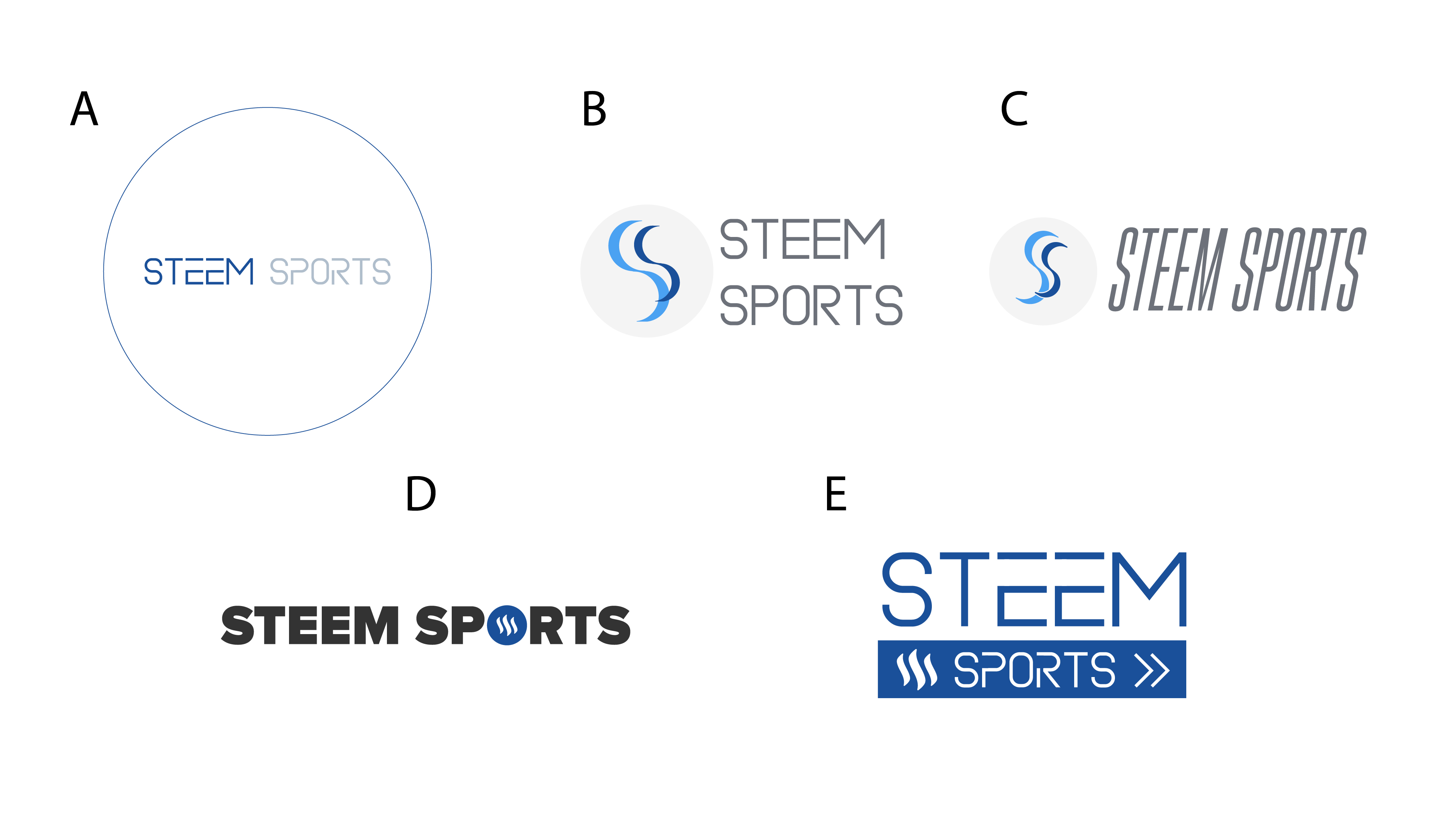
For now this is what I have came out with:


D! Much cleaner than the rest.
I really think E looks pro! D is good too.
Yeah E is great