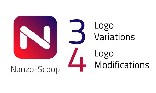
@Nanzo-Scoop Logo Design Proposal - 3 Logo Variations - 4 Modifications - Design Process 🍪 Eating some cookies 🍪
Hellooo dear Stemians and Collegues! 😃
Today was the day of trying it! I finally got some time to spend on @nanzo-scoop gig creating a logo to build his brand. You can check the post here and participate! the gig still open until August the 13th, so I'm encouring you to get it and participate, there are awesome proposals to watch and leave comments :)
https://steemit.com/steemgig/@nanzo-scoop/steem-gig-design-a-logo-for-nanzo-scoop-brand-usd200-sbd
Designing Process
First there was a brief where everything started:
Brand
Nanzo-scoop
Tagline
The background voice
Brand Messaging
“Do what works for you… but don’t risk what you cannot afford to lose!”
“One man’s thoughts on cryptocurrency, finance and life in general”
"Not advice but an invitation... to see another perspective"
Extra Style points
Minimal and
stylish
Act as a background image
Distintive font
Design templates for different formats
Let's make the brief!
I suggest drawing on white paper without dots, lines or squares because they may disturb your creativity and be influenced with negative space or shapes proximity.
So let's make some drawings of everything that comes to my mind :)
At first it is quite difficult to address the logo but you need to let your creativity flow, it does not matter if your drawings are ugly as shit, use your drawings as reference for the shapes you like to implement.
Well there was something I really wanted to do here and it is about the letter N, I like it a lot and it's shape looks good for a stylished logo. Also the letter N if we turn it around it could be a Z or a the oposite side the S which compounds the name @Nanzo-scoop.
Choosing Colors and fonts
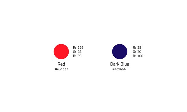
Before getting the drawings into illustrator first I wanted to pick up some strong colors for the brand which are the next.
I've chosen red because it represents the sport side of the brand full of energy and very highly visible color too.
I've chosen this dark blue because it is related to the cryptocurrencies mysticism and because of the technological manner.
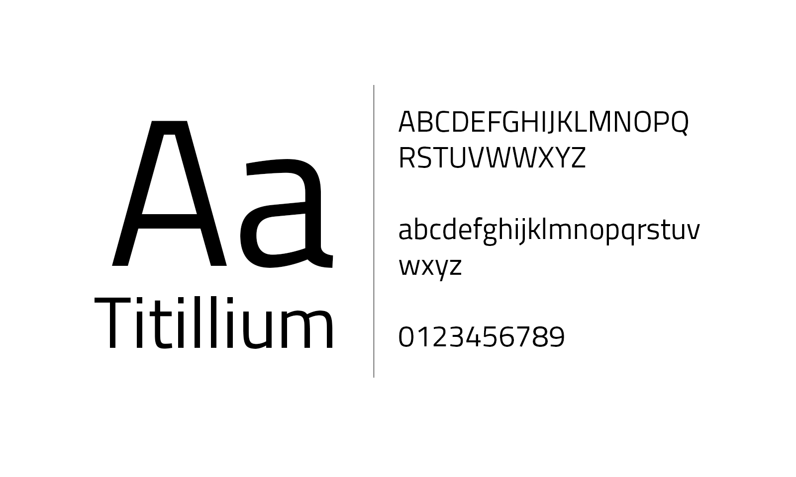
For the fonts I really liked Titillium and how it looks with the logo.
So after making this choice I had to include every single element to Illustrator:
Then after some time working on it I needed a short break to eat something and step back from the screen for a moment, so it was the time for some cookies :) 🍪🍪🍪🍪
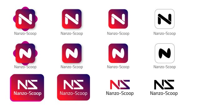
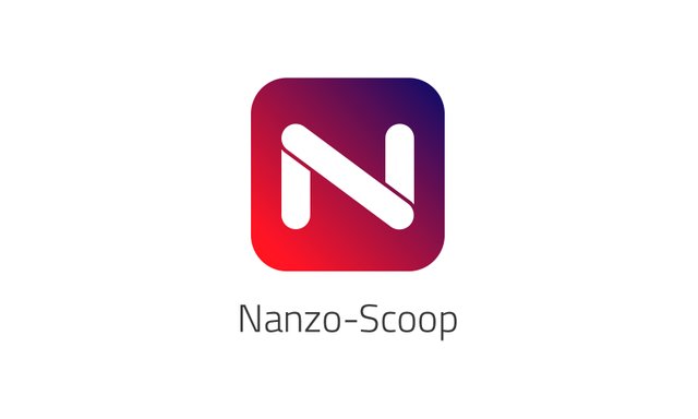
Finally I felt I have completed the design. I'm very open to change the colors if @nanzo-scoop determines it but this is the final product that I want to share with him:

I can say that I loved how the shapes turned into life and specially on the first row you can see the idea that I liked the most. For me it is super simple, super stylished and suuuuper minimalistic. Also I like how it recalls a Z just by taking 3 seconds looking at it.
Final thoughts
I would be totally blessed to have an opinon from @nanzo-scoop speaking about my proposal and the possible modifications for it. I also leave the black and white version beacuse it is very versatil and can be used on busy scenarios. I felt the style I achieved with this logo is very minimalistic and full of energy, this characteristics were the initial goal when brefing it. Sometimes when I look at it I imagine it twisting, blending or spinning which is very cool for the N shape to transform into an Z or S. For now I can not say what to change, thus I'm leaving to @nanzo-scoop hands his opinion and further work on it.
🍪 Thank you for reading community! 🍪
Do you want to help me?
I'm a self employeed graphic designer who dreams on having his freedom and full time dedication on his design passion.
I'm spending time and effort with so much energy to bring cool content almost daily!
If you want to extend your love to my ideas it is super easy to do :)
You can decide on:
- Upvoting
- Resteeming
- Commenting
- Sending SBD or STEEM tips to my account @carlosd15
Wow. Great post Carlos!
Really nice work you put into it.
To logo: Symbol is very nice. It has a mechanical feel to it. Colors - fine, but im not sure about the gradient.
What I dont liek is the typography. Its kinda hard to read and dash is not nessesary in my opition.
Thank you mate! I will make some corrections to it when I have the time later today. I feel I'm going with red only :) and about typo do you have any suggestion?
Remove the dash and make it bigger / darker.
And font? :'D
Comic sans ;)
Or find something yourself :D
Calibri then :D
@carlosd15 got you a $1.92 @minnowbooster upgoat, nice! (Image: pixabay.com)
Want a boost? Click here to read more!
This post has received a 6.14 % upvote from @bellyrub thanks to: @carlosd15.
Tons of great designs man :)
Thank you ! I appreciate your visiting to my post :)
This post has received a 0.98 % upvote from @booster thanks to: @carlosd15.
This post has received a 0.78 % upvote from @drotto thanks to: @banjo.