✍ My graphic design - State of the sndbox thumbnail contest entries
Hello friends!
Next day, next contest :)
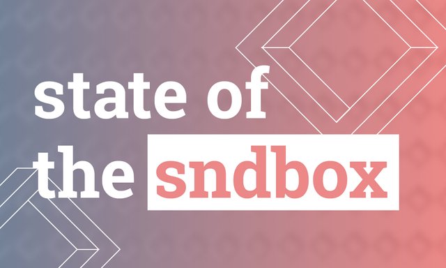
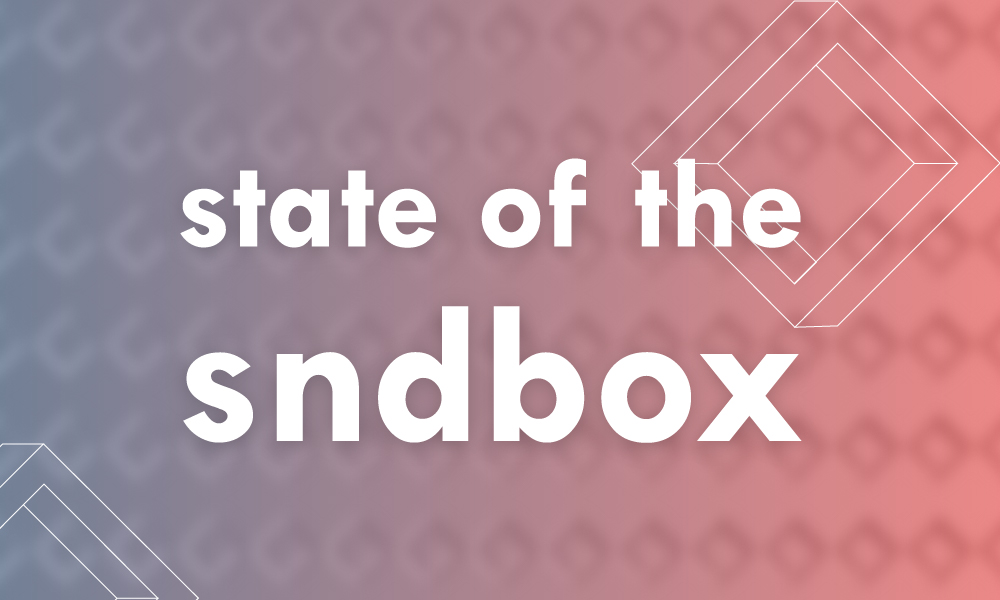
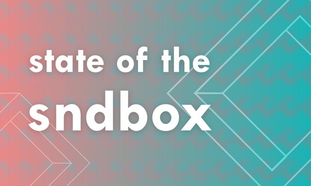
These are my entries for thumbnail design for #sndbox. I was working with their colors and trying to create an interessting composition using the geometry of the logo. My main goal was legibility in small size and eye-grabbing visual style.
version 1
version 2
version 3
version 4
Which one do you like?
I will upvote your comment tomorrow if you like the same one as I do.

Andrej Cibík @andrejcibik
Web design | Web development | Logo design


No.3 カッコイイかなー( ^ ^ )
I like the first one :)
Nice job mate! Looks so great : )
Which one do you like the most?
The first one ; )
1
Hey man, I just wanted to let you know that Abono and Vapor, my projects are in need of a web designer, can we get in touch?
Hit me up on discord - andrejcibik
or steemit.chat
I like the version 1 :)