✍ My graphic design - Logo simplification - traditional blue print

Hi there.
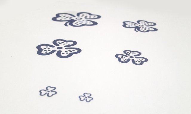
A client came to us wanting to rework his old logo. He does a traditional technique of printing with blue ink. He had his logo just in raster format - printed on his business card. It was not suited for web or any other application.
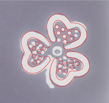
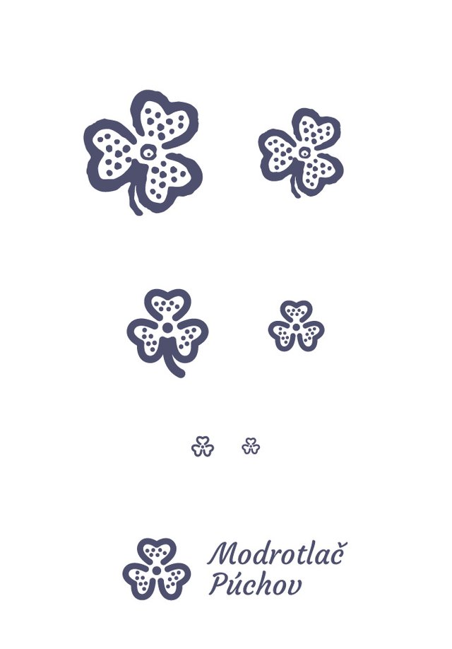
I have started with reworking his logo to vectors and then started to simplify it. I have kept the basic shape and style, but used simple gemetric shapes to make it cleaner.
Vectorizing

Simplification

Logotype

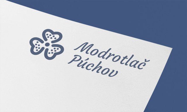
We are happy with this result. It will certainly work for him better than his old design.
Andrej Cibík @andrejcibik
Web design | Web development | Logo design

beautiful :)
Hello greetings. What programs do you use? I am also a designer and note by a comment that you are very detailed. I'm looking for design contests, I love seeing the work of my colleagues.
Hola saludos. Que programas utilizas? También soy diseñadora y note por un comentario que eres muy detallista. Busco concursos de diseños, me encanta ver los trabajos de mis colegas.
95% of time Illustrator.
Y el 5%?
photoshop
Great work, very elegant
good idea and good job
OMG... very nice art.
im play genre art to like you.
But is still bad.
if you want? im very respect to your visiting my art blog and say something
This is great design, i appreciate this art and logo. best of luck dear friend
Wonderful art...great design...all the best...
wow you graphic design is soo good
What an amazing logo. How do you do this. I see you very blessed in this field. The logo that was previously your trademark logo can cultivate into the logo of Trends Now. Good Job
Well done mate, this one is like my project in early years of graphic design. I took time roaming the city to take photos of some artwork and then tracing them manually to train my basic skill.