Minimalist Design: Examples and Tips to Kickstart Your Next Creative Project
Minimalism is more than a design technique; it is a timeless concept with a clean, streamlined look and universal appeal. What’s more, it’s a great way to reach consumers in an oversaturated digital marketplace. Here’s how to do it right.
Minimalism is defined by a lack of embellishment in the overall design. Often minimal elements have a white or light background, with simple typography or imagery. (Although some designers take the opposite approach with a dark aesthetic, as seen below.) Minimalism can show up in any medium, from black and white photography to the UI of a website, but it always means uncluttered, simple design.
For non-designers who need to get creative, minimalism is a simple and trusted style that will open up the design possibilities for your business. The best thing about a minimal design is that it gives the content plenty of room to stand out. Here, we’ll look at 15 examples of impactful minimal design with ways that you can apply these concepts to your small business design and marketing projects.
Focus on space
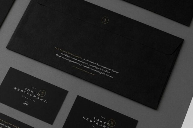
Minimalism is all about great use of space. Whether you plan to leave plenty of room around design elements, or keep everything tightly placed, plan the negative space so that it works to your advantage.
Design takeaway: Note how the space around “The Tokyo Restaurant” draws the eye to the name. That’s due to great use of space. With a center alignment and simple outline, plenty of space on the outside of the canvas creates focus on the brand name.
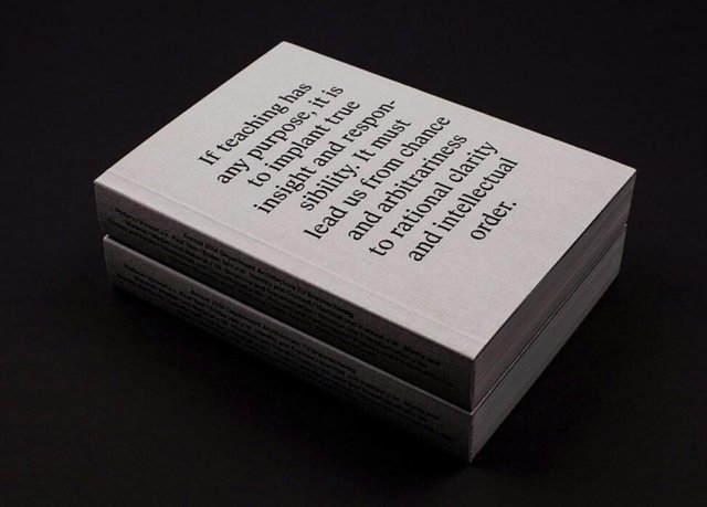
Make it about the words
A simple background with plenty of room for the message to shine exemplifies the minimalist design style. Create distinct messaging using simple, highly readable lettering for optimum visual clarity.
Design takeaway: Simple typefaces work the best, and the message needs to be concise. Focus on a key phrase that you want users to glean from the design.
Do something abstract
While minimalism is about creating simplicity in design, it can also capture more abstract elements. A unique logo, wordmark, or icon can be just the right visual element to jumpstart a design. The trick to ensuring success is to pair an abstract element with something concrete and recognizable, such as a link where users can find more information quickly.
Design takeaway: Abstract design elements present an opportunity to create suspense and intrigue users, which is why it’s been a trick in the advertising world for ages. A neat visual can help encourage action.
Use an icon

Line and flat-drawn icons are trendy design elements that lend themselves perfectly to minimal design outlines. A simple icon can help focus the eye and draw users into the words displayed. It also adds an extra visual element without crowding the canvas.
Design takeaway: Simple, easy-to-understand icons work best. You don’t have to use a company or brand logo (although you can) to create an interesting visual element. Opt for a no-fill icon, such as the one in the example above, to maintain the minimal feel.
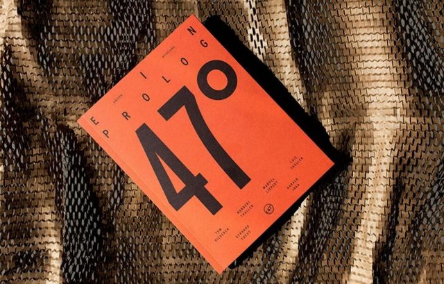
Create contrast
For a user to look at an element of design, it needs to contrast with its surroundings. Contrast comes in the form of color, size, scale, and just trying something a little bit different to create a focal point. In a minimal design, this is especially important because there aren’t a lot of visual entry points, and some users could be bored easily.
Design takeaway: Contrast doesn’t have to be overwhelming to be effective. Here, a simple underline draws the eye to the text in the center of the screen.
Create layers
Minimal doesn’t have to be flat. Build layers into a minimal design style using a distinct background and foreground. This technique can work great for online ads or social media promotions where you can layer a small block of text over an image.
Design takeaway: While the bottom layer can be almost anything, keep the top layer as simple as possible with white text for dark backgrounds or black text on lighter backgrounds. Opt for a more abstract or texture-based bottom layer, rather than an action-based image.
Play with typography
Sometimes all you need for a well-designed piece is beautiful typography. Keep everything else in the design as simple as possible and experiment with a single word of phrase using interesting and unique lettering.
Design takeaway: Fewer words are the key to making this technique work. Remember, a cool typeface won’t help the design if it’s not readable.
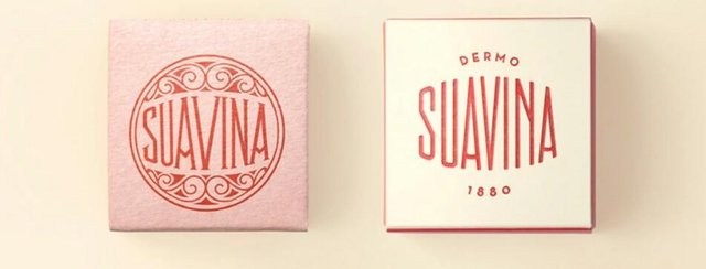
Create texture
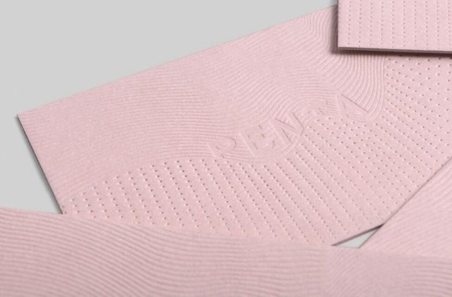
Monotone color palettes with texture are one of the most polished uses of the minimal design trend. The concept, which is born out of letterpress printing, has a classic feel that makes users want to interact with the design.
Design takeaway: Create the look of depth with digital embossing or subtle shadows in the design. Use this technique to showcase branding, but stay away from more robust messages.
Feature asymmetry
Play with a design that’s not perfectly symmetrical to make the most of the space you’ve got. Whether you opt for a complete off-center visual display or just a few elements that break the center line, asymmetry is an easy way to create a focal point. The eye is drawn to the point of the design that looks different.
Design takeaway: Asymmetry does not mean “off-balance.” Even when the design does not mirror from left to right or top to bottom, the weight of elements and space should still feel somewhat centered and easy to read. A design that feels lopsided should probably be revised.
Use color
Most people immediately think “white” when imagining a minimal design, but that’s not always true. Minimal styles can include color. Many times color provides a backdrop for the overall design, or can come in the form of an accent.
Design takeaway: When working with color and minimalism, the trick is to use it as an enhancer, and not as the focal point of the design. Color should almost just fall into the background, creating a canvas for the rest of the design. In most successful cases, the design would still work even if the colored background was removed.