A logo designed by myself
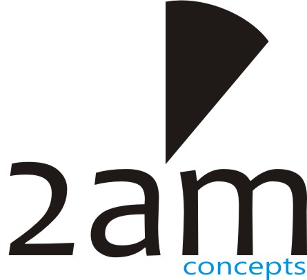
The 2am concept(brand) has a specific meaning
2am was coined from the name of the entrepreneur Akinwale Abioudun Makun. The first and the second names starts with letter A. Thus, representing 2a while the letter M is from Makun. i therefore arrived at 2am. Also, the object on top represents the 2'0clock time.
To make the logo more attractive, the Candara font was used for 2am and Ebrima font for 'CONCEPTS'
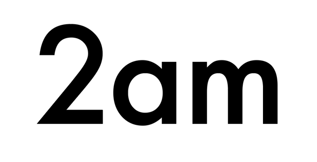
Nice logo. Clean and simple.
How do you imagine it looking when shrunk to 32x32 or 64x64? Would you keep the text?
THANKS BRO
Nice concept dude. If you were looking for feedback, I think I might try a few different fonts. My thinking would be that the icon features a curve and a sharp point, and I think I would want a font that matches, maybe futura:
Apologies if my feedback is unwelcome.