Charting Tips #2 - When Drawing Line Graphs
So to continue looking at best chart practices, we will now look at Line Graphs.
This type of chart is ideal for displaying time-based data, as the plotting of lines over a particular time period can reveal any trends or patterns within the data. This is visualised through the direction of the lines across the graph: an upward slope indicates where values have increased and a downward slope indicates where values have decreased.
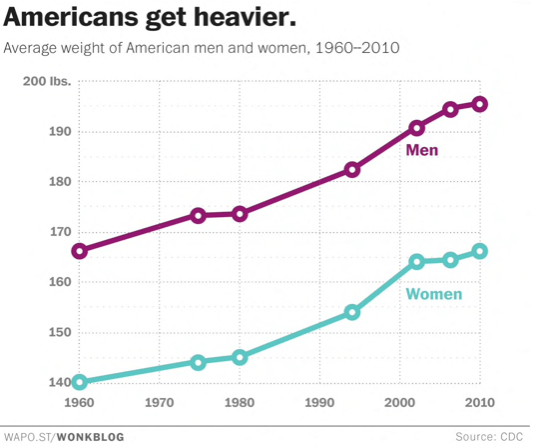
Chart source: The Washington Post
Typically, the y-axis has a quantitative value, while the x-axis is a timescale or a sequence of intervals. Negative values can be displayed below the x-axis. Also, as you can see in the example above, a Line Graph doesn't necessarily have to start from a zero axis.
However, when drawing a Line Graph, there are a few things to watch out for.
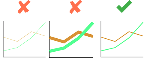
Don’t make the line too thin or too thick.
Thin lines can be hard to read and over thick lines can be overwhelming.
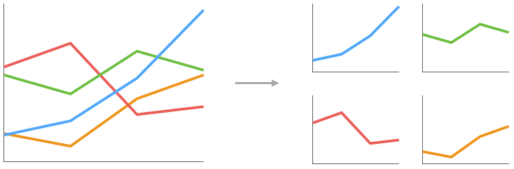
Break the chart up into small multiples when you have more than 3-4 lines to visualise.
Avoid the dreaded ‘spaghetti lines’ effect that occurs when there are too many lines on one graph. These charts are harder to read, so splitting the lines individually makes things clearer.
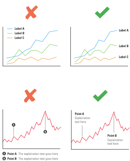
Try to keep your labelling direct and avoid displaying labels at a distance.
This just makes the labels quicker and easier to read.
Previous Post:
Charting Tips: Bar Charts & Column Charts