This post is about the process behind the logos I made for @curie's logo design contest using Adobe Illustrator.
Logos
Curie to me predominantly stands for community, transparency, connections, and of course curation. I tried to represent these attributes in the logos I created. My style of design is flat and minimal. Meaning, I don't use drop shadows and 3D effects but try to communicate with as little as possible. Often the process of arriving at something simple can actually be complicated. I tinkered around with some ideas and using Illustrator, came up with these.
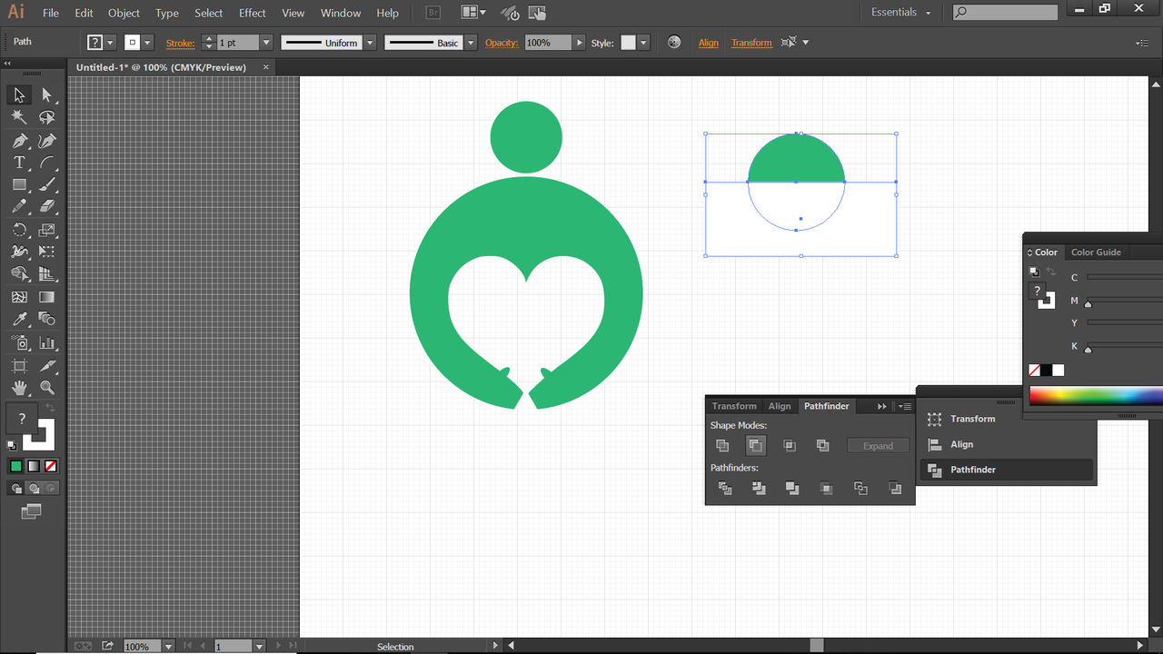
This logo is made to represent the positive reactions curie can bring to a post. I remember the giddy feeling when I got my first curie vote. I wanted to represent the love I felt, how curie embraces new authors and how it's a community effort. The upvote symbol has become a vital part of curie's image and I included that in the logo. I chose to add 3 as a curie vote is often followed with more votes, and I wanted to represent that trail.
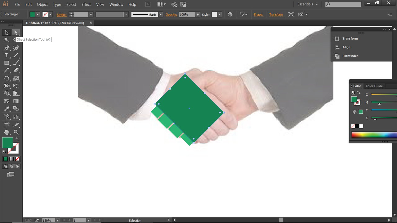
This logo is a little more abstract. The image of a magnifying glass is associated with search engines. Curie does in a way search for new content and the icon could also represent scrutiny and the fact that curie is transparent about all its operations. The handshake is universally understood to represent an agreement. That's the focus of the magnifying glass with two stick figures surrounding it that have the upvote symbol in their faces. I tried a version with the handle of the magnifying glass and two versions without it.
This is a mandala type of logo that celebrates the community spirit of curie and how they connect people through the blockchain as witnesses. The upvote trail is also included to show how they bring rewards to new users.
The Process
I use the pathfinder tool to cutout my basic shapes.
I then create smaller silhouettes of people and use the reflect tool to mirror them.
I then add a few details in the hands, and the upvote symbol which is duplicated two more times. I didn't experiment too much with fonts, partly because I haven't updated my font library in years. I think a bold all caps font works well and used the few ones I had which are also all over my blog, haha.
Experimenting with colours. I think the white makes the negative space stand out more, so decided to go with those options.
For the next logo, I used shapes to make a block image of a handshake using a reference photo. I use the direct selection tool to pull the corners of the shapes till they align with the photo.
I then use circles and the pathfinder tool to create the stick figure bodies.
A few more shapes, direct selection and moving around and the logo is done!
This logo had a simple start. I used the ellipse tool to form this humanoid shape.
I then use the reflect tool to mirror the previous shape, and add a computer screen with the square tool. I changed the top monitor to a smaller upvote trail later for better symmetry.
These are my entries for curie's logo design contest. Hope you like them! There are several excellent entries already as well.
If only I could think like you. You HAVE to design more! Your process is exactly what makes for something unique. Big negative space fan so I think that works really well. Also, the hands in the first logo remind me of awwters holding hands so special points.
Awww, that picture is so adorable. Thanks a bunch for the compliments, I just try to work with what I have. Another reason I favour minimalism is cause my software knowledge isn't so great, haha. Seems like my execution needs to catch up with my ideas to get better overall design. So many skills to learn, such little time. This was a lot of fun thinking out though.
Wow, all those logo designs are good but that first one is awesome. You have skillz brother!
Thank you! It's my favourite too. I try my best with the knowledge and tools I have. Glad to know it's appreciated.
@soulturtle that looks great, you should have posted it on utopian.io! ..Or try posting it again on utopian.io bro!
Thanks man. This was for the curie logo though and they wanted only one tag to reduce clutter I suppose.