Logo Proposal for Curie Design Contest
Details
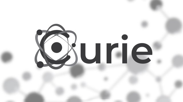
I want to start by saying that I liked the idea of creating a logo for this concept from the beginning. I did a research, and I realized that nothing can represent chemistry better than an atom. That's why we combined the letter "C" from Curie and an atom in the concept.

Because a logo has to work in any color, I've decided to offer the alternative of a logo based on gray tones.
Work Process
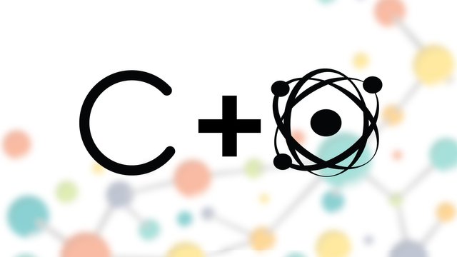
As I said above, I tried to combine the atom as a symbol of the science of chemistry and the letter C of Curie. We started by building the letter C and then we went to the atom. After both shapes were defined, I put them on top of each other and with the help of design software tools, I got to the final concept.
Throughout the creative process we used Adobe Illustrator. All exported files are editable and scalable.
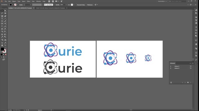
The font used is part of the Montserrat family. This font is offered free of charge by google.Link download below:
Editable files AI/PDF/EPS/SVG
Congratulations @radudangratian! You have completed some achievement on Steemit and have been rewarded with new badge(s) :
Click on any badge to view your own Board of Honor on SteemitBoard.
For more information about SteemitBoard, click here
If you no longer want to receive notifications, reply to this comment with the word
STOP