6 Common Magazine Design Trends Found in Today's Web Design
#1 Layered Content Boxes in Web Design
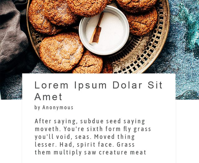
As shown in the example web design above, the content is contrasted over the underlying parent’s background color/ image. As a result, the website content stands out while still gaining influence from the background.
Why use this:
In clarify, stacking content on top of the related image allows you to pair the visual element with the content and provides a seamless relationship for your reader.
#2 Drop Caps for Web Design
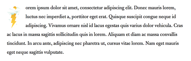
To give example, the screenshot above was taken from the “I” category at Daily Drop Cap - A free for personal use drop cap resource. Additionally, both images and/ text effects can be used in drop caps in your web design.
For instance, use drop caps to position more of your design elements into your text. In addition, drop caps assist with the flow of colors and textures throughout your web design.
#3 Web Design With Skewed Borders

Skewed borders are edgy and easily capture your reader’s attention. In particular, use skewed borders on images or content boxes in your web design. To clarify, this can be accomplished with CSS by using the transform property on the ::after selector of an element.
For fear that content will run past the skewed edge, ensure enough padding is set in order to keep content from crossing the slanted border(s).
Example:
[css]
.block {
background-color:  #F00;
height: 200px;
margin: 50px auto;
position: relative;
width: 780px;
}
.block::after {
background: inherit;
bottom: 0;
content: '';
height: 100%;
position: absolute;
-webkit-transform: skewY(5deg);
transform: skewY(5deg);
-webkit-transform-origin: left bottom;
transform-origin: left bottom;
width: 100%;
z-index: -1;
}
[/css]
In the above code, the transform property of skewY(5deg) is what controls the degree of the skew.
#4 Staggered Left/ Right Content in Web Design
For the most part, staggered left to right content keeps the reader’s engagement by limiting their ability to stray from your website. For instance, much like a timeline, you follow the path all the way down to the end.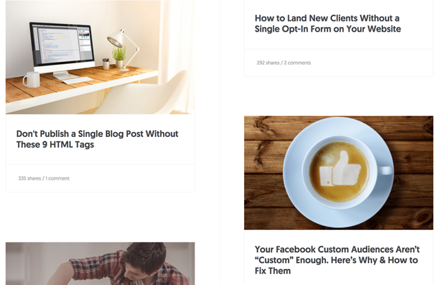
As seen above is a Screenshot of Neil Patel’s blog at neilpatel.com/blog.
As the founder of multiple analytics and marketing websites such as kissmetrics.com and crazyegg.com, Neil understands web metrics and A/B testing. Taking that into consideration, you will understand the staggered content organization method is worth considering.
How this works:
As shown in the diagram below, this staggered left/right content organization method follows the “Gutenberg Diagram.”
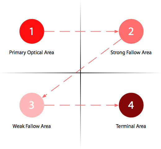
As can be seen in the diagram, your reader's eyesight travels from the top left to the top right, returning immediately back to the bottom left and ending at the bottom right.
According to this article on eye-tracking study results, your reader’s eyesight moves in an “F” pattern, going from the top left, over to the top right and back to the bottom left.
#5 Columns of Text in Web Design
As shown above, columns for text separation has been used in all kinds of magazine page design. In brief, use this type of layout to split your content and make reading through your content easier.
Why this works:
Ultimately, this works because most readers will not try to read a big wall of text. In fact, your visitors will likely leave your website because of it. Separating your text into chunks makes your content easier to digest and scan through for your readers.
#6 Text Over Image Backgrounds
On account of magazine design, overlaying text on top of a background image is simple to do in a graphic design software. Using CSS, you can achieve the same effect in your web design.
Here's how:

As seen in the above image, is a screen shot taken from fzcreative.com. By using this text over background image technique, they are able to put emphasis directly onto their brand tagline. In addition, by using a related background image, they can easily convey more about their business.
Of course, ensure your background provides enough contrast to your text. By doing this, you ensure your visitors are able to read your text easily. I have found that when you add shadow to your text it increases visibility. Do this by adding a bit of CSS to your overlay text.
Here's the code to do that:
[css]

#banner .overlay-text {
text-shadow: 0 0 5px white;
}
[/css]
In the above code, I simply added a white text shadow with a 5px spread to the overlay text. To explain, you should use a white shadow for darker background images and a black shadow for lighter background images. In addition, text shadows will also make your text appear visually sharper. You can read more about the CSS attribute "text-shadow" at W3schools.net.
Final Words
All in all, common trends for magazine page design have been picked up and are now being used by web designers. Overall, these 5 common magazine design trends are the most popular techniques being used in Today’s web design.To conclude, use the techniques outlined in this article to achieve easy to read content that flows much like a magazine. In effect, you will retain more readers and gain more shares on your web design.
Posted from my blog with SteemPress : https://divto.com/magazine-design-trends-web-design/
It's great that you shared web design trends. I also try to follow this and keep abreast of all the news. Master Bundles is an indispensable tool for me in these matters. I recently found the photos and images I was looking for among many stock options.
Hello, thanks for sharing. Now the designer market is crowded and it is important to be in trend and stand out from others. It is also important to make a quality product in the field of web design. I use this resource https://thedesignest.net/free-finest-paper-textures/ ,where do I get the textures for my work, in addition to textures, you can find many ideas for your design