QUOINEX UI Kaizen: continuous improvement to deliver a customer-driven exchange experience
Key insights behind major design updates on QUOINEX

By Jon Myers, QUOINE Chief Design Officer
A change for the better.
At QUOINE, we embrace a Japanese business philosophy that is at the heart of our user experience design practice. That philosophy is called “kaizen”, which means the process of continuous improvement or, quite simply, “a change for the better”.
We take this practice of constant improvement very seriously by spending a lot of time listening to customers, testing and validating our assumptions, and we even have a Slack channel dedicated to this practice called, UI Kaizen.
In the spirit of kaizen, constant improvement, today marks the day we are rolling out some major design changes to QUOINEX.
You will find a brief rundown below of the improvements we’ve made to the exchange.
Additionally, you may notice we have previously rolled out some of these changes to our other exchange, QRYPTOS. However, there are some key differences. In particular, please take a look at how we’ve made it easier for you to add your bank accounts to deposit and withdrawal funds.
As always, we’re here to listen and improve. If you have any thoughts or feedback you’d like to share, please contribute to our practice of kaizen and let’s change for the better.
Top line navigation improvements

The first thing you will notice is we have improved the top line navigation and have consolidated it to keep things focused on trading and managing your assets. Additionally, you’ll see we have a side menu that is available for navigating to your settings area.
The wallets area, cutting out the clutter
In the wallets area, the balances screen now makes it easy for you to see your total combined asset value.
Additionally, you can easily scroll through the list of available assets here.

We’ve decided to keep the visual noise of the controls out of your way.
If you want to take action on an asset to view transactions, make a deposit or to make a withdrawal, simply hover over its table row and you will see these options available to you instantly.
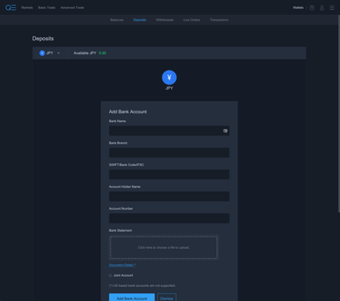
Easier search, enhanced focus and simplified workflows for managing banking details
We wanted to make it easier for you to navigate between currency options and crypto and we wanted to make it as simple as possible to add your bank account to deposit to and withdrawal from QUOINEX.
We also wanted to simplify the process of deposit funding and withdrawals.
There are a number of new workflows here to note and the main thing is that you can do it all from one place.
For deposits, simply add your bank account details:
Create a funding request:

Wire the funds:

Once you’ve sent the wire to fund a deposit to your account, you can check back here at any time to see the status.
Withdrawals work in a similar fashion.
Finally, on the withdrawals area we’ve made it easier for you to focus on the asset you’ve selected and whitelist an address for withdrawals all in one place.

Improving the accounts area and verification process
When you visit the accounts area, you’ll notice a number of improvements we’ve made that are focused on usability, readability, and making it easier and faster to verify your profile.


Basic and Advanced Trading
We’ve made some improvements here related to usability and readability of the trading environment. We’re in the process of developing and testing some major improvements in this area, so please stay tuned and let us know what you would like to see.

Help us improve to better serve you
We always want to hear from customers and welcome your thoughts and feedback. Get involved and help us shape the future of financial services.
We have a special place setup where your voice can be heard.
Please visit liquid.canny to give feedback and request features.
Thank you and see you on the exchange!
I see the page load is improved in new release, great work.
There's some idea I want to show to improve UX for traders.
In Account panel, allow users to copy text. I think there's a bug in here, drag & drop is preventing users from copying text.
In Watchlist, allow users to drag & drop as Account panel. It'll provide capability to order crypto pair by priority users want
In margin trade, should only show crypto pairs which you allow to trade. It's not good when users receive a message
product is disabledafter they filled all things.When users input for margin trade, you should show estimation about required balance users need to keep to avoid system auto close their position. If possible, show specific market price which system auto close their position if it's reached.
Support options 25%, 50%, 75%, 100% for users to fill amount quickly in Advanced Trade as you did in Basic Trade
Great to hear this✌