BTC Market Watch 8/8/18
I have been away perfecting methods and really taking a deep look into better ways of doing things. I have found my own method of doing things I find pretty effective. Perhaps it will change over time. For now though, lets take a look into BTC.

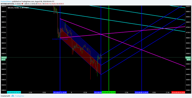
I have drawn this exact same type of chart literally 100's of times to analyze how they play out and how to trade it properly. The dark blue lines show a "perfect world" price/volume divergence correction. The green line shows when the weakest bearish and strongest bullish fib trend lines meet. The purple cross is the most important lines here though. They show a 1/1 ratio expanding wedge that the price is always trying to get back inside of. This doesn't mean I am "bullish" but after a dump like this, it is extremely likely that we go up to test the bottom purple line at the very least.
Basically, this chart is describing a bounce, however small, will either reject off the bottom purple line and continue down, or break the bottom line and move to trade inside of the expanding wedge. This type of trading is an advanced way of looking at always regressing back to the mean of a move in price. Taking this chart as it is, I would be looking to trade bullish here to 6600 going into tomorrow. Like I said, this doesn't mean we can't go on to go down again, but given the magnitude of the drop, we are likely to make a move up here to give the market some breathing room and how it would like to react today.
The angle of the purple expanding wedge is showing a floor that is lowering more rapidly than the ceiling is expanding up. I am currently of the opinion we are starting a lower high, lower low pattern as we move into the expanding wedge where I can make another call about where we might be going.
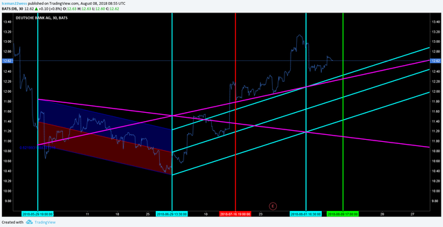
To prove my point about not always getting back inside the wedge, I would like to show a chart I was working on with DB. Take a look.

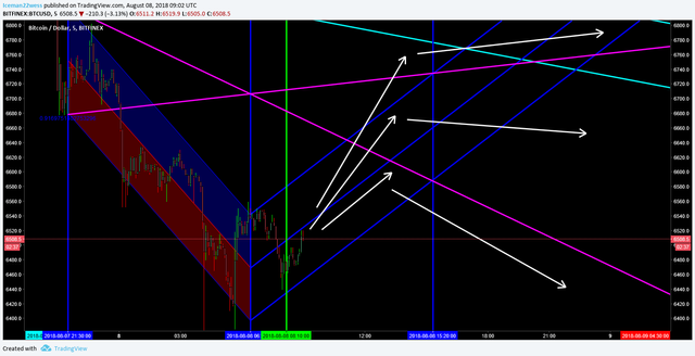
Trading bullish under the assumption that the price wants to get back inside the wedge would have been a great trade. When I drew this chart, the current time is always at the second vertical blue line. However, you can also see that the red and green lines ARE NOT buy and sell signals, but rather the most likely place to see a large increase in volatility. Which direction you trade it would depend on other things in the chart. The most important thing in this chart is that we break above the wedge, and begin to use it as support. Pretty spot on for drawing it weeks before those moves happened! The way to trade this at this point though is over. When you first draw the chart, it gives you a good idea about which way the price wants to go. Applying that to BTC would give you something like this.

Now I can't claim to know which one of these will play out, but I can safely say that the price will want to test that purple line before crashing or moving up. Either way, that is a bullish trading moment in the chart.
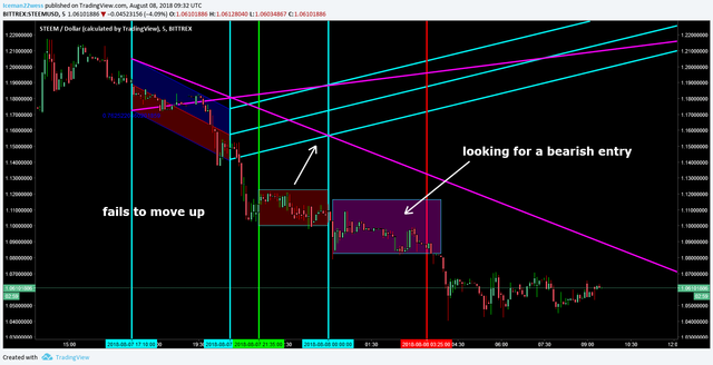
The final chance at where this goes is that is never tests the purple line and we just keep going down right? Well, yes certainly that could happen. If by the time the 3rd blue verticle line comes to pass, and the price did not get affected by the green "bullish" largest trend against the weakest bearish trend line, than that signals that a bearish continuation is in order, and would look just like this steem chart.

Thanks for reading,
-Icee-
Please leave me an upvote and remember this is not trading advice.
Hey bro, nice to see u back making post.. i liked the explanation on this one, it is slowly starting to make sense to me..
Hope all is well man.. hit me up on discord when u get a chance..
Peace.