Crypto History: I Designed the Litecoin Logo
Five and a half years ago I made this post on Bitcointalk.org about how I thought Ł should be used as the litecoin symbol. You see, back then the litecoin logo looked like this:

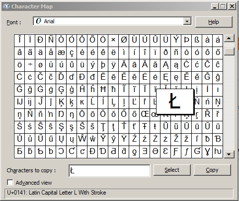
Myself, being a graphic designer thought this too vague and unclear. Litecoin needed a strong identity, a highly recognizable sigil to anchor it's place as one of the founding cryptocurrencies. How did I choose Ł? I simply opened up my computer's character map and thought it looked the best!

The symbol I originally chose was adopted by the community and even though the actual logo is not of my own design, I am proud to have picked the core visual identity for an entity with an over $3 billion market cap.


So u r a kind of legend here ..good job👍🖖🖖
Awesome! Amazed to know about your contribution. We never know when our simple thoughts will evolve into great ideas of future. Congrats and you must be proud of it.
This is definitley something worth mentioning. In design, complex is almost never the way to go when trying to think of a design to be used in a large scale project. My insides are tickled at this tale!
That is freaking awesome! The feeling must awesome too!
Hopefully you had plenty of time to invest since then.
Unfortunately I lacked the foresight and sold 30,000 LTC for $0.05 each lol...
wow nice work :D
are you serious? wow! nice!
I wish Satoshi Nakamoto would post something like how he made Bitcoin.
Wow!!!!! just great work ,,,,,,,,,,,,,,,,,
wonderful post
wow man so are you designing steem logo ? that would be more awesome i believe 😍😍😍 really great logo you made for ltc 😍