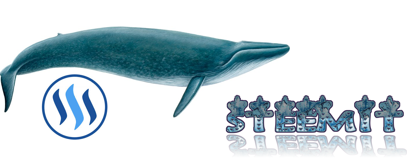
Is this supposed to be ironic?
I'll be honest, they're bad. They're really, really bad.
The effort is good, and it's cool that you're not afraid to experiment, but you definitely need to improve before you should go putting your designs out there. Go torrent a copy of Adobe Creative Cloud and start hitting youtube for tutorials, build out your skills, find your inspiration, and at the same time appreciate that design is a craft - you must learn over time various techniques, and can't expect to receive praise for using simple effects and filters that any 5 year-old with a smartphone can pull off.
Well the top part of the words is not so good, but keep it up, you need more definition but I do not know software at all, @killakoolaid is right but kind of harsh in a good way.
Also the flow of your complete design doesn't work together, you need to integrate subjects so they relate to each other better. But I am not a logo professional, I paint and I know flow that moves the eye.
Is this supposed to be ironic?
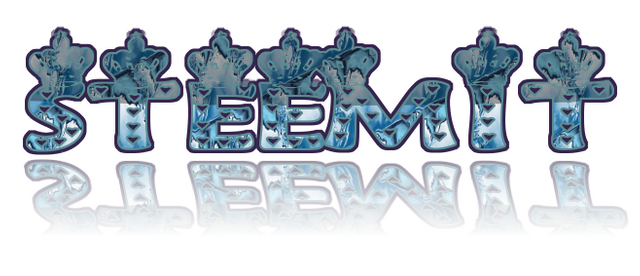
I'll be honest, they're bad. They're really, really bad.
The effort is good, and it's cool that you're not afraid to experiment, but you definitely need to improve before you should go putting your designs out there. Go torrent a copy of Adobe Creative Cloud and start hitting youtube for tutorials, build out your skills, find your inspiration, and at the same time appreciate that design is a craft - you must learn over time various techniques, and can't expect to receive praise for using simple effects and filters that any 5 year-old with a smartphone can pull off.
thanks :) for your comment :) you are right :)
He's not right! That's a pretty good design, keep doing it! You are free to post whatever you want!
Btw: Do you check the @killakoolaid Blog? Where is he's Designs?
that's amazing .
so kind of you i wish seniors would also like it 😢
be confident. .. or try to do steemgig
This post recieved an upvote from minnowpond. If you would like to recieve upvotes from minnowpond on all your posts, simply FOLLOW @minnowpond
Lovely logo, I like the reflection the best.
thankuu soo much reddust its only you who appreciated otherwise i was really demotivated 😢 thankuuu sooo much 😢
Well the top part of the words is not so good, but keep it up, you need more definition but I do not know software at all, @killakoolaid is right but kind of harsh in a good way.
Also the flow of your complete design doesn't work together, you need to integrate subjects so they relate to each other better. But I am not a logo professional, I paint and I know flow that moves the eye.
again thanku soo much 😍