Double Exposure Artwork (2nd Attempt)
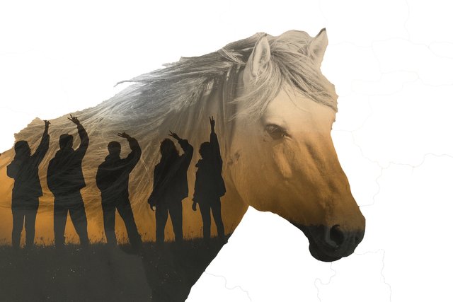
I was surfing the web earlier today and something caught my attention - Double Exposure Images. The striking contrast and complementary nature of two fused images is rather remarkable.
So I started doing some research and realized that I have some software that can do the trick - Pixelmator. I reviewed this tutorial and then I was off and running.
My first attempt was a great learning experience, but not worth posting for the Steem community. My second attempt was better because I was able to highlight the outlines of the horse well, and the two images I choose worked well together.
Check out the final result:

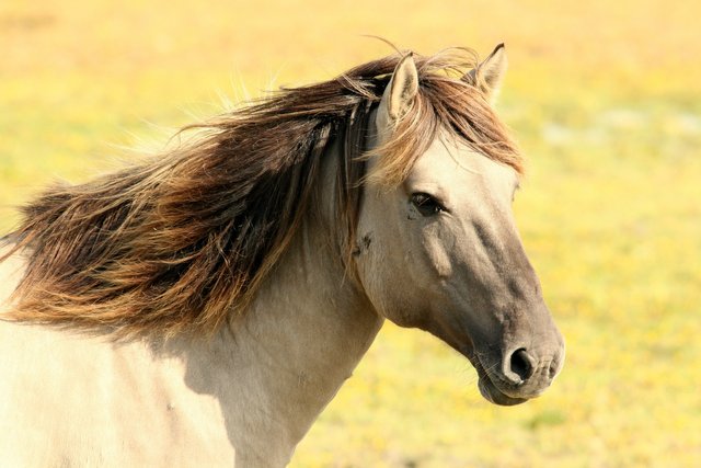
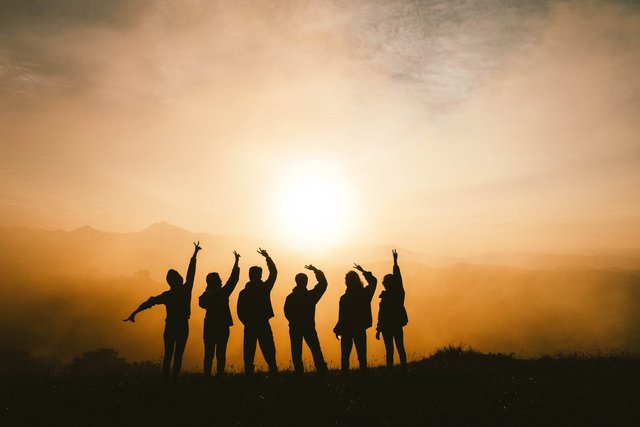
I used the following images to create the end results
 |  |
| image source - pixabay | image source - unsplash |
Basic Steps to Recreate:
- Remove unwanted color from horse background. I used the Quick Select tool in Pixelmator.
- Decreased the saturation level and increased the lighting level on the horse image.
- Added the second image to the project.
- Selected the second image and choose Create Clipping Mask.
- Reduced the opacity of the second image.
- Repositioned the second image for the best look and feel.
I will definitely be adding more "double exposure" artwork in the future.
Thanks for stopping by!
@SumatraNate
Hi @sumatranate!
Your post was upvoted by @steem-ua, new Steem dApp, using UserAuthority for algorithmic post curation!
Your UA account score is currently 4.525 which ranks you at #2093 across all Steem accounts.
Your rank has not changed in the last three days.
In our last Algorithmic Curation Round, consisting of 103 contributions, your post is ranked at #76.
Evaluation of your UA score:
Feel free to join our @steem-ua Discord server