Talking about A Dummy Creative Project
Hello!
Last days I participated in a graphic design contest launched from the ETHBoston team for the convention that they organized. I read of it on the web and I joined from a Dapp built on the Ethereum Blockchain. The goal of the contest was simple: create an original image with the mascot of the event, the Lobsticorn. Then, the pics would have been voted on Twitter ETHBoston page. The winner would have received a cryptocurrency award and the image would have been included in the event as an unofficial mascot.
The result of my contest was naturally disastrous, but I decided to share my experience illustrating how I got my final image in a very dummy way.
Conditioned by the banal idea of the lobster such as hero, I immediately decided to start my opera directing it towards this goal.
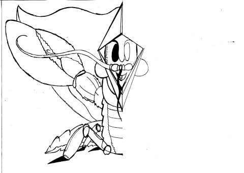
In the first step, I drew with a pencil my Lobster's Outline and the details in a very rough way. After I corrected some errors, I re-drew with an ink pen the principal profile and I canceled with rubber the other pencil line.
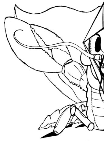
I left only one half of the picture because I wanted to create a nearly symmetrical image. So I used a simple scanner to digitalize the pic. There were some little points of ink that I removed after I open the illustration on a Graphic Desktop App.
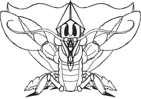
I obtained the result above. At this point, I duplicated the image and reflected it horizontally - in a new page-. The result: a more precise outline of my Lobster that I decided would to be the definitive one.
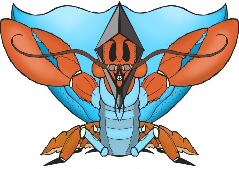
The next step was the color: I thought to utilize the colors of the Lobster and the Boston Flag, but I revisited them to obtain my liking graphic design.
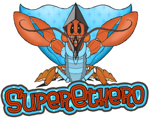
The picture was almost complete: but since I am a lover of fonts within the images, I decided to create a logotype. By assonance, I have chosen "SuperETHero". I created it with some simple levels and techniques.
Since the whole picture had to refer to the Ethereum world, I added the logo in 3 different places:
- In the Logotype;
- In the Cloak;
- Above the Head of the Lobster: this is one of the possible causes of my defeat because it became impossible to recognize the horn that was supposed to make my Lobster a Lobsticorn
In conclusion, I assembled the pic with the Lobster and the Logotype to obtain the final illustration. Personally, I think that isn't a so bad picture. Maybe I obtained a Lobster with a worse air than I was aiming for.
