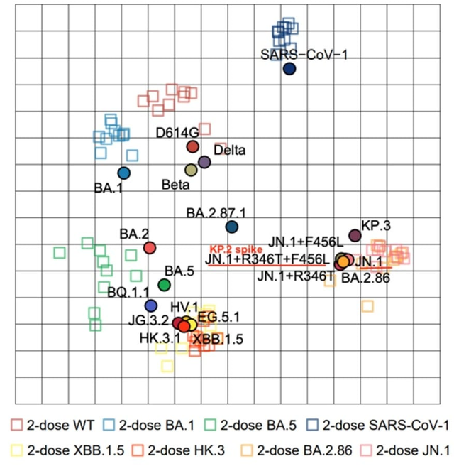
An antigenic map.

https://www.biorxiv.org/content/10.1101/2024.04.19.590276v1
These are always fun. This is a great way to see that you shouldn't stress about the coronavirus vaccine strain updates. The circulating variants are all pretty antigenically similar. So the updated vaccine will be helpful regardless of which strain is selected.
(In the bottom right are the circulating variants)
Circles on the antigenic map are the strains and squares are the sera. Antigen similarity is inversely proportional to distance on the map. Both axes are the same- antigenic distance as measured by sera dilution.
Also you can see quite clearly why we should update the vaccines as well. And naturally why it was a smart move to do the first update to BA.5 and then to XBB.1.5.