JavaScript Data Visualization: Coronavirus data with D3 — Pie
I love data visualization because it is a wonderful tool to communicate what you have found in that data with the world. You can turn an array of numbers into a narrative and express it in the language which everyone can understand.
Preambula
I built a coronavirus app in January 2020 in order to show what is actually happening with this virus. But it lacks a data visualization component. I show maps and sorted lists of the affected countries, but you have to spend some time looking at the data to draw a broad picture in your mind. By the way, read my original blog post about the initial developing phase of the app.
D3 (Data-Driven Documents)
After brief research of the data visualization tools and consulting with colleagues I chose to work with D3. It’s a great library which allows us to make very customized visualizations.
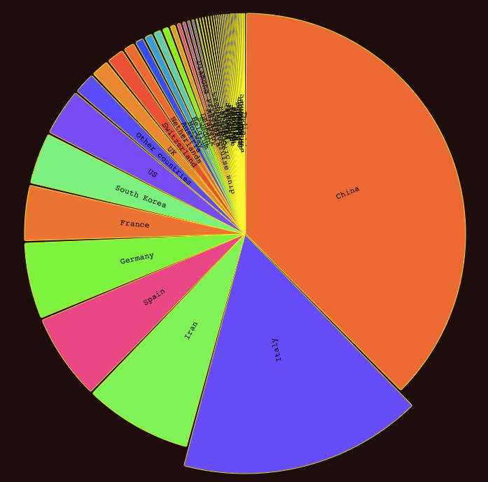
For this example I will create pie and will display the country according to the total amount of the coronavirus confirmed cases in the country.
React integration
First you need to add the D3 library into your React app. Make sure that you located in the root directory of your React app. To Install D3 run this command in you console:
npm install d3
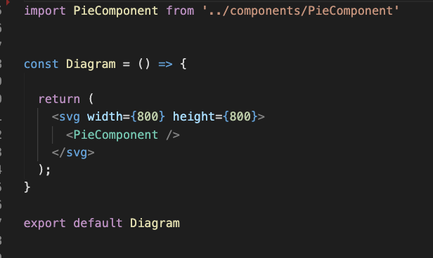
Then create React component which will be responsible for rendering:
import * as d3 from “d3”;
I like to use functional components and I will keep doing so.
D3 uses an svg element as the main container for any type of the visualizations. Our functional container looks like this:
Pie component
As we know from the first blog post, I use Redux for this app. All data I need stored in the Redux store. We will need this data in order to render pie. To get access to the store from the functional component let’s use useSelector hook.
Import hook from the redux:
import { useSelector } from ‘react-redux’
And getting data from the store:
const data = useSelector(state => state.countryByConfirmed)
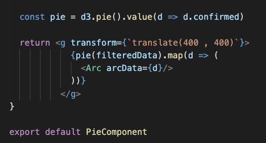
Next let’s import the pie function from the D3 library and store it in the variable. Then we can invoke the pie function in the return statement of the pie component. We need to wrap our pie in g element. It’s a container which is used to group other SVG elements.
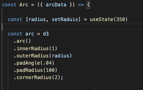
Arks
Ark class will be responsible for rendering each slice of the pie. Every slice will represent a single country. And the size of each slice will depend on the confirmed cases value we pass to each Ark.
From documentation:
The arc generator produces a circular or annular sector, as in a pie or donut chart. If the difference between the start and end angles (the angular span) is greater than τ, the arc generator will produce a complete circle or annulus. If it is less than τ, arcs may have rounded corners and angular padding. Arcs are always centered at ⟨0,0⟩; use a transform (see: SVG, Canvas) to move the arc to a different position.
See also the pie generator, which computes the necessary angles to represent an array of data as a pie or donut chart; these angles can then be passed to an arc generator.
Here is how the beginning of the Arc class looks like:
And this is return statement of the pie component:
Colors and Labels
To fill space of the slice with the color we will use the Path element. To this element we will send props with data to determine size of the pie and color of the pie. We also can add event listeners to this element if we want to make it interactive.
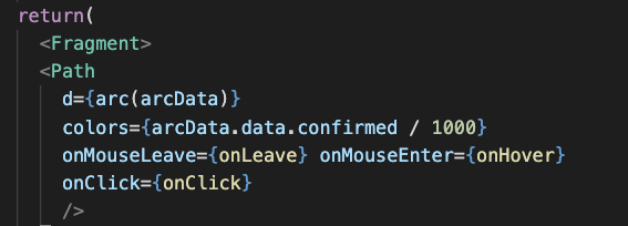
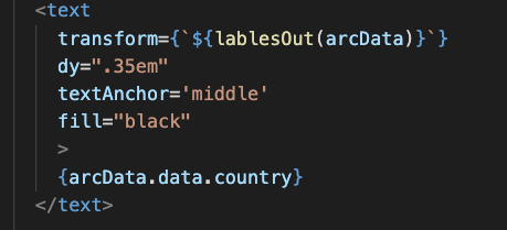
Also in addition to the Path, let’s add an text element to render names of the countries on top of the slice.
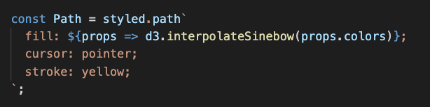
Path style
Let’s use React styled components to style our path elements. To fill the attribute we will pass d3 interpolateSinebow function which will arrange colors based on the numbers we feed it. There is plenty of the the color schemes, you can find it here.
Events
When we create path and modal elements we add event listeners to it. Let’s look at it a bit closely.
Path:
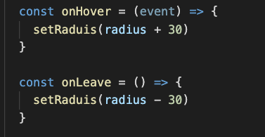
In order to manipulate data and keep it in the functional component we going to use hook useState:
const [radius, setRaduis] = useState(350)
onMouseEnter — when mouse cursor over the path element, function onHover invokes. This function increases the radius of the Ark.
onMouseLeave — when the mouse cursor leaves the path element, function onLeave invokes. And this function is responsible for bringing the radius of the Ark in initial state.
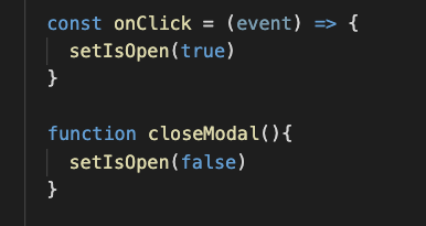
Modal:
For the modal we also going use hook useState:
const [modalIsOpen, setIsOpen] = useState(false);
onClick — invoke function onClick which triggered rendering of the modal.
onRequestClose — invoke function closeModal which removes modal from the screen.
Conclusion
Working with data visualization is great. It allows you to see what the situation actually is like. And easily communicate your findings with the non-tech world.