You are viewing a single comment's thread from:
RE: We draw the letters M contest: Dressing up
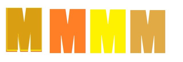
Sorry...I thought it was obvious. I just kept superimposing smaller versions of M--three to get the layered effect. I started with 200 Impact font, in bold and went down. Something like this, though I don't remember the exact values and shades: (I used a simple Paint program)

Next time I will show each micro step. Nice contest!