Community Feedback Request: Curation Guild Logo Development
By now, many of you will be aware of the ongoing development of a new curation guild which is founded upon a different set of principles. If you missed the post which introduced the idea to the community, you can find it here.
With voting power delegation arriving in march, the need for us to use a third party curation trail service such as streemian will be negated, and so from now until then will be spent developing on the idea so that it is ready to be put to use come the next hard fork.
A few days ago, a 100 STEEM bounty was offered to whomever could come up with the best name for our new curation guild. Though there were a number of great suggestions, and the winner was paid for providing the best one, we decided to go with a different name.
The guild will be named, "Ascend."
This name was chosen because our goal is to set higher standards for Steemit. We will do this through finding higher quality posts, and ensure they receive higher rewards, so that they can achieve higher visibility by being higher up on the trending page. This guild will hopefully inspire higher quality posts all around, and lead to a higher amount of users, and in turn, a higher value of STEEM. So yes, this is why the name "Ascend" was selected.
I have been working on some early logo design concepts, and feedback from the community would be greatly appreciated. This is for all of us, so I feel we should all have a chance to make suggestions on how it can improved. That includes the logo design.
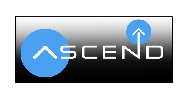
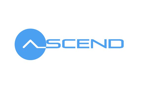
Here's what I have so far;
Logo One:

Logo Two:

It would be useful if you could tell us;
Which do you prefer?
Why do you prefer it?
What changes can be made to improve the logo?
Is there a more suitable colour scheme?
Too simple/complex?
Is a font change necessary?
Anything else you can think of..

Dude, that second one is where it's add!
It is beautiful just the way that it is, no joke.
The font flows flawlessly.
The first one I'm not too keen on because the gradient is a bit abrupt, and I'm not fond of the double upvote symbols in it...maybe with the boxes corners rounded a bit, a more subtle silver gradient and just the "A" having the upvote symbol? Either way, the second one is crazy clean. Nice job, bud!
Thanks for the feedback.
So, I took your advice on how to improve the first design. With these changes, do you still prefer the second one?
That's a much harder choice, but I would have to go for the new one now. Very nice!
Thanks for your help. With every bit of advice the design will only continue to improve.
Much appreciated.
The second one of these two new ones looks great!
told you :D , here the second is better because of the shadows. It pops into view a bit, I still like the first(second) one simple and stunning as @rigaronib pointed out :) it seems to be a question of esthetics and yeah we all agree :D the logos are great. Have to second the @skypal it would be better if the circle wasn't there in the first logo, symbolizes a house and the upvote (also the gradient)(I'm not sure why it's used even on steemit pages) simple is great when you convey a message. Best design practice take out everything that doesn't have to be there. it's not a art composition. It could be but simple is best. Still i like the second one because the background fits the white "paper" could be transparent and the text is flowing together, the space between kind of spaces everything too much, at least when you compare the two, plus it looks badass and you can always add information around it because it's so simple it can carry any message and compliment the page :)
Excellent feedback. Thanks a lot.
I like both. On the first one, I might lose the second upvote graphic above the N. I think I prefer the second one though.
Seems at least that we're a few in this comment section that see two blue upvotes as excessive in the logo. Personally I still prefer the first one over the second.
For what it's worth, I love the first logo. Thumbs up and hope this project goes great!
You're the first to. Lol.
Thanks a lot.
Ah, good choice for the name. I prefer the second logo. I don't really know why. Maybe if the first one didn't have a background, or no gradient, and the A didn't have a blue circle, so that just the N had the vote button. I like how the N ascends into a vote.
I can see where you're coming from with that... removing the first blue circle sure wouldn't make it look any worse.
glad you're here :)
It's good to get to know you too :) I love support good community projects. Any projects taking us closer to liberty and a warm welcoming society really.
Yeah it seems that the second is by far the favourite, even though that one was a lot easier to whip up.
Simple is not always a bad thing though.
Ya, I think simple is good for a logo.
Sweet! I like this one the best actually. I think the second one in your original post looks too much like Curie. What do you think?
I really don't know. I find things that I like and dislike in all of them. This one isn't going to work. I realised that it only looks good at a large size. When it is small, the writing is not readable, which makes the logo useless.
I'm kinda leaning towards the second one I posted in response to @rigaronib's comment. But most people seem to think the one you said looks like curie is the best, so I may have to go with that one, but just tweak it a tiny bit.
Ya, I mean, it doesn't really look like curie. The one you posted in response to rigaronib is cool, too. They're all pretty cool, lol.
Hi mate @son-of-satire - what does that mean for streemian then "With voting power delegation arriving in march, the need for us to use a third party curation trail service such as streemian will be negated"?
I imagine Streemian will still be active. It offers a lot more than just curating services.
Also, voting power delegation will not return curation rewards to the source, so whales that delegate their power to guilds for the sake of earning more curation rewards will continue to use third party sites such as Streemian.
We would just prefer not to use a third party platform, which is why it is mentioned in the post.
understood or at least a bit with my minnow knowledge - using third parties is nowhere ideal in business (usually) - thanks for feeding back, appreciate the reply @son-of-satire