Lovecraftian Horror Comic Preview
Exciting News!
Many of you have discovered me through @drwatson and his posts about the comic series we are working on together but for those of you who don't know, Hi. I'm Theresa. And I've had the honor of illustrating @drwatson's comic, Ithaqa. It's a 1920s Lovecraftian horror comic set in Ithaca; it follows a filmmaker/conman as a moving picture he’s struggling to produce goes horribly wrong. It has everything you love aesthetically about the 1920s prohibition era with a little dash of creepy cults and cosmic horror.
If this sounds like something that tickles your fancy, then today is a great day night for you! If you sign up here you will get an 8-page preview of the story! You'll also be updated when the book goes on sale.
In case you need a little visual persuasion, I'll share with you one of my favorite pages that I've done so far and it's rocky start.
The Rough Roughs
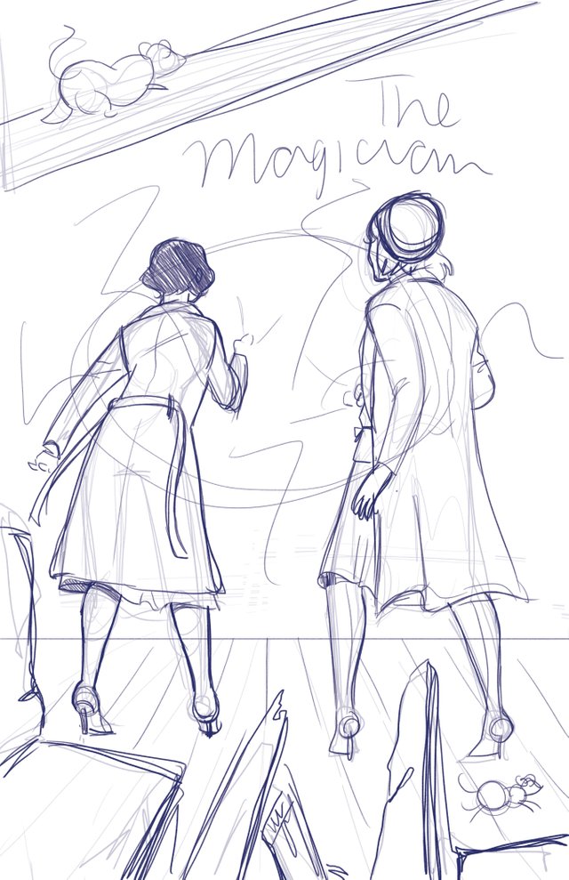
This is one of those pages where I had a lot of difficulties getting the vision in my head onto the paper (or the computer screen in this case). I had this awesome picture in my head but I was having trouble finding good references for the poses and angles I had in mind so when I sent off the rough to Michael, I very professionally told him he was gonna have to trust me on this one and that it'd look a lot more dynamic in the future.
Things Start To Shape Up in the Pencils
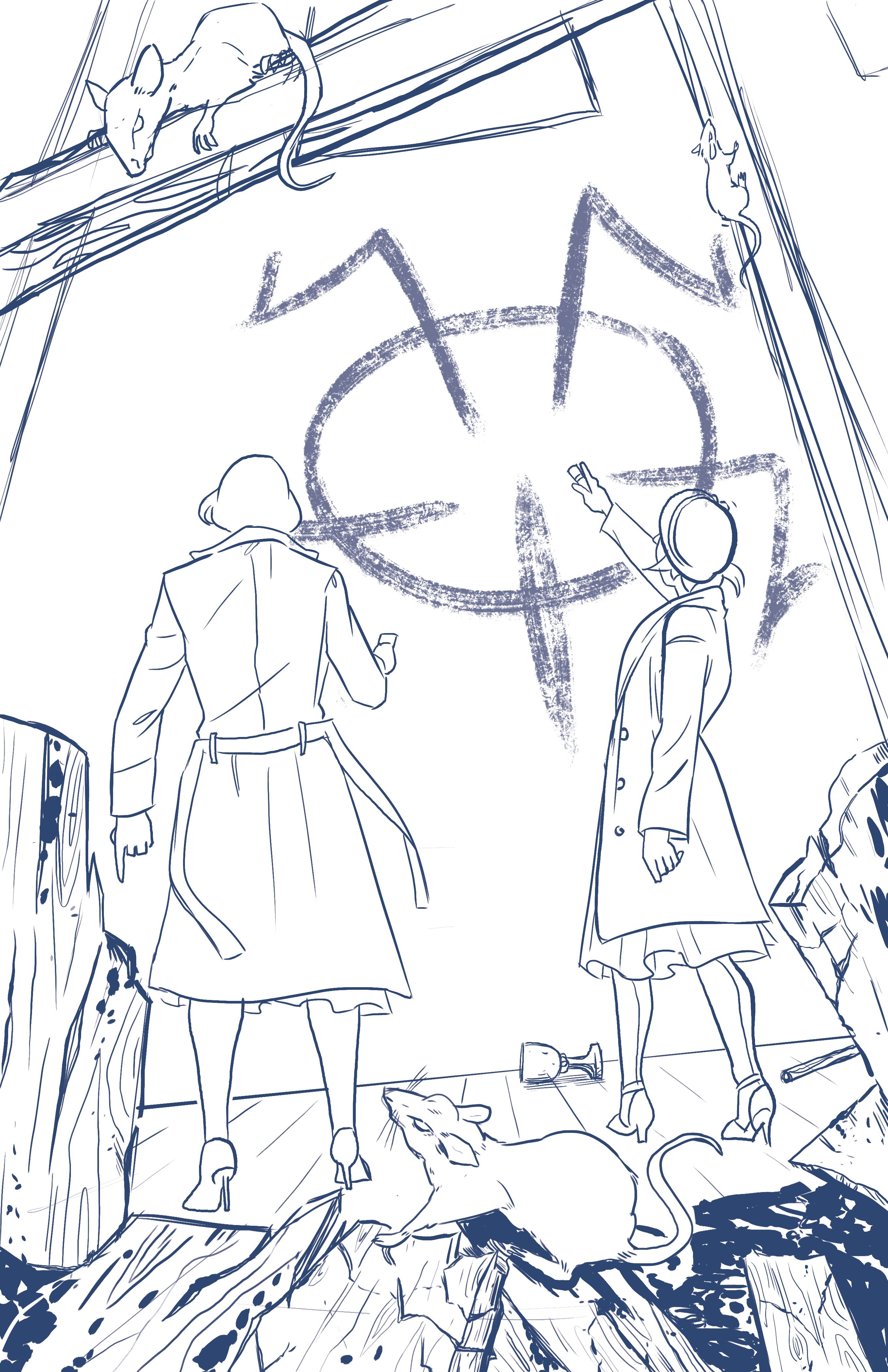
Thanks to the power of photo references (and if there is any one shred of wisdom I can bestow upon anyone, it is to use references photos), things definitely came together in the pencils. All of the splash pages correspond with a tarot card, so we tweaked the poses a bit and added some extra elements to match the magician tarot.
The Inks
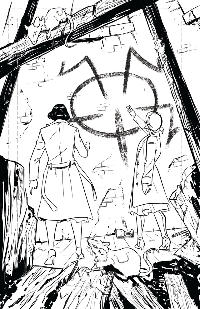
I'm not sure if you can tell but in the inking stage, I shrunk everything down a little bit so more of the church rubble could fit within the trim and safe line. I leave a lot of space for the bleed because I get very paranoid about weird cropping when it comes to printing but then I always come across the problem of me getting attached to the stuff I draw outside of the trim line which leads me to usually shrinking the image. You always have to draw outside of the trim line because printers aren't perfect; they'll either cut a wee bit inside or a wee bit outside of the trim line. I have to make peace with the art I draw the I know will be sacrificed for the sake of good printing practices.
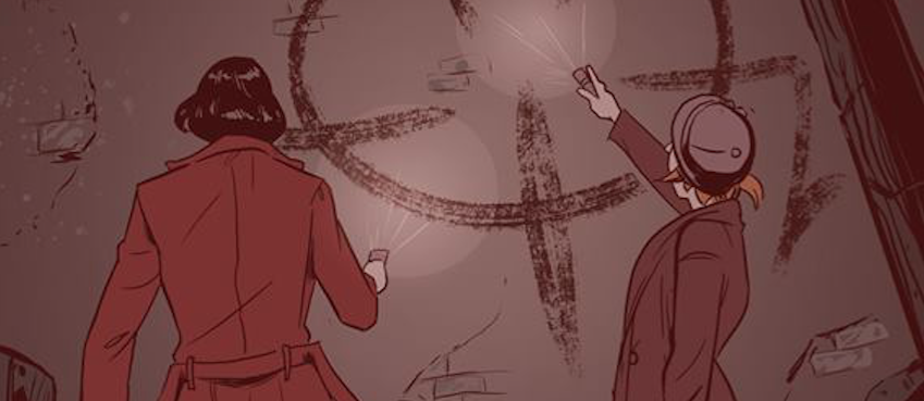
The Finished Page
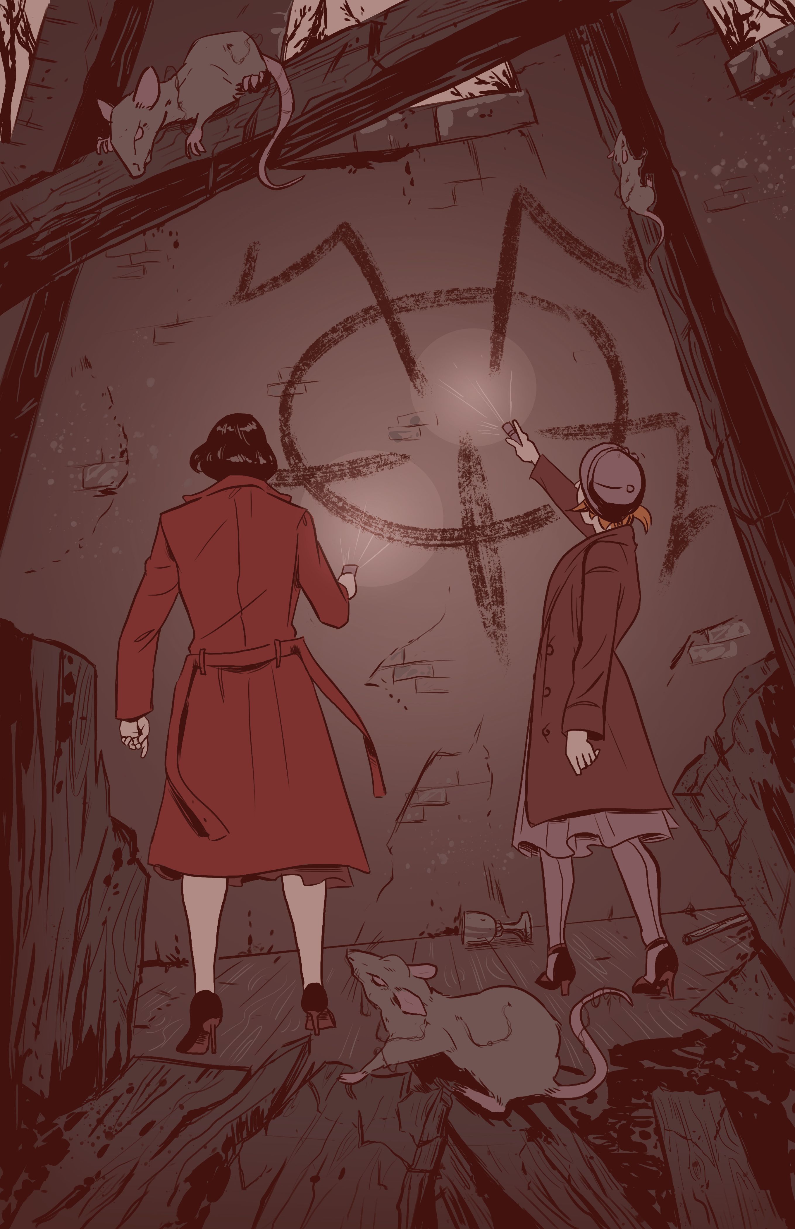
Well, almost finished... the letterer adds the finishing bits at the end. But for me, this was the last step. And I was pretty happy with how it came out. I normally stick to just flat colors but for the splash pages I use a few gradients to add to the atmosphere.
Thanks for reading till the end! If you're interested in the series please sign up for updates here! And if you're really interested please spread the word.
Don't forget to check out @drwatson if you're curious about the writing side of the comic process.
Until Next Time 👋
If you'd like to keep up with more of my work you can check me out at the following:
Instagram: @la.fumettista
Tumblr: http://la-fumettista.tumblr.com/tagged/art
Twitter: @TheresaChiechi
Website: https://www.theresachiechi.com/
You have an eye-catching artistic style. And, as a graphic designer of more than 25yrs experience primarily in print (magazines and newsprint), I can advise that you can be sure of your bleed by leaving 1/4” more than the required page size. Then, you will always be assured of a full bleed page, but not give up critical illustration elements.
interesting artwork, the process is great! following you