#ColorScience
What is color? To begin, the general term is applied to the way light exposes the visible hue, value, and saturation of every material color we see.
“Hue” is the specific color in the rainbow spectrum; the spectrum includes every possible hue that exists. For expediency, colorists, color scientists, artists, designers, decorators, etc. refer to this material color spectrum – as opposed to the light spectrum – as the color wheel. Every hue has its place in the progression on the wheel from one to the next, to the center. “Value" is a determination of the brightness of hue, if it’s pale or dark. “Saturation" is the term we use to describe how vibrant or subdued a hue may be. Every material color is perceived in terms of its hue, value, and saturation. This is the spectrum of color commonly referred to as a “color wheel.” We organize the spectrum on the color wheel by primary, secondary, and tertiary colors.
Primary colors are “red” and “yellow” and “blue.”
The secondary colors are a mix of two primary colors: red and yellow make orange; yellow and blue make green; blue and red make purple (or violet).
Tertiary colors result from mixing a primary color with its nearest secondary color.
The color wheel pictured below shows primary and secondary color progression. As you can see, the wheel is a convenient organization of all the colors of the material color spectrum because the mix of colors transitions from reds to oranges to yellows to greens to blues to purples, and then back to reds.
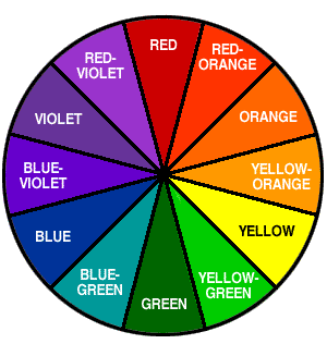
Image source from “Offset Printing Technology | Offset lithography”
http://www.offsetprintingtechnology.com/2011/basic-color-wheel
Please note: This essay does not seek to elucidate the science of print color management. Basically, though, print color management mixes cyan, magenta, yellow, and black (CMYK) to achieve every color in print.
The color wheel is also a useful visual tool to determine the complementary color to each hue on the wheel. Colors that appear opposite each other on the color wheel are designated “complementary colors.” The term “complementary colors” does not necessarily mean that those two colors will look good together. In fact, depending on the values of each, mixing them will produce browns, or, with high or low enough values may produce black or greys. Pairing complementary colors side by side visually emphasizes both colors because they visually conflict with each other.
When we look at the light spectrum (as in astronomy), what we perceive as white is actually every color of the light spectrum. While in “material color,” or pigment mixing, white is achieved by a removal or an absence of color. Rainbow light and rainbows in the sky occur when white light passes through a prism, dividing the light colors into the visible spectrum we call a rainbow. This effect was scientifically established in the 1660s by Newton in his treatise, Opticks; the seven visible colors we call a rainbow is “Newton’s Rainbow,” derived by his experiments with sunlight and prisms.
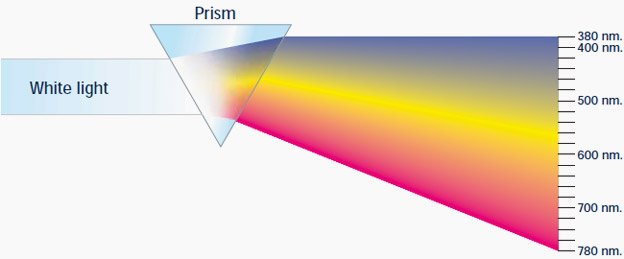
Image source from Online Sciences https://www.online-sciences.com/the-waves/the-nature-of-light-waves-and-analysis-of-white-light
In the 1720s, the science of print color management emerged when J. C. LeBlon was the first to codify “material color” from Newton’s “light colors,” forming the basis of modern color printing process in his treatise, Coloritto, or, The Harmony of Colouring in Painting. Newton’s treatise further gave rise to entire science on the psychological effects of color, when Johann Wolfgang von Goethe challenged Newton’s views on color and expanded accepted understanding of color with Goethe’s own systemic study on the psychological effects of color – the first of its kind – in his Theory of Colors, published around 1810. Both LeBlon’s and Goethe’s theories and studies have been expanded upon and continue to be fine-tuned with today’s expanding technological advancements in color science specialties.
Panatone as a company is the premiere authority on color management and their “Panatone Matching System” (PMS), with around 1,870 proprietary color formulae, remains the standard in color science and mixology. The Pantone color-books of swatches (below), are organized to fan out into a wheel, and include mixes of hues that give us whites, greys, blacks, and browns. Each swatch has a color formula, or mixing code that, if followed precisely, will give the exact color result shown on the individual swatch.
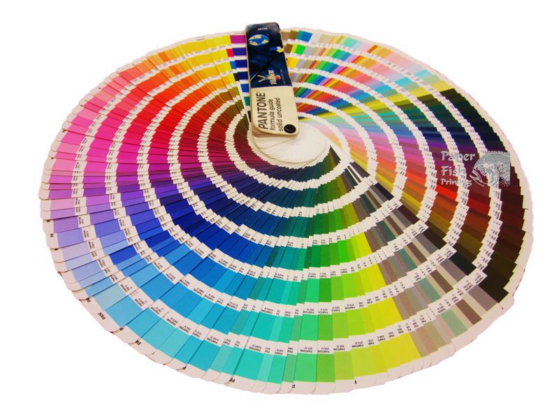 Image sourced from Panatone
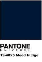
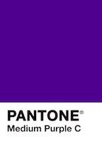
I hope this essay will be useful resource for Steemit users choosing submissions for the various #ColorChallenge(s). Particular thanks goes to @kalemandra for creating a permanent daily ColorChallenge. Here are the Panatone swatches for the daily colors as set out by kalemandra: MondayRed, TuesdayOrange, WednesdayYellow, ThursdayGreen. FridaySkyblue, SaturdayIndigo, and SundayPurple. The following reference images of the swatches below were sourced from Panatone https://www.pantone.com/color-finder
MondayRed – TuesdayOrange – WednesdayYellow – ThursdayGreen
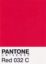
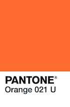
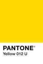
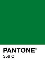
FridaySkyBlue – SaturdayIndigo – SundayPurple
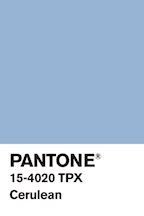
For further reading about color science, I recommend the Boston University article, “The Science of Color: CFA class teaches how hues fool the eye, what it means for art-making” http://www.bu.edu/today/2018/the-science-of-color/
This is really interesting, especially the last images with Pantone colors. That means nobody knows the real indigo color! me, too! :)))
Interesting point there @kalemandra... but I guess isn't that the beauty of colours? As in everybody has a perception of what they think a certain colour is and if you put two suggestions together they could be completely different from each other. With the colorchallenge (thanks for hosting it) it's been interesting to see how people see these colours in nature/objects/things etc. And I think it's a good thing that we don't know what a certain colour is exactly, as it always creates a sense of mystery :D
Actually, @allanshrstha, I was inspired to compose this article by the confusion over which colors are which. As a former print media graphic designer, specializing in color management, I often noted people feel a certain way about color names, but exhibit confusion when visualizing the physical color – they “feel” like the name which appeals to them should apply to what they “feel” is the color. It doesn’t help that the industries making money off color marketing exploit the aesthetic appeal of these color names. We humans want to be part of the trending aesthetic – it’s in our natures. Unfortunately, outside of art/design school, most folks don’t learn more about color than the basic primary and secondary color wheel.
Interesting way to look at it. But I guess if someone is completely "feeling" the colour wrong.. meaning if they are thinking a blue is actually green then I see your point. But if lets say a blue for someone is actually a dark blue, then it's still blue right? So, for me from the pie chart you've got above I identify orange as whats listed as yellow-orange. That doesn't mean I am wrong though.. and no I'm not "feeling" what the colour should be, thats what I identify orange as by looking at an "orange" the fruit. Thats what I've been taught orange looks like. So, it really depends on the application of the knowledge of colour, that matters. If you're using it professionally - like in art school, graphic designing, painting, decoration etc. then I guess you have to know exactly what a specific colour looks like to it's very detail. But in daily life if it's close enough then it shouldn't be too much to worry about as long as someone is not getting it completely wrong.
Up to a point, I agree “in daily life it’s close enough.” But, I’ve seen more than a few “indigo” submissions that were definitely more like lavender or lilac than a shade of blue; I’ve also seen a plethora of gorgeous purples submitted as indigo and vice versa. Indigo is a dark, pure blue (it’s that shade of blue just bordering the flaming sunset, as darkness overtakes the sky), as opposed to navy, which is a black-blue. As to orange vs. yellow-orange, I would say that the fruit comes in shades ranging from yellow-orange (as most grocery store oranges look) to pure orange (the orange I used to see when we plucked them straight off the tree, fully ripened, in Florida) and red-orange (or the Seville orange color often seen in Spanish paintings, especially from the Renaissance era onwards).
I really think most of the confusion is down to industry marketing. They spend a lot of money researching and then marketing a color name. They intend to make people feel an aesthetic draw toward color names, the same way we inherently feel something about colors. But, my experience is that most people seem to find the names arbitrary and don’t necessarily connect them to the corresponding physical colors.
Actually, the psychology of color is fascinating. I encourage everyone to read a bit about it.
Interesting article, I must admit I never actually knew how #indigo looks or are supposed to look until I joined @kalemandra's #colorchallenge. I also have to admit that of all the colors, I have the most difficulty in finding original photos in my photo albums with #indigo colors. I think it will be easier from now on to find or take photos with this color in mind. Thank you for writing this very informative article.
Thanks for reading. And, I’m glad you find my essay helpful.
Thats a quite informative @momzillanc! I enjoyed reading it :)
Thank you.