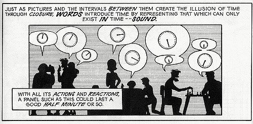
Timing and pacing

How do you play with time effectively in comics?
In moving image media such as cinema this timing is, to a large part, in the direct control of the director and the editor. It is, of course possible for the viewer to pause, rewind and skip forward if watching outside of the confined viewer experience of the movie theatre. However, if the director has done their job right and created an engaging story, you will most likely watch at the normal speed, as intended.
This scene from Better Call Saul gives a sterling example of playing with time. Please note, this video has a trigger warning; please view at your own discretion.
https://www.youtube.com/watch?v=ya3_EwQdJrkNow.
Take a moment and let that sink in.
Did you feel the same intensity of emotion as Kim?
Were you focused, then calm, then relaxed, before lulling into relaxation, and perhaps some anticipation given the warning. And then, were you as surprised by the adrenaline moment* as Kim was?
Somewhat shocked, slow to comprehend? Dazed and confused?
Stories are pretty amazing things. They can teach us a lot about each other and the world. But it takes a masterful hand to keep you engaged in that world, and even more to put us in the experiencing body of its characters.
If I were to break down this scene and depicting it in static, disparate shots, the choices of timing available to me immediately change. However, much remains the same. I have images. Words. Flow/drawing attention. Framing. Choice of transition between shots.**
The thing I do have, that the filmmaker doesn't, is the fractured nature of panel transitions. I know that comics can hook a reader to the same extent as that scene does. If they couldn’t, comics wouldn’t have survived for this long and expanded into so many avenues of our daily life, all over the world.
I create comics. I need to be able to do that too- to stretch out a long moment.
Fade into a relaxed lull, so peaceful, and then Exploding!
Stunned moments.
Unbelieving shock.
Dawning of consequence.
The curtain closes, the scene ends, the page turns.
*Notes*
* Adrenaline moment- Rule 42 of Ed Hooks' 52 quick acting notes.
** see Scott Mcloud's seminal text Understanding Comics for more on panel transitions
A brief introduction to panel transitions
(If you're still here, what do you think? What are the advantages and disadvantages of working within comics as opposed to cinema when dealing with time. Know any great examples, from any medium? Keen to hear your thoughts.
Interesting stuff. I added McCloud's book to my amazon wish list and will be reading the wordpress article soon.
Upvoted, cos I learned something new!
P.S.: In the video, did the audience fall asleep along with the driver, and wake up when she did? Is that how I'm supposed to interpret the cut?
Yeah, learning! I'm pretty sure that cut was a micro nap- if you know the show, this character is on the verge of exhaustion at this point of the story. Once the stress wore off for a moment, micro sleep, and bam. That's my interpretation, at least
Yeah that's what I thought too. It was a nice one - hard to find a new way to show a car crush anymore. I was expecting, from the title of the video, just the good ol' car-appearing-out-of-nowhere trope. I was pleasantly surprised when that didn't happen!
I watched all the seasons of Breaking Bad. Maybe I'll watch BCS in the future. I sometimes wait till a show is done so I can binge!
Yep I know what you mean. Although the car hitting from the side is often effective, its a little overused. I'm thinking the end of No Country for Old Men, and Adaptation as two uses where it was really surprising. But this was a new way and completely unexpected. It would be worth looking at it frame by frame to see how the hit was edited with such impact. And you should definitely watch BCS if you have time. It's just finished the third season so enough for a whole weekend if you're dedicated :)
The only "disadvantage" I've ever had working with comics is never quite being able to figure out how to express subtle emotion. This is more of a me and less of a medium issue though XD
I know what you mean. Faces and hands are hard!
Will Eisner's work is a masterclass in pose, expression and gesture. Also, you should check out Scott McCloud's Making Comics, there's a great section on breaking down the myriad of facial expressions into a handful of base expressions. The whole book is genius.