The illusion of choice in the free market - Infographics show who owns almost everything we consume
Fascinating and slightly concerning infographics that show who owns all the major brands in the world, and how worryingly little our 'choice' as consumers actually means.
A great visual insight into how much of a consolidated and monopolised world we've become.
Consumer goods:
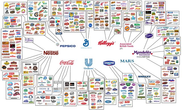
As you can see —Mondelez, Kraft, Coca-Cola, Nestlé, Pepsico, P&G, Johnson&Johnson, Mars, Danone, General Mills, Kellogg's, and Unilever own everything.
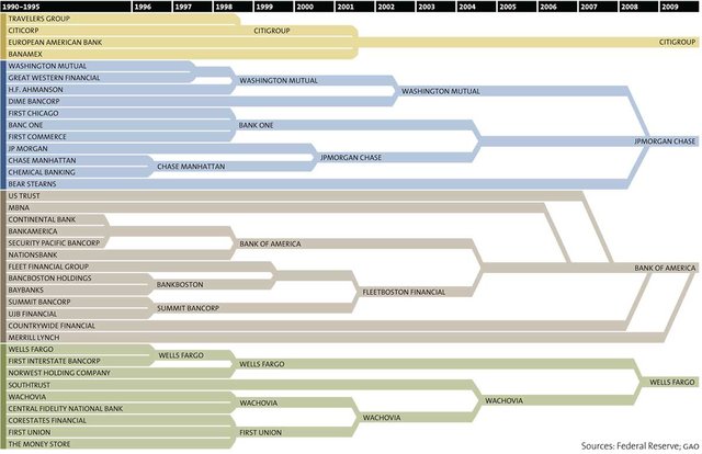
But it doesn't stop there, of course. Our money is all in the hands of a few megacorporations too. Here's all the stuff that merged into Citigroup, JP Morgan Chase, Bank of America, and Wells Fargo since 1996. Now, according to MotherJones, 54% of all the financial assets in the United States are owned by just 10 institutions. (Thank God for cryptocurrency, eh!?)
This list goes on...
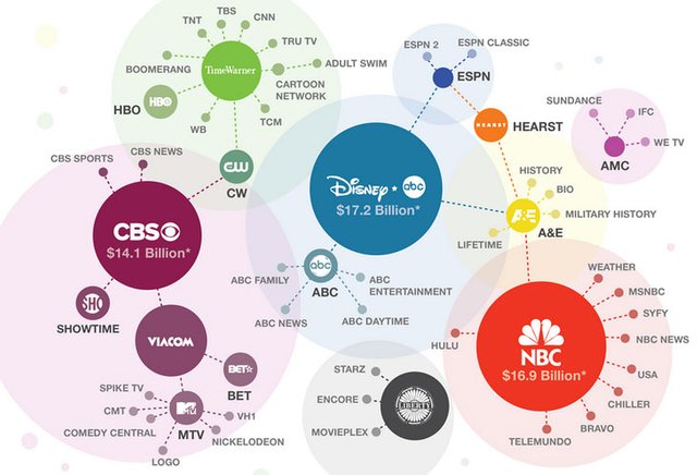
Studios and media companies:

TV Channels:
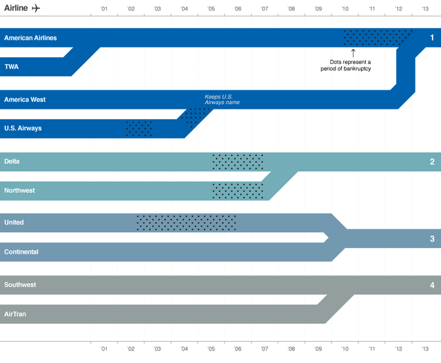
Airlines:
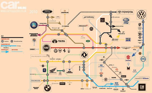
Cars:
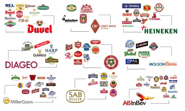
Even your beer:
This process of consolidation is alive and well in the tech industry too (although I didn't have an infograph for that) with the giants like Google, Amazon, Facebook etc. attempting to monopolise the industry.
Here's a few articles on the topic that might be of interest:
Not so much consolidation as the 80/20 rule?
CG