✴️ WOW, DID YOU CHECK OUT THE NEW STEEMIT BLOG INTERFACE! WHAT DO YOU GUYS THINK? IT LOOKS AWESOME!
I just wanted to get this blog out real quick, did you see the new Steemit Structure? It's looks so awesome, and it's runs more smoothly than before 😲😎
Check out the images below: 👨🏼💻
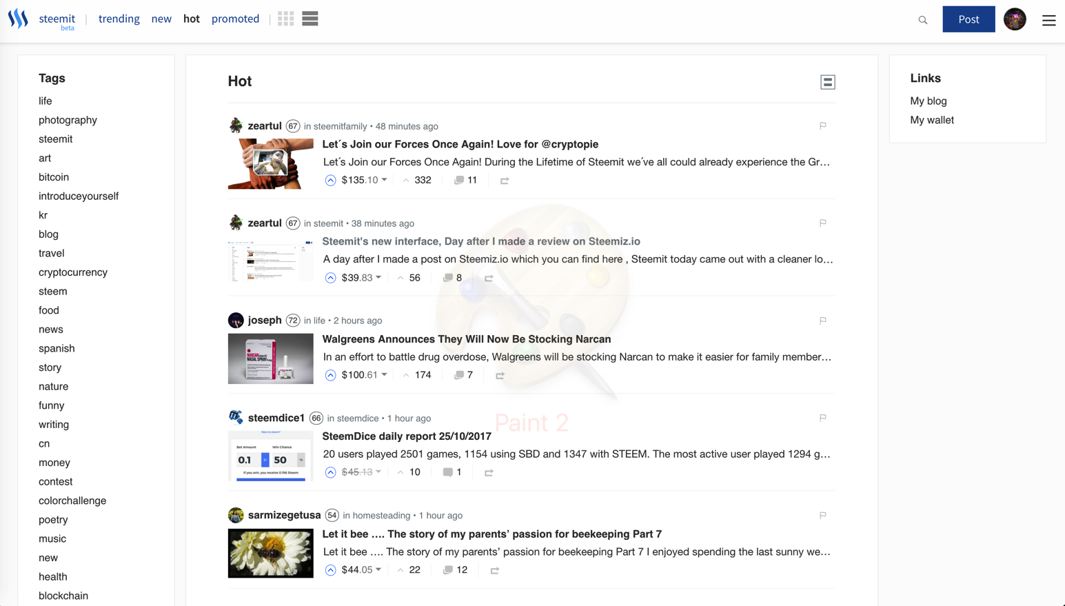
Tell me what you guys think? I know Steemit has lots of work ahead of them but this is a great new update for us Steemians. 📝
I'm so excited in the future of Steemit, there were several negative comments from a few bloggers the last few weeks about the speed. However guys, we are still in beta!
More fantastic things are coming down the road, get ready guys! 💞


So far pretty slick and load times seem a little better but still far from being optimal. Steemfest is coming up!
Nice.. Coll.
I owe you a big upvote for being a loyal Steemit bad ass :)
It was really annoying to wait 1-2 minutes for a reply or comment :p It looks cool man
Yeah Man, It's looking way better! :)
I hate it. It's too white and makes it harder for me to view. That's just my opinion I may get used to it but right now..nope not an improvement. Also I tried to upvote this and it's still circling so it seems between this and the new logo the boys just putting lipstick on a pig. We need them to focus on fixing all the issues the site's been plagued with for almost a month @stackin
A dark version would be great for this patform.
Dark version would be sick, kind like Steemnow's dark theme. Would be a great setting for nighttime use.
It's not you. It's not the you hate the new design. It's simply that the new design is badly thought out.
I now use https://stage.steemiz.io
It has some bad design to but it's much better than the current steemit design. I will try to send my recommendation to both and also to all other designer looking to build a Steem front end.
Thanks, @teamsteem for Stage.Steemiz wasn't aware of it. Liked and bookmarked.
Update: I'm getting more used to it already haha I hate change maybe?
Quite possibly. I love he clean and bright, but certainly noticed it on the first refresh that it appeared on. I can understand how others prefer an off-white background to make things easier to read for them. Would be nice to have some customisation ability so we could personalise how we see our own feed
Quite possibly. I love he clean and bright, but certainly noticed it on the first refresh that it appeared on. I can understand how others prefer an off-white background to make things easier to read for them. Would be nice to have some customisation ability so we could personalise how we see our own feed
Yeah, it's still slow still... took me 3 minutes to comment haha
Meh its okay... could of been better done really.
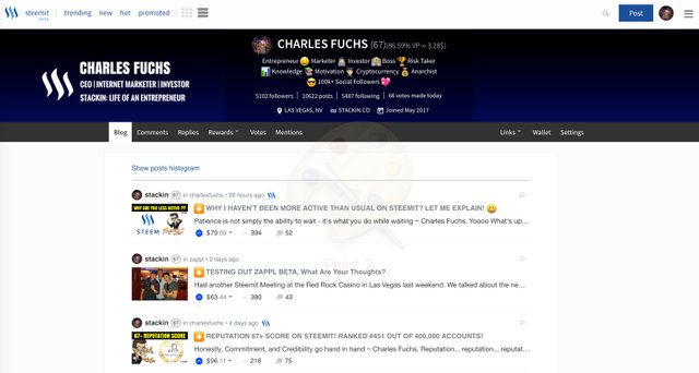
Good catch @stackin caught me and my two hot posts!
Opps my bad, friendly steemit competition haha jk
It definately proves that they are working on the interface now! I bet more upgrades are coming especially after the 2x fork
Yep, it is cool, but i hope it will stop to be so slowly!
Yep, it is cool, but i hope it will stop to be so slowly!
re arranged the deck chairs...new paint..
still sinking?
Only time will tell....
It's looking good, I was surprised to see the new look and feel! Good to see the productivity of the team!
im diggin' it! 😎👍 🔥
I'm really digging it! :)