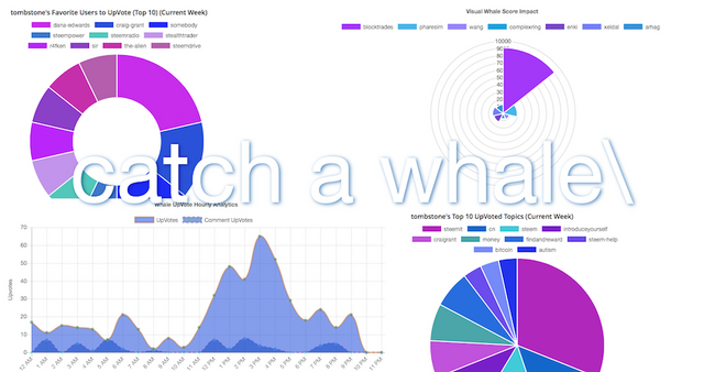
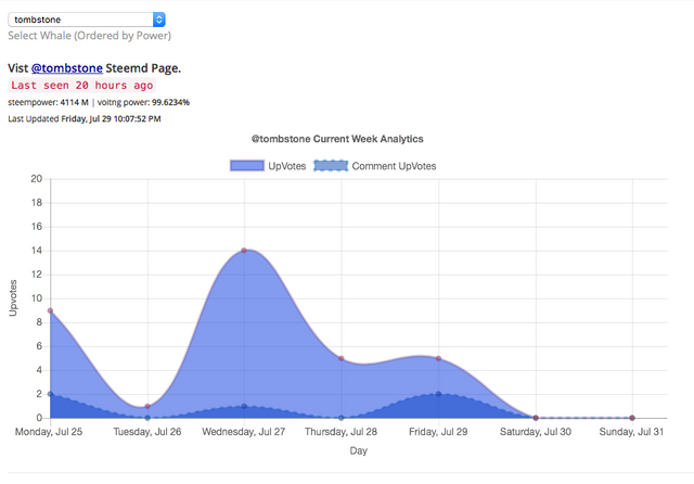
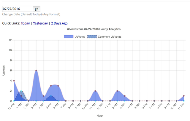
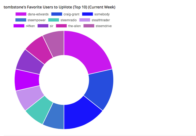
[catchawhale] Graphical Update - Now with Hourly, Daily, Weekly Whale UpVote Analytical Visualizations & More!
The Script bases itself on the Top 70 Steemit Active Users (better known as 'Whales'). It analyses the amount of posts within past hour (pwh) and the weight of that Whales potential up vote power. realup = (Vesting Shares(Voting Power/100))*
The Script then determines potential chance of catching a Whale (Getting an Upvote) for the upcoming 20 minutes.
The Script outputs a number (Whale Catching Score) which starts at 0 (no activity) and increases depending on, you guessed it, Whale activity. wcs = realup * (1+(pwh/10));
Graphical Whale UpVote Analytical Visualizations Update!
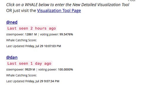
Instead of going through each of the new Awesome Whale Visualizations here... I'll just let you explore! Enjoy!
Screenshots from catchawhale.com
I have only really just begun!
Stay Tuned & Enjoy the Whale Watching ;)
Blue
Ps - Any Feedback, Bugs, Etc? Comment!
Also I love posting when it says this! ;)
Potential chance of catching a whale is currently very low (Consider waiting a while longer for more Whale activity!)
For anyone trying to catch a school of minnows, Check out our group #MinnowsUnite (125+ Steemers Strong!)
https://gli.ph/g/mT205P/CbFybHevfa12pvgQqtZgt50coGG6ZTyxDzDyWSXQJ7s=
excellent. good job! have upvoted.
I would be interested in a "catching minnows" stat post which does the opposite of this; what highly upvoted or trending posts have been mostly upvoted (say 90% or greater of the vote value) by "minnows" (persons whom are in the bottom 90% or so of the Steem Power holders at the time of voting).
Well I did actually build this for the minnows :) and because it was fun to be honest
So many charts...
All with their own purposes ;)
nice script! It is really helpfull for me. hope to catch a whale!
Great to hear! Enjoy
This is genuinely a great post....I liked reading it. Thanks !
Awesome! Look at @bernisanders go! :)
Which time zone is on the charts though?
Hope to see some weekly and monthly trends over time.
Time wise, It's currently synced up with the blockchain.
Which is -1 GMT, right?
Thanks for the great visualization tool! The graphics and charts looks pretty good, closest thing on the pie chart might be to add another color to 'slices' so that the blue for bernie sanders and next highest one are a little more distinct, but that's really a very minor thing. I do think it'd be nice that when you click on the pie slice for a what that it takes you to their stat page (versus having to scroll to the activity feed and click their username)
Hi
What is the timezone on the graph?
UTC
You know that it was an insanely fast reply considering the post is 11months old. Loved it.
Hi! This post has a Flesch-Kincaid grade level of 6.5 and reading ease of 74%. This puts the writing level on par with Stephen King and Dan Brown.