My golden chance to prove I can be a graphic designer.
A month ago I got my chance and didn’t let it escape!
I’m going to tell you the experience.
A month ago I got a job interview. In this, as a part of a test to enter to the graphic design part, I had to redo some logos they send to me. I took recently a graphic design course and soon I hope I’ll receive my certification, so, this was my golden opportunity to prove, I can do it!
...
My anxiety is consuming me. It had been a while and i have not received an answer of the job interview. I’m afraid they will let in me in "check", like any other people.
I want to share these logos because; I don’t want them to be forgotten in the files of my computer. The thing will make me very sad it is watch my logos, for most "horrible" they look, it will definitively have a use in any place.
I had experience this before with a company which makes cleaning product. chloro for be specific. they attached to the " I don’t like it" for avoid me but at the end, they really used my logo in their products. I didn't know what was the destiny of this company but it was a sweet sour feeling watch my logo on the supermarket with the " you know, we don't like you logo" in my mind.
...
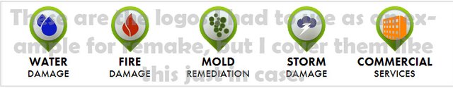
These are basic sketch of the first ideas.
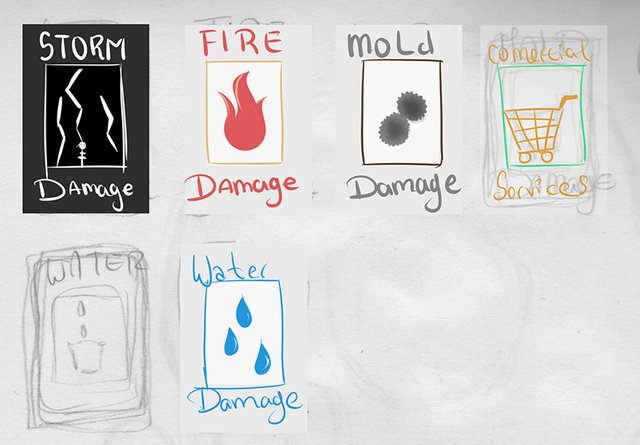
Basically, I wanted to limit myself to use less color I could. I wanted them to be simple and intuitive..
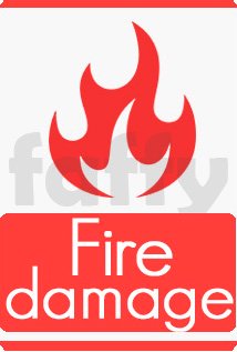
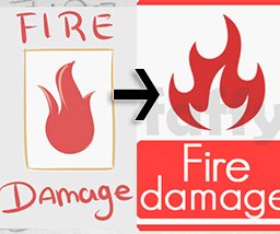
For the Fire damage, there is nothing that represent better the fire than a flame. I helped myself with vectors because, manually, I was incapable to draw a flame. It wasn’t a good time for shaking hand. -_-
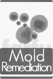
In Mold I wanted to make reference to the bacteria in a microscope level. I drew a circle with many little circles on the linen to represent that.

Commercial services, I didn’t know exactly what is this about. But i guessed it was something related to, buy and sell? For that, I used a bag, like a commercial bag on the hand.
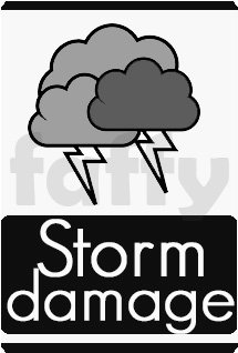
For Storm damage, originally I have thought in a bulb like the electrical entertainment sphere has. The one which attracts little lightings to your fingers when you touch the crystal. But that was many details that I couldn’t represent well, and I change it to a cloud with Little lightings.
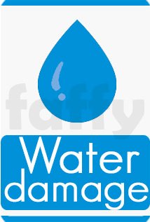
For the Water damage I went for the classic, the typical water drop. I made some shines on the border to emphasize this.
...
I really don’t know what is the reason of these logos, about this, the company wasn’t clear. I wanted to share the job I did, and also the inspiration and the ideas I got for designing them.
It is hard to be a novice, because inevitably, you always do it wrong. But you tell me How do look for you? It is “ok” for not say it is horrible, or I’m just simply a failure without a cure.
Let me see you opinions in the comments!
excellent work! it seems like you have a good understanding of graphic design and logo design :D I hope to see more of your work in the future!
Thank you !
I mostly do artistic illustrations, but the graphic design works I can share, I'll publish it here.
Hello @faffy, thank you for sharing this creative work! We just stopped by to say that you've been upvoted by the @creativecrypto magazine. The Creative Crypto is all about art on the blockchain and learning from creatives like you. Looking forward to crossing paths again soon. Steem on!
Thank you, Thank you! for consider my designs, and for read and stay by.