How to Make Your PowerPoint Look Awesome and Some Pictures of Scandalously Ugly Slides
No, you can’t use the PowerPoint slides as your manuscript during a presentation. PowerPoint is a visual tool. What you say is in your presentation is supposed to be stored in your head or in your notes. The slides should emphasize your message. You should also limit the amount of slides. We’ve all suffered through a seminar where someone made a 75 slide presentation.

You should only make a few slides. I have yet to see an amazing presentation with more than 10 slides.
Disclaimer: I made these slides now, to illustrate my advice. I haven't spend a lot time to make them look as good or horrible as possible. Also I'm no PowerPoint expert, I just like to share advice.

You can experiment with different fonts, size and color. But remember to keep it simple.

Show it, don't write it. This slide doesn’t have to say “My username on Steemit is @susanne”. The audience is smarter than you think they are! Notice the yellow color repeated in the slides? You can do that with your company logo, the company colors or even a repeating shape. That'll tie all the slides together.

Because it looks better and because the audience is more likely the remember it.

I use big text a lot, and I fill the text with my pictures instead of a color.
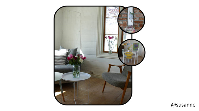
If you need many pictures in one slide, there are many simple ways to showcase them. It doesn’t have to look messy.

Get creative. This is informative, but it also looks good. (This is what I like, we all have different taste.)
If you want the slides to look ugly:
Just copy what I did here and your slides will be hideous.
This is how it looks when someone is using the slides as their manuscript. The audience will read quickly through the text before you start reading it out loud. They don’t have to pay attention to your presentation, because they already know what you’re going to say.
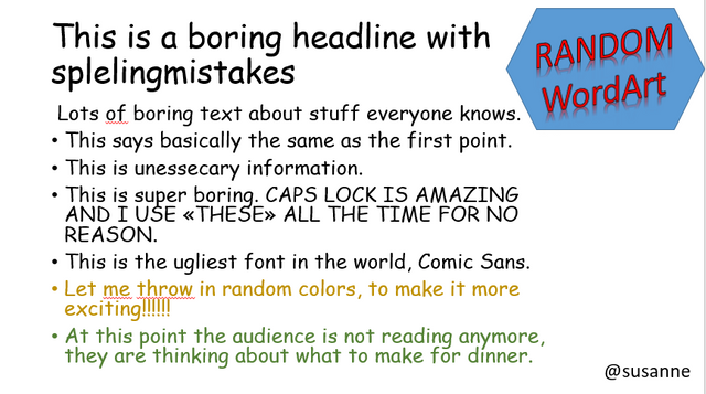
The font in this slide is terrible, and the colors are not doing the slide any favors. Stay clear of cheesy WordArt and the red underline - spelling mistakes.
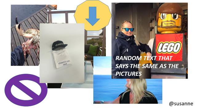
Placing many pictures on top of each other, that are different sizes and different styles, is not a good idea. It doesn’t look good and the audience is probably not going to remember one single picture.
Now, pay attention, this is the most important advice you’ll get from me:
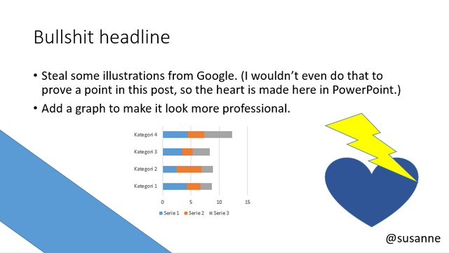
Never steal pictures from Google or any other source online. Not for a PowerPoint, not for a website and not for a Steemit post. If you for some reason need to show a picture from somewhere else, you have to ask for permission, link to the source and name the photographer.
The pictures you find on Google are shot by a photographer. He or she owns that picture and what you’re doing is stealing and benefiting from someone else’s hard work. Not cool!
Take your own picture or make an illustration. There are thousands of stock photo websites where you can get images. It’s easy, cheap and legal. If you use other people’s pictures, and especially in a business setting, you can get inn all sorts of trouble. And people are not going to think of you as a professional. Luckily, most people know this.
Good luck with your future PowerPoint presentations, and remember that less is more.
The song of the day is this Norwegian band.
Susanne
Hey nice post! I really enjoyed it! Thanks
Hi @powercouple .Thank you, I'm glad you enjoyed it.
As someone who has to deal with hundreds of presentations a year (I work in A/V), I completely agree with you
If the audience has to read thousands of lines of text during your presentation they will NOT be paying attention to what you're talking about
Presentations should make the point you can't through speech, and be there to reinforce what you're talking about. If your entire presentation is focus around your powerpoint (or keynote, or whatever), then there's no point in YOU being there- the audience could download it from the internet and get all the same information!
Oh, my brother works in the same business, and I feel your pain! ha ha.
I completely agree, and what you say about "there's no point in YOU being there" is a very valid argument. Thank you.
I shared your post on my companies facebook page...
Another tip for presentations is to make them in the aspect ratio of what they're going to be displayed in. 4:3 presentations look terrible on 16:9 screens and vice versa. All major presentation software (powerpoint, keynote, etc) have the option to change your slide format, and duplicating your presentation into both formats will maximize your screen space- no black bars on the top or sides.