SEC S19W4 || Organization using CSS (box-model Display, Position, Flex)
Hello guys,
It's a pleasure to be part of this week's engagement challenge which goes with the title Organization using CSS (box-model Display, Position, Flex). This week the contest is organised by @starrchris and it is a beautiful contest as all hands are on practicals. So without further ado, I would like to start immediately.
Background image Edited on Canvas
1. Theoretical Questions
| Explain the Difference between the in-line display and the block display. |
|---|
There are majorly two display formats when dealing with web development and these are the in-line display and the block display. Simple Web development which has to do with the structure of HTML and the design of CSS uses either of the display formats I have named above and whichever display format is used determines the outlook of the webpage when viewed on a browser.
To properly see the difference between the in-line display and the block display format, I will want to present a table below which shows their differences from each other.
The differences we will be looking at in the table below will be based on the following headings, layout behavior, size common elements, and use case.
| In-line display | Block display | |
|---|---|---|
| Layout Behaviour | Here, you don't start the elements in a new line instead you will have to add them within the line of code you have created | Here, you must start on a new line and always call the element or tag you wish to work on |
| Size | Also, here width and height don't work, this means that if you apply for a specific width or height, it doesn't work here as it will carry the same width and height as the entire content you are working on | Here the width and height effect takes place once set to any size of your choice. |
| Common Elements | Some of the major elements used here are <span>, <a>, <strong>, <em>, etc | Here also some.of the majorly used elements are <div>, <p>, <h1> to <h6>, <ul>& <li>, <section> etc |
| Use case | Best used when you are working on small content. For example, if you want to style a particular text within a paragraph this is the best styling method to use. | Best used when you are working on a large content in the webpage. You can style a group on the web with this and that is why we have the <div> etc as a group. |
| What's the difference between Margin, Padding, and Border? |
|---|
Margin, Padding, and Border are key elements used in web development as they are used to help give the spacing & size of an element within the web page. If you want an element to give a space from another or you want the size of a particular element you will have to make use of these elements.
The difference between Margin, Padding, and Border can be seen below via the following headings, i.e., definition, purpose, and properties. So let's see them in the below table for more clarity.
| Margin | Padding | Border | |
|---|---|---|---|
| Definition | The space that we see outside an element that separates one element from another on the same webpage is what we call the margin. | Padding on the other hand is the space between an element and its border | The Area between our margin and padding of the element on a webpage is what we call the border. |
| Purpose | It is used to separate elements on the webpage so that they will stand alone without touching or overlapping each other. | Here you use the padding to control the element and the border around where it is located, this means padding is used to control an element from its border | Used to show the edges of an element which saves as a frame in which elements are enclosed. |
| Properties | Common properties used here are margin, margin-top, margin-right, margin-bottom, and margin-left. | Properties used here include padding, padding-top, padding-right, padding-bottom, and padding-left. | Properties used here may include the following border, border-width, border-style, and border-color. |
| Define Position property. |
|---|
Position as the name implies, is a property that is used in the CSS to keep an element within a document in a specific position. This helps to keep different elements in different positions within the webpage. There are different positioning types I would like us to look at today including static, relative, absolute, fixed, and sticky.
In the table below, you will see the positioning type, its behavior, and its effect. I will discuss them one after the other for more clarification.
| Behaviour | Effect | |
|---|---|---|
| Static | Here, the positioning of an element is seen in the manner it is written on HTML code which means that it will appear just the way it is ordered from HTML, and no effect such as right, top, bottom, etc., works on it. | There is no effect here as it stays default |
| Behaviour | Effect | |
| Relative | Similarly, the positioning of an element is seen in the manner it is written in HTML code which means that it will appear just the way it is ordered from HTML code but the difference is that the effects such as the right, top, bottom, etc., works on it and can help alter the position | Using the top, bottom, right etc, affect the element can be adjusted from it usual position |
| Behaviour | Effect | |
| Absolute | Here the element is positioned close to the nearest element within the webpage. So it follows the orderly pattern | Since it is positioned to the nearest element, it doesn't affect other elements which will later or have already been positioned |
| Behaviour | Effect | |
| Fixed | As the name implies fixed position, this element doesn't move it remains in the same position even when you move other things within the webpage. | Since it is fixed, it doesn't affect other elements as well. |
| Behaviour | Effect | |
| Sticky | Here the element behaves like relative and fixed based on the threshold it found itself. This means that it can have a relative position at a certain level and going down to another level it will have a fixed position | Used always for webpage that has much on them and at some point that element is needed as a focal point so it becomes fixed even when you continue scrolling |
| Differentiate between Grid and Flex display properties? |
|---|
Before I go ahead to differentiate between the grid and flex display properties, I would like to first explain them one after the other for proper understanding. So let's start with the CSS Grid.
Grid Display: This is a type of display that is made up of two dimensions i.e., a column and a row. So in essence, both the column and row used for the webpage design can work simultaneously or at the same time making the webpage more interactive and beautiful.
The Grid Display is ideally used to create a webpage that has many things on it such that one can visually see almost all that he needs with just a glance.
Some of the major properties used to activate grid display include grid-gap, row-gap, and column-gap among many others. Also, this layout is mostly used by modern technology and it is supported by almost every browser.
Flex: Unlike the grip display with two dimensions, the flex display is a one-dimension display i.e., it either has a row or a column but can not have both. It must be one of them either column or row.
The flex display is suitable for creating web pages that don't have much on their interface. The properties which this display uses majorly include justify-content, align-items, align-self, flex-grow, flex-shrink, and flex-basis among many others. Also, this layout is mostly used by modern technology and it is supported by almost every browser.
Now let's look at the differences between the grid display and the flex display have discussed them all in detail one after the other above.
| Grid Display | Flex Display | |
|---|---|---|
| Dimension | Here the display is always a two dimension display i.e., column and row | Display here is always one dimension i.e., either a column or a row. |
| Use case | Best used for complex webpages which have a lot | Beat used for simple webpages which have little information |
| Complexity | Handles complex layout more effectively as that is what is ideally designed for | Handles simpler layout and won't work well for complex layout. |
2. Practical Questions
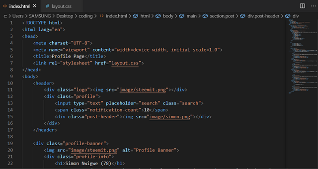
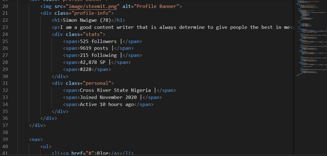
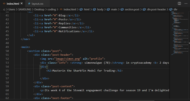
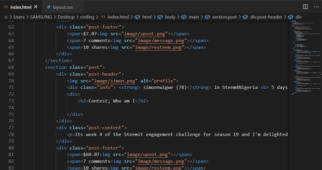
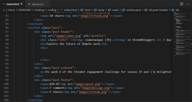
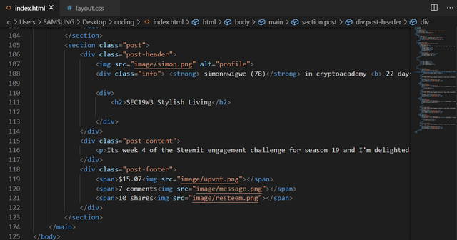
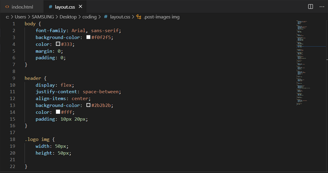
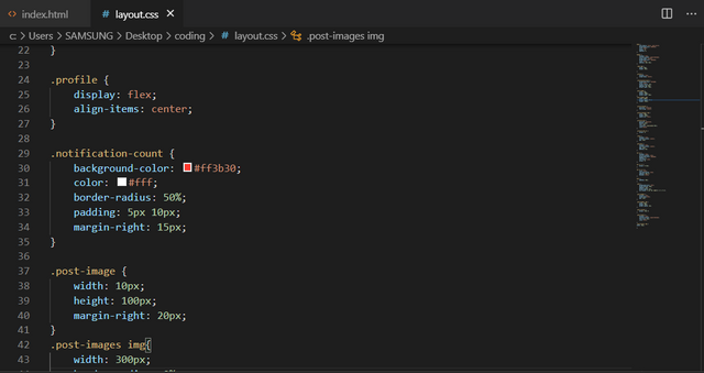
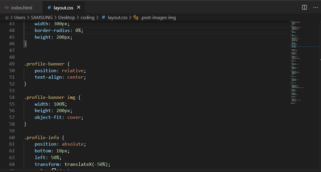
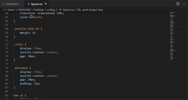
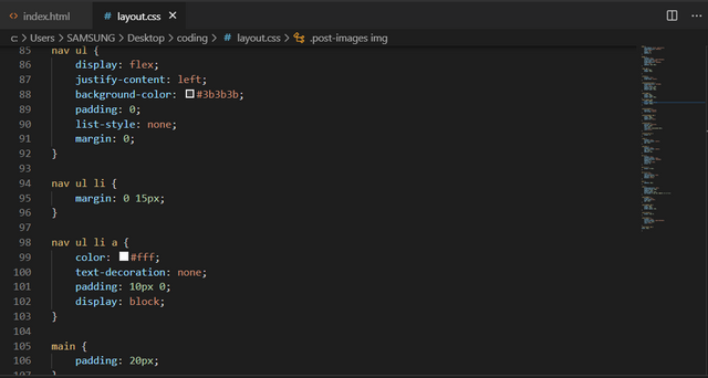
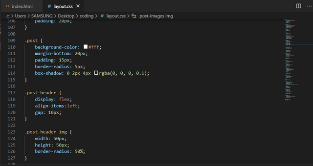
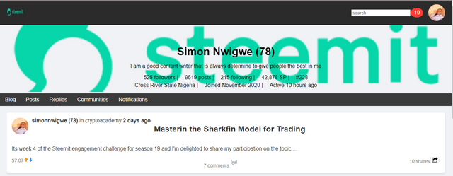
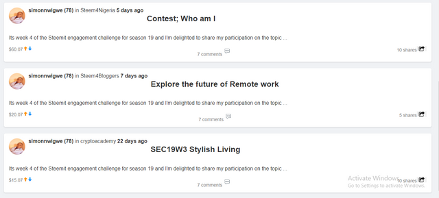
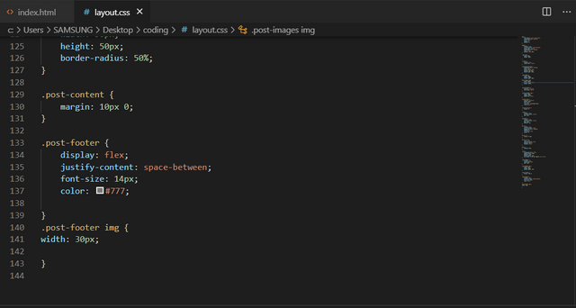
Here I did all the work I can and then took all screenshot along side the code below.
HTML Code
 |  |
|---|---|
 |  |
 |  |
CSS code
 |  |
|---|---|
 |  |
 |  |
I want to finally invite @solaymann, @steemdoctor1, and @suboohi to also join the contest in this community today.
Cc: @kouba01
Thank you, friend!


I'm @steem.history, who is steem witness.
Thank you for witnessvoting for me.
please click it!
(Go to https://steemit.com/~witnesses and type fbslo at the bottom of the page)
The weight is reduced because of the lack of Voting Power. If you vote for me as a witness, you can get my little vote.
Upvoted. Thank You for sending some of your rewards to @null. It will make Steem stronger.
Greetings dear friend hope you are doing well. Thanks for sharing your thoughts on this task with h us. You explain in a box with difference and with example properties is the way to understand easily. Practical work help us to understand how you use CSS in your task. Video output is the best way to showing your hard working. I like you theory part more. I wish you more success.
Thanks, dear friend for your wonderful comments
Theoretical work is well detailed and managed. Very much explanation maybe not everyone can go through this much reading. But I went through much of it. I tried to understand first and then I participated. We are same in Practical work, nearly. We are hoping and working for best then. In your webpage the Post title is coming in center, the other most things are better than me.
Thanks for your valuable comments my friend.
Hey simonnwigwe
I expected nothing but good work from you. Good to see you participating in the dev contest. You recreated the similar webpage as of steemit. Keep the good work up!
Thank you, mam, for your valuable comments, it is much appreciated.