More on BTC - The Big Triangle
Here is the up-to-date chart for BTC/USD going back to start of 2017 on the 1 day setting.
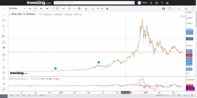
This chart shows what I would refer to as a (reasonably) symmetrical triangle compression wave pattern on the BTC/USD price. "Where?" I hear you ask. Well, let me add in two lines to lay out support and resistance trends.

Now lets complete the triangle here to visually demonstrate my point.

In short what you're seeing here is a falling band of overhead resistance comprised of sellers who are losing confidence (At point R) converging upon a band of rising support comprised of buyers who are gaining confidence (At point S). I refer to this as a "compression wave" due to the way the price range "compresses" as the trajectory and the waves of the trend progress.
The nature of the wave causes a neat triangle pattern to develop as shown above.
Now the important thing to note here is that both A and B are following similar trajectories. This means that both supply and demand (sellers and buyers) have roughly equivalent power in the marketplace at this point in time and it's very difficult to make any clear judgement call without further examination. This is what creates the symmetrical triangle pattern.
If you look at the bottom of the chart I have added one of my favourite indicators called MACD (which stands for moving average convergence divergence) and drawn similar trendlines on it to map it's own trend.

Now you can clearly see from MACD that the trend of the indicator at the lows has adopted a pattern very similar to the price line with a couple of interesting points. Lets add in lines to represent the highs and lows of the oscillator so we can compare them to the lines we drew on our price chart.
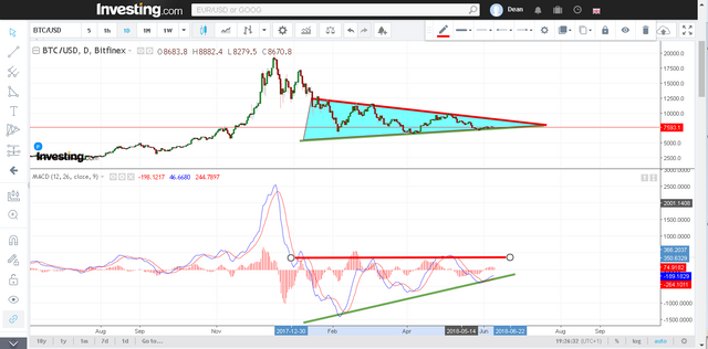
The lines on our MACD look a little different to the lines on the price chart and so we appear to have some divergence here.
The most important thing is that the one thing MACD and Price have in common is that they are both experiencing higher lows.
This is generally a bullish signal because support is being tested continuously, holding it's ground, and in fact gaining ground with every re-rally.
If we look at the half-hour chart for BTC/USD then we can also see that the strong line of support I drew on the previous charts is evident here and that the market appears to have dropped towards a rallying point overnight.
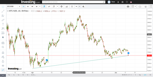
So I am now expecting another rally which would correspond to the next wave on the triangle.
The interesting point here, is that there is simply no space left in the triangle for another $10K rally without breaching it completely (in a bullish fashion).
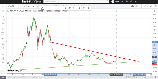
At this point even a $9k rally would lead to a positive breakout of the pattern which has been in place since the new year.
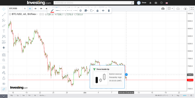
So watch out for the next rally. As an Investing.com user I should point out that their algorithms are already calling a bullish 3-outside-up reversal as pictured here.
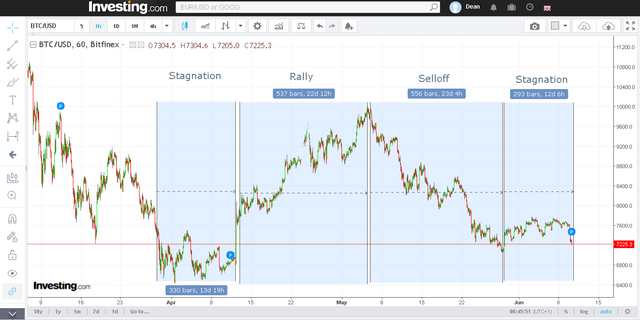
This fits with the pattern from the previous rally towards $10K as demonstrated here.
I've heard people say that this is the last good buying opportunity. I'm thinking that they could be right.