[BLOG] Removing the Legend: You Can Do It, Too
Removing the Legend: You Can Do It, Too
With all the talk about knowledge capture, note taking, and Roam, I thought I might just share some work I did today and demonstrate what it looks like in the context of how I'm using the tool and the swerves that you can catch when you start tinkering,
When I started, my notes were deliberately focused on the applicability to data science, graphing, that sort of thing. After all, that is what the article is about and what its original intention was to communicate.
Anytime I'm taking notes on a specific thing, I make sure that it has its own page in Roam and that the first thing I start with is a number of tags. In practice, that line generally doesn't have the word "tags" on it, it's just a bare line full of tags with concepts and ideas that I believe will be related to the content of the article and later, when I'm working on something else, any of those ideas or concepts will bring me right back to this page. I also make absolutely sure that I get the source for whatever I'm talking about, almost always a URL. Making sure that's front and center means that I'm not going to lose it anytime soon and if I open it in a sidebar, it's easy to just drag the URL over as a reference.
I take notes a little differently than a lot of people. I am not as obsessive about taking the content and rephrasing it right at the point of consumption. I like to go through and grab those representative quotes, the things that make me have ideas, put them in with the traditional >at the beginning of the line to designate that they are quotes from another source, and then double bracket anything in the body that strikes me as another one of those link concepts. If it makes me think about something that is not literally mentioned in the body, I am happy to add that as a tag at the end of the quote. Sometimes those in tags are more inspirational than content-derived.
Some of the links you see will not actually be links you can follow; those are my Roam aliases, constructs which are made exactly like markdown links but which actually target a Roam page. I use those fairly often to alias plurals to singulars, or one form of a word to another. It's a little bit of a pain to do it manually but I've always maintained that explicit is better than implicit.
Down below the direct quotes, my notes start. Some of them, most of them in this particular case, come from literally going back through the quotes and beginning to restate them and connect them to things that already exist in my mind and other things already in my RoamSpace. Sometimes this spins off entirely new pages, like when I find a book which is mentioned in the course of someone else's discussions. Sometimes I'm just accumulating ideas and concepts to back reference later.
"Remove the Legend" is particularly of interest because my idea of why I was taking notes changed from the beginning to the end. I started looking for information presentation ideas but as I continued, what really started opening up in connection to my experience was taking it as direction on narrative, on storytelling. That abstraction wasn't strongly in there to begin with (though it existed), it came into being from my observation and absorption of the content, filtered through my personal experience.
And that's okay. That's amazing. That's the sort of thing that is why I take notes.
I'm not a grad student, I'm not writing academic papers, I'm not a productivity guru – on my good days I'm a journalistic scrivener trying to pull together the frayed threads of a review or an analysis so that other people can understand what I'm trying to understand. On a bad day, I'm jotting down notes in my personal log so that I don't forget that the guy who came out to fix my dryer today did an amazing job and that I should get back in touch with his service so that I can tell them how good he is. And that I'm out of checks.
This process of thinking and these tools are not just for people who need to keep up with the 30,000 things their business or their schooling puts in front of them. Every day normal Joe's can use things like this to pull their ideas together. Even if it's just keeping up with the cool people you sent emails to, who posted that most awesome cat picture this week, and a few ideas on that movie you saw tonight to post to Facebook. Don't let the flavor of the community turn you off. You can do it. You can use it.
And if you just happen to start thinking about putting together the segments for the Great American Novel or the Great American Screenplay, start blogging three times a week on recipes you enjoyed preparing, maybe do a few notes for a Twitch stream with your friends where you play a few games and share your joy with the world – so be it. You can do it. You can use it. It's here for you.
In fact, I encourage you to.
Remove the legend to become one
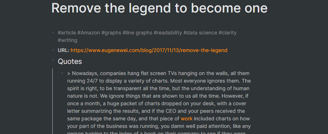
Tags:: #article #Amazon #graphs #[[line graphs]] #readability #[[data science]] #clarity #writing
URL:: https://www.eugenewei.com/blog/2017/11/13/remove-the-legend
Quotes
Nowadays, companies hang flat screen TVs hanging on the walls, all them running 24/7 to display a variety of charts. Most everyone ignores them. The spirit is right, to be transparent all the time, but the understanding of human nature is not. We ignore things that are shown to us all the time. However, if once a month, a huge packet of charts dropped on your desk, with a cover letter summarizing the results, and if the CEO and your peers received the same package the same day, and that piece of [[work]] included charts on how your part of the business was running, you damn well paid attention, like any person turning to the index of a book on their company to see if they were mentioned. Ritual matters. #attention #[[intermittent reinforcement]]
- > For all the painful memories that cling to the Analytics Package, I consider it one of the formative experiences of my career. In producing it, I felt the entire organism of our [[business]] laid bare before me, its [[complexity]] and inner working made legible. #[[situational awareness]]
- > The same way I imagine [[programmers]] [[visualizing data]] moving through tables in three dimensional space, I could trace the entire ripple out from a customer's desire to purchase a book, how a dollar of cash flowed through the entire anatomy of our business. #programming
- > At Amazon, I could see our revenue next quarter to within a few percentage points of accuracy, and beyond. The only decision was [[how much to tell]] Wall Street we anticipated our revenue being. Back then, we always underpromised on revenue; we knew we'd [[overdeliver]], the only question was how much we should do so and still maintain a credible sense of surprise on the next earnings call. #credibility #surprise #lies #deceit
- > What does this have to do with [[line graphs]]? A month or two into my job, my manager sent me to a seminar that passed through Seattle. It was a full day course centered around the wisdom in one [[book]], taught by the author. The book was The Visual Display of Quantitative Information, a cult bestseller on Amazon.com, the type of [[long tail book]] that, in the age before Amazon, might have remained some niche reference book, and the author was [[Edward Tufte]]. It's difficult to conjure, on demand, a full list of the most important books I've read, but this is one. #[[The Visual Display of Quantitative Information]]
- > Excellence in [[statistical graphics]] consists of complex ideas communicated with clarity, precision, and efficiency. Graphics displays should
- show the data
- induce the viewer to think about the [[substance rather than about methodology]], graphic design, the technology of graphic production, or something else
- avoid distorting what the data have to say
- present many numbers in a small space
- make large data sets coherent
- encourage the eye to compare different pieces of data
- reveal the data at several levels of detail, from a broad overview to the fine structure
- serve a reasonably clear purpose: description, exploration, tabulation, or decoration
- be closely integrated with the statistical and verbal descriptions of a data set.
- Source:: [[The Visual Display of Quantitative Information]]
- > One data point is one data point. Two data points, trended across time, tell a [[story]]. [I'm joking, please don't tell a story using just two data points] The line graph tells us [[where we've been]], and it points to [[where things are going]]. In contemplating why the line points up or down, or why it is flat, one grapples with the [[fundamental mechanism]] of what's on study. #storytelling #communication
- > Applying [[Richard Thaler]] and [[Cass Sunstein]]'s philosophy from Nudge, if we just improved the defaults in Excel and Powerpoint, the graphic excellence the world over would improve by leaps and bounds. #NudgeI began this post just wanting to share the following simple point, the easiest way to upgrade your Excel line graph:
Remove the legend. #legend
That alone will make your line graph so much better that if it's the only thing you remember for the rest of your life, a generation of audiences will thank you.
In [[The Visual Display of Quantitative Information]], [[Tufte]] uses very little color. When producing the Analytics Package, I was working with black and white printers and copy machines. Color was a no go, even if it provides an added dimension for your graphics, as for elevation on maps.
For sharp changes, like an anomalous reversal in the slope of a line graph, I often inserted a note directly on the graph, to anticipate and head off any viewer questions. For example, in the graph above, if fewer data series were included, but Greece remained, one might wish to explain the decline in health expenditures starting in 2008 by adding a note in the plot area near that data point, noting the beginning of the Greek financial crisis (I don't know if that's the actual cause, but whatever the reason or theory, I'd place it there). #clarity #[[predict the future]] #[[thinking ahead]]
To accelerate that understanding, upgrade your line graphs to be efficient and truthful. Some broadly applicable principles should guide you to the right neighborhood. To recap:
- > Don't include a [[legend]]; instead, label data series directly in the plot area. Usually labels to the right of the most recent data point are best. Some people argue that a legend is okay if you have more than one data series. My belief is that they're never needed on any well-constructed line graph. #clarity #focusUse thousands comma separators to make large figures easier to read
- > Related to that, never include more [[precision]] than is needed in data labels. For example, Excel often chooses two decimal places for currency formats, but most line graphs don't need that, and often you can round to 000's or millions to reduce data label size. If you're measuring figures in the billions and trillions, we don't need to see all those zeroes, in fact it makes it harder to read.Format axis labels to match the format of the figures being measured; if it's US dollars, for example, format the labels as currency.
- > Look at the spacing of axis labels and increase the interval if they are too crowded. As [[Tufte]] counsels, always reduce non-data-ink as much as possible without losing communicative power.
- > Start your y-axis at zero (assuming you don't have negative values)
Try not to have too many data series; five to eight seems the usual limit, depending on how closely the lines cluster. On rare occasion, it's fine to exceed this; sometimes the sheer volume of data series is the point, to show a bunch of lines clustered. These are edge cases for a reason, however. #[[seven plus or minus two]] #[[The Magical Number Seven, Plus or Minus Two
Some Limits on Our Capacity for Processing Information]]- > If you have too many data series, consider using small multiples if the situation warrants, for example if the y-axes can match in scale across all the multiples. - > Respect [[color blind]] users and those who may not be able to see your charts with color, for example on a black and white printout, and have options for distinguishing data series beyond color, like line styles. At Amazon, as I dealt with so many figures, I always formatted [[negative numbers]] to be red and enclosed in parentheses for those who wouldn't see the figures in color. - > Include [[explanations]] for anomalous events directly on the graph; you may not always be there in person to explain your chart if it travels to other audiences. #clarity - > Always note, usually below the graph, the [[source]] for the data.
- Some other suggestions which are sometimes applicable:
Display actual data values on the graph if people are just going to ask what the figures are anyway, and if they fit cleanly. If you include data labels, gridlines may not be needed. In fact, they may not be needed even if you don't include data labels.
Include targets for figures as asymptotes to help audiences see if you're on track to reach them.
A [[line graph]] is just another ugly chart lost in the scramble for its own gratification in a slide deck no one wants to read. It can be disregarded, forgotten. But if you make your graph more than just the default Excel format, if you devote yourself to Tufte's ideals, then your graph becomes something else entirely.
Which is?
A line graph without a legend. Remove the legend, Mr. Wayne, and become a legend. #[[when in doubt, dike it out]] #Batman
Notes
- [Spaced repetition]([[spaced repetition]]) only works if there is [[spacing]]. Continuous exposure means there is only one repetition, the initial one.
- Ritual matters. Putting people into the right [[mental space]] guides them into [[thinking]] about problems in ritual ways.
- Simultaneously, establishing or understanding [[ritual]] and then deliberately subverting it allows you to shake up how people approach problems.
- A full understanding of a complex thing often looks like [[information overload]] to those who don't know the information. #complexity
- Deception is just one more tool on the [[battlefield of consciousness]]. Setting [[expectation]], controlling expectation, and managing [[ritual]] allow you to present credibility.
- Clarity, [[precision]], and [[efficiency]] should be the hallmark of good [[communication]], whether it be a graph, a chart, or [[story]]. #writing
- All [[communication]] is, in some way, a [[story]]. #writing
- To tell a [[story]], at bare minimum, you need two things that are different. They may be different times, they may be different people, they may be different events, but at least two things must differ for a story to be drawn.
- Picking the right [[defaults]] can improve the [[quality]] of product for all the people using that platform.
- Deliberately picking the wrong [[defaults]] can deliberately cripple the [[quality]] of product for all the people using that platform.
- "[Remove the legend]([[remove the legend]])" applies a lot more broadly than to charts and graphs; it's anything that distracts the [[reader]] from following the [[trajectory of the story]] from one point to another. At all of those points, the reader should know enough to understand what that point means. If they don't have enough information to know what it means, they should at least know that the absence of knowledge represents an intentional act they should be wondering about and isn't just an accident of poor execution. #writing
- A major swerve in the flow needs to be annotated by [[context]] outside of the expected.
- Elements that you bring in need to be comprehensible. Don't have more [[detail]] than the reader cares about. Avoid [[unnecessary precision]]. Remember what you can show. #writing
- 5 to 8 elements is "[[the right number]]," no matter what you're talking about. [[The Magical Number Seven, Plus or Minus Two
Some Limits on Our Capacity for Processing Information]] appears to be the source citation for this in an [[academic]] sense. #writing - If you have too much to tell, break it down into more comprehensible, individually digestible chunks. Everything may be happening simultaneously but the reader can't follow everything simultaneously. #writing
- Designing for colorblindness is a big deal. The improvements in [[clarity]] you can achieve by making sure your content is consumable by the colorblind can improve the overall experience for everyone. Look for those opportunities. Making your content more accessible on every axis increases the audience. #[[color blind]] #writing
- Always include your [[sources]]. Always always always. Always know your sources. Always allow your reader to find your sources. This applies to [[fiction]] just as much as it does to [[journalism]]; make sure that your references and [[in jokes]] are clear and compelling. Make sure that you [[respect the source IP]] if you're working in someone else's world (or make clear that the point is to [[disrespect the source IP]]). (See the [[Star Wars]] series for a fine example of this breaking down in horrible ways.)
- Quote [[Batman]] whenever you can. Paraphrase Batman whenever you can. When in doubt, be Batman.
If you’ve enjoyed what you’ve read here today and want to support my continued efforts to bring engineering, art, and the occasional philosophical divergence to the masses, please feel free to send me a tip. Or thousands of dollars, I’m really not that picky. It’s through the efforts of you and others of like mind that content like this gets created.
Thank you for your time.
Do check out my portfolio if you'd like to get in touch or see more of my work.
- PAYPAL: http://paypal.me/SquidLord
- FLATTR: https://flattr.com/@SquidLord
- BITCOIN: bc1qy9wkj3g6ueugu0tjuwmh6dfxxn590r3p9tj9qt
- BAT: 0xcca4C3A3024d7496bDe06f6Fd865BfD5992Bf10B
- LBRY: https://open.lbry.com/@LexTenebris:9?r=FE9CbhqxgCUs23o2HvnPkMwZi9qVGNsD
- STEEM: @lextenebris
- HIVE: @lextenebris