My Submission To Blocktrades Logo Challenge 💥- Round 2
This is my second round submission for the Blocktrades logo challenge held by @officialfuzzy. The challenge is to create an updated logo for Blocktrades that reflects how fast and cutting edge the Blocktrades tool is. For the first round I was fortunate enough to get in first place, but now in round two I have seen a lot more great submissions so it will be interesting to see how the final round unfolds.
My design focus is on the speed and also I wanted to make it look more modern and clean as well as professional. Below are my different designs submissions.
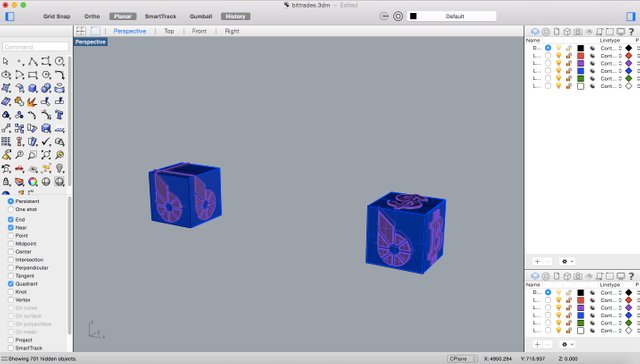
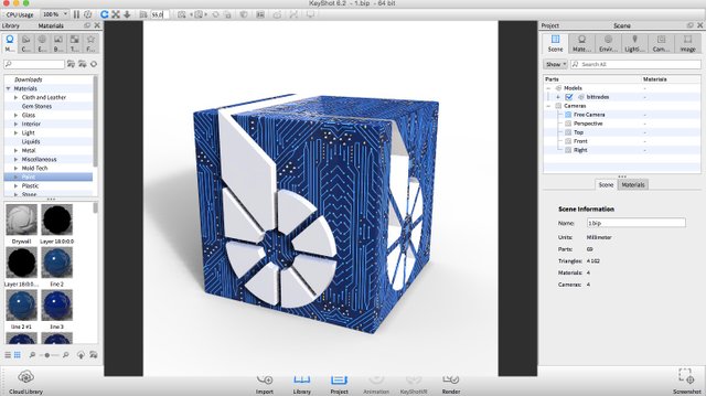
This is an updated version of my previous design. I played with the texture of the Bitshares, Bitcoin and Dollar sign, that originally was completely white. In this design I added some of the circuit board texture into the white.
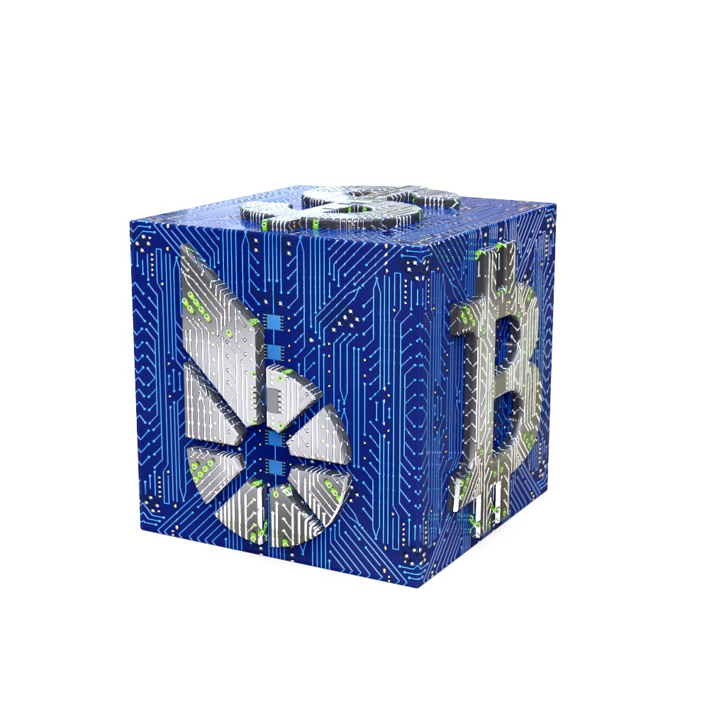

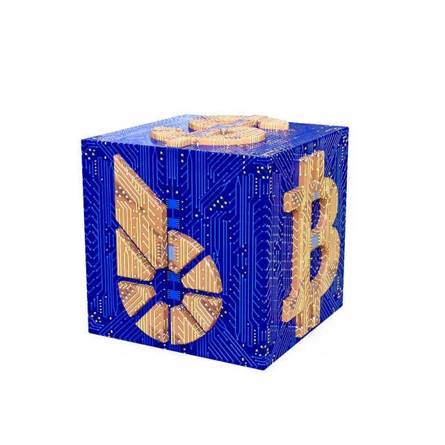
The texture I believe is very modern looking and reflects the fast speed of using Blocktrades. I also made one other design where I used blue and orange together. As they are opposite colors they give a good contrast

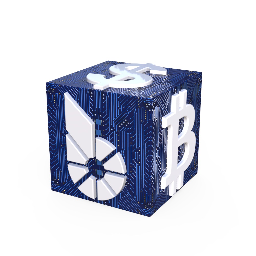
Below is the design which I won round one with. This is still my favorite design because it is more clean.
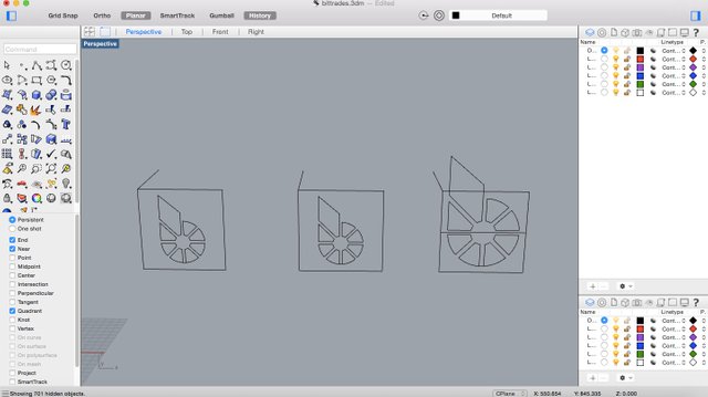
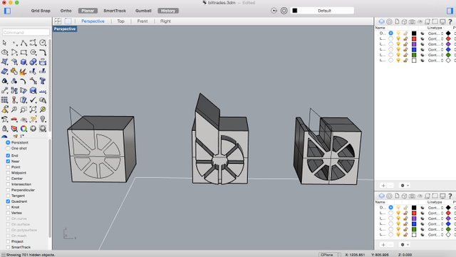
Below are some pictures of the process and proof of work.
Overall i think the original logo is good, at least conceptually, but everything can always be improved. Hopefully this design can make it look a bit more modern. For you who are not so familiar with Blocktrades you can visit www.blocktrades.us to see the original logo. Further more in you haven't use this website before I strongly recommend it, because it doesn't get more convenient than that!
Please let me know what you think of the designs and more importantly have an awesome day !
The first one is my favorite.Good job.
Thanks a lot Oldtimer :)
One word - perfect @dandesign86
Thanks a lot Dobartim:)
Superb. The designs are super, @dandesign86. Your designs have all the necessary elements and aura - Speed, Dynamic, Digital, Trance, Sci-Fi , Futuristic and Opulence of wealth
I like the first one the most. - Blue and Silver. It kind of brings "mercury" and "science" to mind. And it glitters like silver, embodying richness. Futuristic Money Systems. For me the first one :)
In very happy so many like the first one best that is great news :) thank you for your awesome feedback ! tip! 0.1
You are most welcome @dandesign86. Totally my pleasure :)
Hi @nehab! @dandesign86 is sending you 0.1 SBD tip and @tipU upvote :)
:)
@tipU - send tips by writing tip! in the comment, get share of the profit :)Thank you @dandesign86 and @tipu ....
So much detailing and lot of thinking goes there! Good luck! Though i am not an artist who can analyse your thoughtful design but as a spectator I like the first one in this post.
Thank you very much for your comment and glad you liked the first one :)
They're all great! I like the gold one the best tho...and more importantly "you" have an awesome day! lol Best wishes from @kenentertainment! Also i just posted some new music...check em out if you have the time bro
Thanks for your comment buddy !
Your designs are great. Good luck!
Thanks a lot buddy !
awesome design, good luck
Thanks buddy :) Fingers crossed 🤞
from what I could see yours is way ahead of the rest in my opinion
Thanks a lot that's very nice of you to say :)
only awesome 100%
Thanks :)
this is a great challenge, good luck passing this challenge @dandesign86.
Thanks a lot my friend :)
thanks also my friend.
Most welcome :)
Thank you friend.
friend please always support me.
Nice work there mate!
Thanks a lot man :) Hope you are having an awesome weekend !