Bitshares GUI Release v2.0.171121
Summary
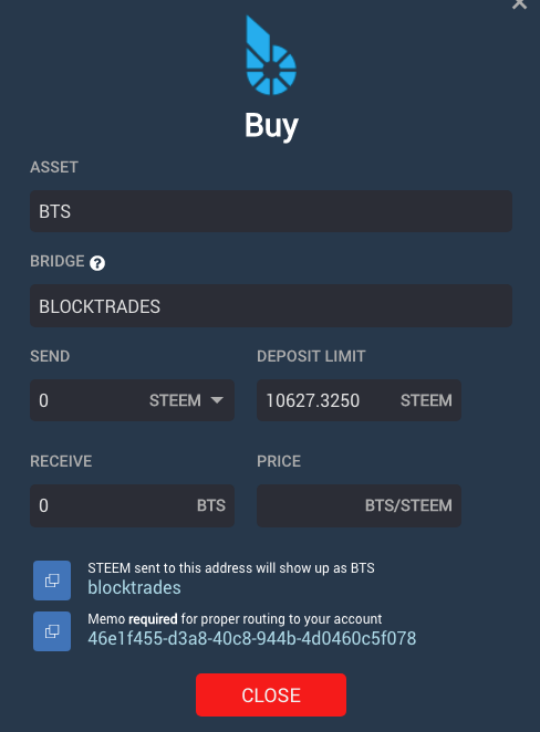
In 171121 we present a framework for a new system of modals. In this release, we present the updated buy modal and begin the migration process to https://wallet.bitshares.org.
Announcement
In an effort to address a security concern, we are migrating web users to https://wallet.bitshares.org from https://bitshares.org/wallet effective immediately.
Bitshares Light Client (Downloaded Client)
This won't affect you. Just download the newest version as usual
Cloud Wallet Users
All you need to do is change your bookmark to https://wallet.bitshares.org. You will need to reset all your preferred markets and for that we are sorry for the inconveience.
Local Wallet Users
If you access your local wallet from https://bitshares.org/wallet, you will need to take a backup of your .bin file then import it into http://wallet.bitshares.org. We have minified the https://bitshares.org/wallet interface to make it easy to download your backup file.
New and Improved
We've completely rewritten the Buy Modal. This is, in essence, an in-wallet API to the blocktrades.us functionality. It's a particularly easy way to purchase BTS and we would encourage tutorials to include procuedures for new users when explaining how to first acquire BTS. It removes the complications associated with explaining how to use the exchange.

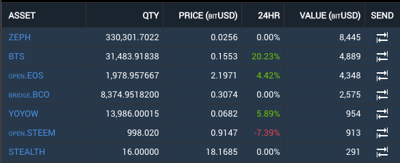
We are now displaying a 24hr price change indicator in My Portfolio. The is a first attempt, so please help with any obvious bug reports related to it.

Other notable improvements:
- Changed the faucet to the bitshares foundation fixed referral problems associated with the last release.
- Improved sort order in My Portfolio
- Added BTS as default asset in My Portfolio
- Standardized on Roboto Regular throughout most of the app
- Further improved notifcations related to current websocket
Future plans include:
- Improved Header
- Redesigned Deposit / Withdrawal / Send Modals
- Tradingview integration
- Responsive Design
For a summary of bugs and features, check out the Release Page.
For a detailed view of all closed issues in the Sprint, check out the closed Milestone.
Downloads
Binary downloads for Linux, Windows and OS X are all located on this page in addition to the standard Bitshares Downloads location.
Web
Proceeds from this post will be divided among @svk and me.
Thank you for all the work you and your team are doing - huge progress and looking awesome. This has already one of the best wallets/dex out there and it keeps getting better!
This work looks fantastic and will allow more new users to up-ramp into the Bitshares environment, well done!
As long as the lingo is as plain and simple, every single person coming from the street corner would be able to use it and, therefore, feel empowered and would empower their loved ones too!
Namaste :)
You rock, Bill. Pretty awesome to see how much you've accomplished getting the cats herded together to get work done. :)
Thanks man.
The GUI is improving daily. Thanks to those working on it. The core programmers certainly know what they are doing, but with respect to the GUI fixes, it feels like BitShares finally has some first-class project management that is geared towards user-friendliness. Very gratifying.
And it's not even Christmas yet🤣
Hoho
all improvements are welcome; you do a remarkable job thank's
Most excellent Bill, great work by you & your team!
I particularly like the new font (very clean and easy to read) and how you prefix 3rd party assets with a smaller font like open.BTC
Also glad you decided to implement a purpose specific "Buy BTS" panel. That type of simplification has been discussed more than once in the past, happy to see it finally implemented.
Curious to hear how long you think it will take your team to implement the responsive design. Depending on the existing structure, that may be something you can't incrementally change.
I'm looking for one person to consistently sweep up behind us and handle the responsive part. We have a few leads, but I would prefer one rock star.
Frankly, congrats for the continuous and constant work on it.
Can I just bring to your attention that there are still inconsistencies in the UI that you might not be aware of ?
For example when I am in the BTS/bitUSD market, and that I buy bitUSD, I get a notification that I just sold BTS.
Though this is technically true, it is very confusing indeed when I click on buy the last thing I want is a message telling me that I sold, else I will be wondering if I made a mistake !
Also next to this, when I look at the activity that is logged for my account : I see that I sold (again) BTS. And if I click on the market, I land in bitUSD/BTS market which is not the market where I want to go, I want to go back to BTS/bitUSD market where I originally bought bitUSD.
I wonder why it is all mixed up like this ? I am sure I am not the only one who is confused by this.
Also have you considered adding a mobile phone version ? i.e without graphs and with much less depth to the book order (could be set in options for example) ?
This would be great for slow mobile connections and would also help servers to deal with more connections at the same time...
We will get to the exchange eventually. It's a mouthful. I totally understand your concerns.
Great news! Thanks for answering.
Regarding mobile, see responsive design comments above.
Getting there. Good job!
Great work! =)
Thank you! Trading view is a big one!
cool stuff! thank you so much!