Bitcoin Charts: Making Cryptoeconomics Look Romantic
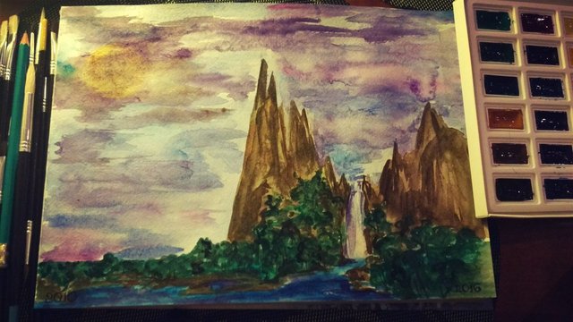
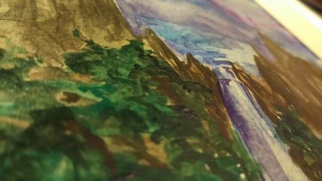
An unusual perception of the cryptocurrency charts - is the first artwork in the seria of original cryptoart. The idea dawned upon me when I was monitoring some of my currency investments and realized that I was sick from those red-green candles showing the market movements. So why not make the charts a bit more beautiful and inspiring? The first crypto to be represented in such an unusual way is Bitcoin.


Still, I would like to create a seria of such paintings illustrating market charts in different artistic ways. The next to be "redesigned" is STEEM, SBD and Ethereum.

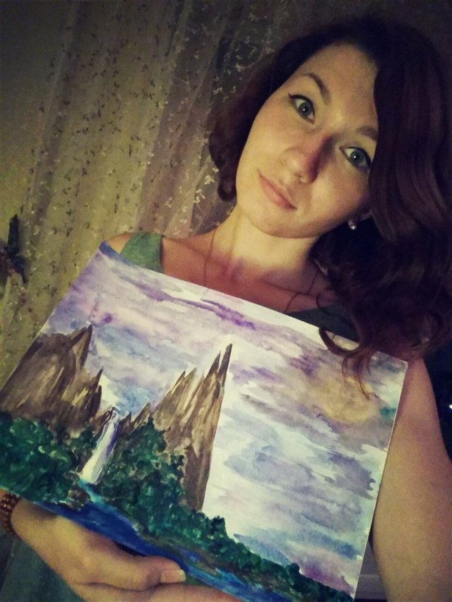
And here comes a proof of this peice being original. Hope, you enjoyed my amateur art.

Great idea and I love the originality.
Is the top one bitcoin's price chart since inception? Very cool!!!
Absolutely! There's even some year marks at the very bottom of the paining. So yeah, the landscape represents the changes from 2010 to 2016:)
Very beautiful!