[0111] - Spot the Difference: Why Do Cryptocurrency Graphs Look The Same?
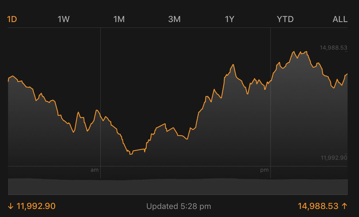
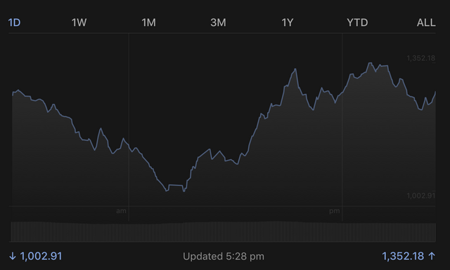
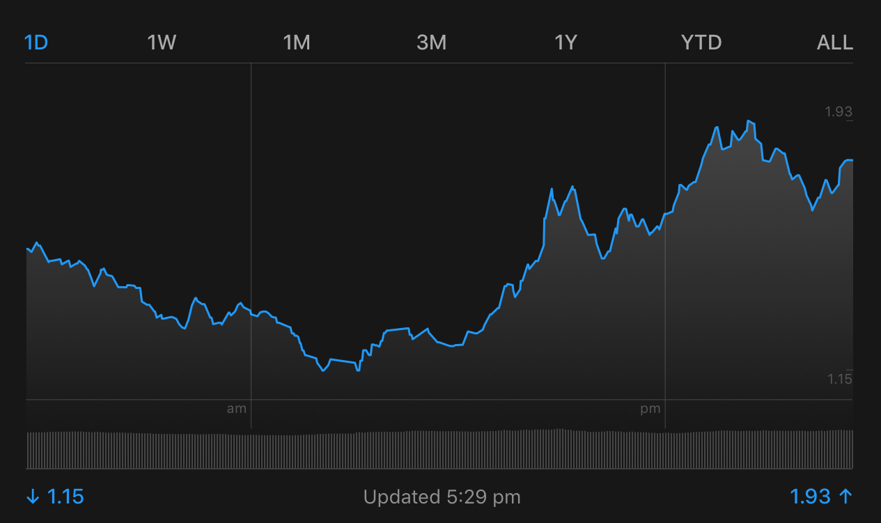
What do you notice about the 3 graphs below...
Bitcoin
Ethereum
Ripple
... In actual fact, all of the top 10 graphs like identical to these. As do other lesser coins.
What gives?
I've seen this before but today it's even more apparent. Coin graphs that spike... And dip... At the same time.
In surveying the wreckage of the crypto crash, picking over the bones looking for left over discounts, I noticed that every single coin I looked at has exactly the same graph. I went through dozens.
When Bitcoin grows, everything I have looked at is also growing. When Bitcoin dips, everything I have looked at is dipping.
This is handy because it makes it easy to manage my after-crash buys and sells.
Just thought I'd share.
Check it out yourself when looking at CoinMarketCap. Don't just look at your own coins. Look at the ones next door as they may be doing similar things.
Not sure why this is the case. If you know why, leave a comment below and educate me gently.
Thanks for watching,
Brendan Rohan - Indie developer of 'next gen' natural medicine from Melbourne, Australia
Www.Skyflowers.co ( see "botany" tab for the plant research )
Www.ClinicalFlowerTherapy.com
Social @iSkyflowers
YouTube Skyflowers.Tv
If you support natural medicine and an independent research project that began in 1997, then steem me. The creds I get will help me provide a solid body of information that future generations can build upon.
DISCLAIMER: This article is written by an amateur investor and is offered purely for information purposes. This is not financial advice and you should always seek the advice of a finance professional.


I think people just look at Bitcoin without researching the background of other cyptocurrencies and knowing how these are different from bitcoin. And hence any news on bitcoin influences the prices of other cryptos too.
That would part way explain it. But aren't the graphs representative of buying and selling activity? Which is occurring at the same time, across all coins? #Mindboggles
Awesome work! I`ve re-steemed!
Must be supported...
Thank you for your wonderful work 😊😊
I think it's zionist bankers manipulating them all for quick gains
the pattern that repeats through everything in the world!
I've been doing some market manipulation of my own. I hope you cleaned up too these last few days.
Have you found any charts that don't follow that pattern?
No we haven't really cleaned up - I know the opportunity is there but we just can't be bothered trying to beat the market - by leaving it a week or two it will probably go up anyway, and we have already made enough money on cryptos to just let them play out over months rather than days.
I never have any idea what the markets will do over the next day, so I just try to avoid worrying about it
Sound advice. If you're cleaning up anyway, why sweat it?
At the moment there are predictable trends. The crash makes it easier to read how people will react. So it's action stations on my trading desk. Then it's back to the banana lounge.
I'm really curious about this as well and nobody gave a reply as to why. They should act independently if they are truly based on buying and selling with supply and demand.
I think this happens due to the algorithms of trading bots, which are similar to each other. Even now, three years after the opening of this branch, the similarity of the charts is very expressive both on the leading coins and on altcoins, including all of them tied to the bitcoin rate, since the main trading pairs are pairs to bitcoin and the dollar token. In addition, whales do not trade with their own hands, algorithms do it for them, and large sums combined with algorithms move the market equally in all currencies.