5 Charts that prove Bitcoin's Success!

If you have doubted Bitcoin thus far, take a look at these 5 charts and it may change your mind. In my opinion Bitcoin at the moment is more successful than it ever was, and it is slowly going mainstream as the day goes by.
1) LocalBitcoins
(source: http://coin.dance)
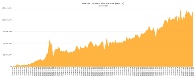
The LocalBitcoins volume chart which show the amount of Bitcoins being traded on this platform. LocalBitcoins is one of the largest peer-to-peer or even face-to-face trading platform where you can meet up with people and trade Bitcoins physically. It's volume is soaring, meaning that more and more people are using it globally to buy and sell Bitcoins.
They are present in over 13374 cities and 249 countries all over the world. Definitely a good sign for Bitcoin.
2) Node Count
(source: http://coin.dance)
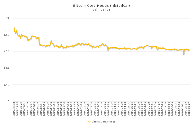
The nodes are the backbone of the Bitcoin network, without them there is no Bitcoin. Thus far the node count is steady and stable. The Bitcoin Core nodes have triumphed over the coup-de-etat attempts with Classic , XT and Unlimited, and is the core of the network with the basic protocol outlined by Satoshi.
All coup attempts have failed, and the original Bitcoin lives strong and prospers, despite the shills attempts to destroy it.
3) Hash Rate
(source: https://blockchain.info/charts)
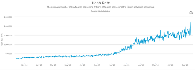
The hash rate has increased dramatically over the past 2 years. The hash rate measures the mining capacity of the network. The more miners there are the more secure is the network, since it costs more and more to do an attack on it.
Bitcoin mining has become a big business and this chart proves it, and it helps secure the network.
4) Unique Addresses
(source: https://blockchain.info/charts)
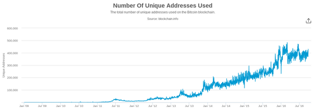
The Unique Addresses chart shows how many unique addresses are being used in a period. Now of course this is not a very precise method of measuring the usercount, since many people reuse addresses or might hold their coins and not spend them, but overall you can see an increase, which means that indeed new addresses are being used, so Bitcoin is very much alive.
5) Bitcoin Transaction Volume
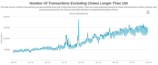
(source: https://blockchain.info/charts)
This differs from the 1) point, since this is the volume on the BTC network itself. By excluding chains longer than 100 we can eliminate the noise from gambling sites and other automated transactions and see how many real people transact with each other. The amount is growing, which is good news, it signals that more and more people using Bitcoin.
If it was succesful enough it wouldn't be needing charts to demonstrate it. Tables and volume can be manipulated since 5-6 mining companies own 85% of bitcoin.
Your charts are similar to a fat woman screaming in the streets "i am not fat, i am big boned".
The charts are from multiple sources, I doubt they would conspire to fake all of them. I should have included some Google charts too if you trust them more, they also show positive growth for Bitcoin in 2016.
Its all positive, all indicators show growth of Bitcoin.